Gigabyte AORUS FO32U2P

Introduction
It’s not that long ago that people were crying out for 32” 4K gaming OLED monitors, and now it feels like there’s a large number of these either already launched, or announced and coming soon this year! Since the start of 2024 we’ve already reviewed some of the first models to market from Asus, MSI and Dell, and now we have with us the competing model from Gigabyte, their AORUS FO32U2P (aka FO32U2 Pro).
It’s got a 4K resolution QD-OLED panel and a 240Hz refresh rate like the others, but what makes this monitor a bit different is the inclusion of the latest DisplayPort 2.1 video interface, including the full UHBR20, 80Gbps bandwidth capability of this new connection. We’ll explain DisplayPort 2.1 a bit more later and why this might be important to some users, but that’s certainly a feature that sets this model apart from all the other 32” 4K OLED screens released so far and is attracting a lot of attention in the market. Potential buyers are of course keen to see how the screen performs and whether this will be the right choice for their needs, offering top notch performance to go along with its modern connectivity and feature set.
The FO32U2P also includes a wide range of other modern features including USB type-C (with DP Alt mode and 65W power delivery) for single cable laptop connectivity, HDMI 2.1 ports for games consoles, a KVM switch function, a 3-year warranty which includes burn-in cover, and a range of ‘tactical’ gaming features and options. Let’s find out if this is THE 32” OLED monitor to buy!
| Where to Buy |
 __ __  __ __ |
| #affiliate. We may earn a commission if you purchase from our affiliate links in this content – TFTCentral is a participant in the Amazon Services LLC Associates Programme, an affiliate advertising programme designed to provide a means for sites to earn advertising fees by advertising and linking to Amazon.com, Amazon.co.uk, Amazon.de, Amazon.ca and other Amazon stores worldwide. We also participate in a similar scheme for Overclockers.co.uk, Newegg, Bestbuy and some manufacturers. |

Key Specs and Features
- 32″ screen size (accurately 31.5″) with 16:9 aspect ratio
- 3840 x 2160 “4K” resolution
- Samsung Display 3rd gen QD-OLED panel
- Standard ‘semi-glossy’ screen coating finish of QD-OLED panel
- 240Hz refresh rate, 0.03ms G2G rated response time
- Adaptive-sync for VRR, including AMD ‘FreeSync Premium Pro’ certification
- Quantum Dot coating offering wide colour gamut covering 99% DCI-P3
- 1000 nits peak brightness spec for HDR, as well as VESA DisplayHDR 400 True Black certification
- 1x DisplayPort 2.1 (UHBR20), 1x Mini DisplayPort 2.1 (UHBR20), 2x HDMI 2.1 and 1x USB type-C (with DP Alt mode and up to 65W power delivery). Additional 1x DisplayPort 1.4 daisy chaining output
- KVM switch function, PiP/PbP modes, headphone jack, mic jack, 2x USB data ports, 2x 5W integrated speakers
- Wide range of ‘Tactical’ gaming features
- Fully adjustable stand with tilt, height, swivel and rotate
- Comprehensive OLED Care settings and technologies, and includes 3-year burn-in cover in the warranty
FO32U2P vs FO32U2 model differences

Gigabyte also have a similarly named model, the FO32U2 (without the “P” on the end) which offers a very similar spec to the screen we are reviewing here, but without the DisplayPort 2.1 connection and a couple of other features. It retails for $100 USD less than the P model as a result, and if competing screens from MSI are anything to go by (e.g. their MPG 321URX and MAG 321UPX models), it is likely to be more readily available for a while. The panel being used and the specs are identical between the two screens, but the differences in features are:
- The P model includes a DisplayPort 2.1 (UHBR20) input and a Mini DisplayPort 2.1 (UHBR20) input, whereas the other model does not
- The P model includes a “wave” RGB lighting pattern on the back section of the monitor, whereas the other model does not
- The P model has a DisplayPort 1.4 output for daisy chaining, whereas there’s no daisy-chaining support on the other model
- The P model’s USB type-C connection has a higher power delivery of 65W, compared with 18W of the other model.
- The P model comes with a DisplayPort 2.1 (UHBR20) certified cable, as well as a USB type-C cable whereas the other model doesn’t seem to come with a USB-C cable, and will only come with (and need) a DisplayPort 1.4 cable. The product page also lists the P model as coming with an “HDMI 2.1” cable whereas the FO32U2 is listed just with an “HDMI cable”, but we believe that is likely to be an HDMI 2.1 cable on both given they both have HDMI 2.1 ports.
The FO32U2P model is available to pre-order and buy from some stores which you can check in our up to date tracker here. The lower-spec FO32U2 model is also available from some stores here.
Design and Features

The screen comes in an all black design with a 3 side borderless design. There is a black panel border around the sides and top though, including some additional space to accommodate the pixel shift function and move the image around a few pixels. This measures ~11mm on the right and left hand sides, and ~9.5mm along the top. There is a slightly thicker matte black plastic bezel along the bottom edge which measures ~15mm thickness, and with an additional ~3mm black panel edge the total border along the bottom is ~18mm.

The back of the screen is encased in a matte black plastic, with a very thin panel thanks to the OLED technology, the fact it doesn’t need a backlight and that it also has an external power supply brick. The central section where the connections are and where the stand attaches is a bit more chunky as you can see from the photos above and below. There is a cable tidy clip on the back of the stand too.

The screen itself has a very thin side profile, but the stand is reasonably chunky with a fairly deep V-shaped matte black metal foot. The stand is finished in a matte black plastic too and provides a strong and stable support for the panel although we felt this foot looked a little cheap compared with the rest of the design.

There is a bit of wobble to the screen when moving it around but it’s fairly minimal. The tilt, height, swivel and rotate adjustments are all smooth and easy to use so it offers very good ergonomics.


On the back of the screen, mainly on the top section of the chunkier part is some RGB lighting as shown above. This includes Gigabyte’s ‘Spatial Rift’ lighting which “incorporates 3D laser technology to create unique water ripple effects, adding dimension to the overall RGB lighting.” It can also be disabled if you want from the OSD menu.
There is no active cooling on this display so you don’t need to worry about any fan noise like on some competing OLED screens.

Speaking of the OSD menu, this is controlled via a single joystick toggle on the bottom edge of the screen in the centre. There are also two pressable buttons which control switching between the inputs, and the other which is the ‘Tactical switch’ which by default controls the ‘Resolution switch’ function. That switches between normal mode and the simulated 24.5″ screen mode (more on this later). You can also customise quick access options when pressing the toggle in each direction, and also change the function of the ‘Tactical switch’ to something else if you want.


Navigation was quick, simple and intuitive via the joystick toggle and there was a very good range of options available. So many in fact that most of the gaming settings, and the OLED care settings have been given their own separate menu sections.


The back of the screen features all the connections as listed above. Let’s talk more about the most interesting of these, the DisplayPort 2.1 connections…
DisplayPort 2.1 connectivity
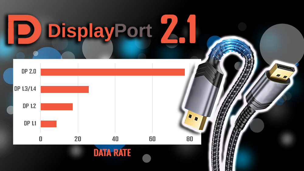
One of the key selling points of the FO32U2P is the inclusion of DisplayPort 2.1 connectivity. This is the latest generation of this video interface, capable of supporting much higher bandwidths than the previous DisplayPort 1.4 connection, up to a massive 80Gbps. With a data transfer rate of up to 77.37 Gbps, that makes it 3x as fast as DisplayPort 1.4 connections which could reach 25.92 Gbps data rate. This means more bandwidth available to accommodate higher resolutions, refresh rates and colour depth where necessary on future monitors. We have a detailed article which explains the ins and outs of DisplayPort 2.1 here, including why it’s been slow to appear in the monitor market so far. We would definitely recommend checking that out.
| Transmission mode | DP revision | Bandwidth per lane (x4) Gbps | Total bandwidth Gbps | Total data rate Gbps |
| HBR3 | 1.4 | 8.10 | 32.40 | 25.92 |
| UHBR10 | 2.1 | 10 | 40 | 38.69 |
| UHBR13.5 | 2.1 | 13.5 | 54 | 52.22 |
| UHBR20 | 2.1 | 20 | 80 | 77.37 |
DP 2.1 can reach up to 80Gbps bandwidth maximum, but one important note is that the DisplayPort 2.1 spec from VESA doesn’t actually require the use of any of the new speeds and so it’s really important to understand what capabilities are being offered when you see “DisplayPort 2.1” listed. Beyond the old DP 1.4 speeds (32.4 Gbps total bandwidth) there are actually 3 tiers of “new” speeds made possible, and these are labelled as UHBR10, UHBR13.5 and UHBR20. UHBR stands for “Ultra High Bit Rate” and each number can be multiplied by 4 to calculate the bandwidth. So, UHBR10 can reach 40Gbps, UHBR13.5 can reach 54 Gbps and UHBR20 can reach the full 80Gbps. When you see “DisplayPort 2.1” advertised you need to figure out which UHBR speed is offered, if any at all, to understand what the connection will offer. As an example, the recently announced HP Omen Transcend 32 monitor is promoted as including DisplayPort 2.1, but the information we’ve had from HP told us that this is using only the UHBR10 speeds.

Importantly, the Gigabyte AORUS FO32U2P is specified as offering DP 2.1, but they specifically list UHBR20 on their product page. This means that the connection can support the full 80Gbps bandwidth of this modern connection. But why is this important? The main potential benefit here is that with more bandwidth available, you can run the screen at 4K 240Hz 10-bit with an uncompressed data signal. All the other currently released screens of this spec rely on DisplayPort 1.4 connections and so need to use a feature called “Display Stream Compression” (DSC) to fit within the lower bandwidth of that connection. DSC is extremely efficient and provides a visually lossless image anyway so there are very unlikely to be any visual differences you would detect between DP 1.4 + DSC and using DP 2.1 instead. DSC is so important in fact to VESA that it is one of only two baseline requirements to achieve the DisplayPort 2.1 spec. Still, some enthusiasts like the idea of avoiding any kind of compression, whether visually different or not, and the new UHBR20 bandwidth can allow that.
There are some other more tangible benefits in dodging the use of DSC that some people are interested in. Firstly, NVIDIA DSR and DLDSR upscaling features don’t commonly work where DSC is used, although they can sometimes. These are of less value to be fair on a screen that already has a 4K resolution, but if you’ve got a powerful enough system they could be useful perhaps to push even higher. They might also be handy in situations where games don’t support 4K natively. So in theory if you can avoid the need to use DSC by having a DP 2.1 UHBR20 connection then you could open up support for these upscaling technologies.
Secondly there are a few bugs with DSC implementation in some situations, normally on the graphics card sides with annoyances like black screen delays when alt-tabbing out of games being often cited, although to be fair easily mitigated if you can use windowed mode for your game.
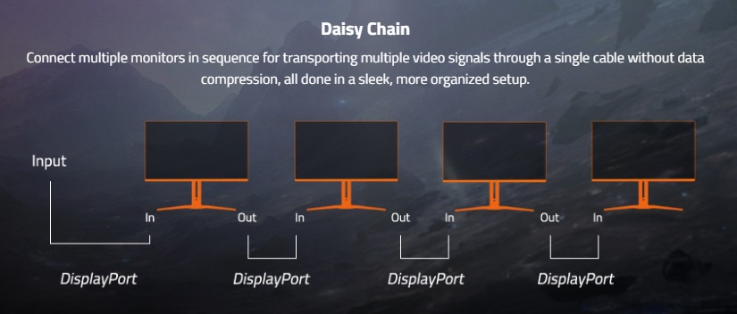
Thirdly with the increased bandwidth available, Gigabyte have added Daisy chaining support with a DP 1.4 output, allowing you to connect multi screens if you want in daisy chaining mode. That’s not available on their lower-spec FO32U2 model which lacks the DP 2.1 input. How many displays you can support in this configuration and at what resolution/refresh rate will vary, but in theory if DSC is used over the DP 2.1 connection you could have 2x FO32U2P’s connected in Daisy Chaining mode, both running at 4K 240Hz 10-bit. That’s impossible when only DP 1.4 is used.
Driving DisplayPort 2.1 from your system
You probably won’t be able to make use of DP 2.1 yet

The other part of the equation here is whether you have a source device that can output using DisplayPort 2.1 UHBR speeds. Right now the only consumer-grade graphics cards with any form of DP 2.1 output are from AMD, with their RX 7900XT offering UHBR13.5 speeds (54 Gbps). That isn’t actually enough bandwidth to accommodate 4K 240Hz 10-bit with an uncompressed data signal. You need UHBR20 for that, so right now even if you have that top-end consumer card, you can’t dodge DSC like you might want to for this screen! There’s no real benefit compared with just a standard DP 1.4 + DSC setup.
- Check pricing and buy the AMD RX 7900XT from leading retailers here

AMD’s professional grade Pro W7900 card has the full UHBR20 support but that’s clearly very expensive and not aimed at the same market that this OLED monitor is. We expect AMD will release more consumer-grade cards at some point soon though with UHBR20 support.
- Check pricing and buy the AMD Radeon Pro W7900 from leading retailers here
There are no DP 2.1 capable cards at all from NVIDIA even announced yet, and with no consumer-grade AMD UHBR20 cards yet, these are two very big reasons why the roll-out of DP 2.1 on monitors has been slow, something we discussed in a lot more detail in our article here.
This might be one of those situations where you consider buying this monitor to use now with your current DP 1.4-only card (and use DSC as normal), with a view that in the future should you upgrade to a new card which has DP 2.1 with the higher UHBR20 speeds you can then switch to a DSC-free experience. Right now, unless you want to pair this monitor with a Professional card like the W7900, you’re not actually going to be able to make use of the full potential, or even avoid needing to use DSC anyway.
It’s at least “future proof” in that when those cards do become available the monitor is ready to accommodate that for you. Although we are a little cautious about the performance and compatibility of DP 2.1 given there’s very little for Gigabyte to test and develop around right now. Hopefully with the screen supporting firmware updates, Gigabyte will be able to thoroughly test new cards as they are launched and address any bugs or compatibility problems. We’d say this is a little bit of a risk right now being on the cutting edge of connectivity technology, with an output device (monitor) where it hasn’t been possible to test it properly or fully with typical input devices (graphics cards). As we discussed in our article, we expect NVIDIA and AMD to put a stake in the ground in terms of DP 2.1 output, and for the monitor manufacturers to work around this as they develop their various screens. Let’s hope Gigabyte keep on top of this later on as it is potentially going to require further development and updates well after the initial launch of the screen.
DisplayPort testing

We tested the monitor with our normal test system which includes an NVIDIA RTX 3090 graphics card, so has only DisplayPort 1.4 + DSC output. This allowed us to sanity check that the screen behaves as normal and works fully even with older cards – which it does. There is a setting in the OSD menu to select the DP version as shown above, although we saw no issues with just leaving this on DP 2.1 during our usage and testing. Perhaps this is there in case of any bugs or compatibility issues with older DP 1.4 cards, but it might not be needed for many users.
We will investigate whether DSR / DLDSR technologies work or not on this screen later on in the gaming section of the review but we should note here that there is no specific setting in the OSD menu to turn DSC (Display Stream Compression) on and off.
Testing Methodology Explained (SDR)

Performance is measured and evaluated with a high degree of accuracy using a range of testing devices and software. The results are carefully selected to provide the most useful and relevant information that can help evaluate the display while filtering out the wide range of information and figures that will be unnecessary. For measurement, we use a UPRtek MK550T spectroradiometer which is particularly accurate for colour gamut and colour spectrum measurements. We also use an X-rite i1 Pro 2 Spectrophotometer and a X-rite i1 Display Pro Plus colorimeter for various measurements. Several other software packages are incorporated including Portrait Displays’ Calman color calibration software – available from Portrait.com.
We measure the screen at default settings (with all ICC profiles deactivated and factory settings used), and any other modes that are of interest such as sRGB emulation presets. We then calibrate and profile the screen before re-measuring the calibrated state.
The results presented can be interpreted as follows:
- Gamma – we aim for 2.2 gamma which is the default for computer monitors in SDR mode. Testing of some modes might be based on a different gamma but we will state that in the commentary if applicable. A graph is provided tracking the 2.2 gamma across different grey shades and ideally the grey line representing the monitor measurements should be horizontal and flat at the 2.2 level, marked by the yellow line. Depending on where the gamma is too low or too high, it can have an impact on the image in certain ways. You can see our gamma explanation graph to help understand that more. Beneath the gamma graph we include the average overall gamma achieved along with the average for dark shades (0 black to 50 grey) and for lighter shades (50 grey to 100 white).
- RGB Balance and colour temperature – the RGB balance graph shows the relative balance between red, green and blue primaries at each grey shade, from 0 (black) to 100 (white). Ideally all 3 lines should be flat at the 100% level which would represent a balanced 6500K average colour temperature for all grey shades. This is the target colour temperature for desktop monitors, popular colour spaces like sRGB and ‘Display DCI-P3’ and is also the temperature of daylight. It is the most common colour temperature for displays, also sometimes referred to as D65. Where the RGB lines deviate from this 100% flat level the image may become too warm or cool, or show a tint towards a certain colour visually. Beneath this RGB balance graph we provide the average correlated colour temperature for all grey shades measured, along with its percentage deviance from the 6500K target. We also provide the white point colour temperature and its deviance from 6500K, as this is particularly important when viewing lots of white background and office content.
- Greyscale dE – this graph tracks the accuracy of each greyscale shade measured from 0 (black) to 100 (white). The accuracy of each grey shade will be impacted by the colour temperature and gamma of the display. The lower the dE the better, with differences of <1 being imperceptible (marked by the green line on the graph), and differences between 1 and 3 being small (below the yellow line). Anything over dE 3 needs correcting and causes more obvious differences in appearance relative to what should be shown. In the table beneath the graph we provide the average dE across all grey shades, as well as the white point dE (important when considering using the screen for lots of white background and office content), and the max greyscale dE as well.
- Luminance, black depth and contrast ratio (static) – measuring the brightness, black depth and resulting contrast ratio of the mode being tested, whether that is at default settings or later after calibration and profiling. We aim for 120 cd/m2 luminance which is the recommended luminance for LCD/OLED desktop monitors in normal lighting conditions. Black depth should be as low as possible, and contrast ratio should be as high as possible.
- Shadow detail – this is evaluated with the screen configured to a 200 nits white luminance for consistency between different monitors, and viewed in a dimly lit room. This first 16 greyscale shades are measured using our UPRTek MK550T spectro device (0.002 nits lower limit) for shades near-black, and the results are plotted on a graph relative to a target gamma curve (usually 2.2 gamma). Where the measurement line crosses the 0.01 nits point on the Y-axis is typically the visual threshold for where we would start to be able to detect luminance compared with black (0.00 nits). We combine these objective measurements with visual tests using a grey shade test pattern to determine the first visible shade, and then rank the shadow detail performance accordingly.
- Gamut coverage – we provide measurements of the screens colour gamut relative to various reference spaces including sRGB, DCI-P3, Adobe RGB and Rec.2020. Coverage is shown in absolute numbers as well as relative, which helps identify where the coverage extends beyond a given reference space. A CIE-1976 chromaticity diagram (which provides improved accuracy compared with older CIE-1931 methods) is included which provides a visual representation of the monitors colour gamut coverage triangle as compared with sRGB, and if appropriate also relative to a wide gamut reference space such as DCI-P3. The reference triangle will be marked on the CIE diagram as well.
- dE colour accuracy – a wide range of colours are tested and the colour accuracy dE measured. We compare these produced colours to the sRGB reference space, and if applicable when measuring a wide gamut screen we also provide the accuracy relative to a specific wide gamut reference such as DCI-P3. An average dE and maximum dE is provided along with an overall screen rating. The lower the dE the better, with differences of <1 being imperceptible (marked by the green area on the graph), and differences between 1 and 3 being small (yellow areas). Anything over dE 3 needs correcting and causes more obvious differences in appearance relative to what should be shown. dE 2000 is used for improved accuracy and providing a better representation of what you would see as a user, compared with older dE methods like dE 1994, as it takes into account the human eye’s perceptual sensitivity to different colours.
Default Setup
The screen comes out of the box in the ECO mode which has a locked and defined brightness level (70). You’ll almost certainly want to move to the User mode or one of the others, but we tested this out of the box setup as usual:

In this default mode you can see that the gamma tracking on the left is good in dark to mid grey shades, but drops too low in lighter shades. This results in some loss of light grey shadow detail in practice and leads to an average gamma of 2.12 across the entire greyscale. This was reasonable. Colour temp and white point were good with only a small 2 – 3% deviance from our targets of 6500K, being a little too warm as the blue channel was slightly lower than it should be. We still had a good greyscale accuracy though with dE 1.4 average measured. With a locked brightness setting we had a luminance of 196 nits which was moderate and not overly bright.

The screen has a very wide colour gamut thanks to the use of a Quantum Dot coating on the QD-OLED panel, with 138.6% relative coverage of the sRGB space measured. This leads to large over-coverage in green and red shades in particular, making those colours look over-saturated and leading to high errors with a dE 4.5 average when displaying SDR / sRGB content. This is the same situation for any wide gamut screen and should be expected, so if you want to work more accurately with that content you will need to be able to calibrate and profile the screen yourself, or use the built-in sRGB emulation mode that we will test in a moment.
The bottom section compares the colours against several wide colour gamut reference spaces, and you can see that the panel extends a little way even beyond DCI-P3 (110.5% relative coverage) and Adobe RGB (118.8%) but it does at least make it practical to work with content in those gamuts if you want, although you will ideally want to be able to clamp the colour space back from it’s native to more closely match the intended colour space. DCI-P3 is the closest match to the native gamut of the screen that’s active in this mode by default, and the accuracy of colours within that colour space is better now. We measured a dE 2.2 average measured which is pretty good.
sRGB Emulation Mode (and Factory Calibration)

Gigabyte provide a factory calibration report in the box which confirms that it has been calibrated in the sRGB mode, with a colour accuracy listed as dE 0.89 on our unit, along with a 6500K colour temp and 2.2 gamma.
It seems that the emulation of the smaller sRGB colour space is only available via the specific ‘sRGB’ picture mode in the menu, which unfortunately has many of the settings locked and greyed out. Thankfully you have access to the brightness control still but other options like gamma, colour temp, RGB channels etc are not available. This is a shame as we would have liked wider access to the other settings. By all means lock a mode if you really want to based on a factory calibration, but at least give us the flexibility to clamp to that gamut in the other modes perhaps via the ‘colour space’ setting (which is where you will find the equally locked down Adobe RGB and DCI-P3 emulation modes). It would be good if there was a setting to clamp the colour space that still allowed full access to everything else, like there is on other screens like the competing Asus ROG Swift PG32UCDM for instance. We’d like to see Gigabyte add this option through a future firmware update ideally.

We measured the sRGB mode and found that the gamma was on the whole pretty decent, being close to 2.2 in most shades and measuring at a 2.21 average. Colour temp was a bit too warm by 5%, and we had a white point of 6240K which was 4% off from our target and the intended factory calibration target. This resulted in a good, but not excellent, greyscale with dE 2.1 average measured. Note also that the default brightness setting in this mode is 32 (you can change this if you want), which delivered a luminance of 102 nits, very close to the 100 nits standard for SDR. You can adjust the luminance of the screen between 270 and 23 nits using the brightness control, while operating within a uniform brightness mode in this preset (assuming you leave the APL stabilize setting on ‘low’ which we will explain more shortly).

This sRGB preset mode provides a good clamping of the native colour space back to sRGB with only a minor amount of over-coverage still measured, resulting in 104.8% relative coverage. This was a strong result and it means that the accuracy of sRGB colours was now good, with 1.6 dE measured. It wasn’t quite as good as the factory calibration report suggested (dE 0.89 listed), although measurement tools and software vary of course, but this still represents a good result and a usable, reliable sRGB emulation mode.
As we said earlier, we would have liked to have either had access to more of the controls like the colour temp/RGB channels so we could tweak that a bit, or to be able to emulate sRGB from within all the other presets using the ‘colour space’ setting and have the other settings available there.
Adobe RGB Emulation Mode
We also tested the Adobe RGB emulation mode which unlike the sRGB mode, doesn’t have its own preset mode as such. You can just switch to this from within the ‘colour space’ setting while using the other preset modes. We used the ‘custom’ mode for this but we turned ‘APL stabilize’ from high to low, to create a uniform brightness operation (explained more later).
Brightness was set to a 70% level but like the sRGB preset/emulation, you lose access to all other colour settings when using this colour space. It’s the same for the DCI-P3 emulation mode, they’re all locked down apart from the brightness control.

Gamma average was close to 2.2 at 2.16 measured, but showed some deviance in the darkest and lightest grey shades as you can see from the graph on the left. This was more pronounced than in the default native gamut mode, or the sRGB emulation mode. Colour temp and white point were again a bit too warm, slightly more so here with a 5% deviance from the target. As in the sRGB mode, you do not have access to the colour temp or RGB controls. You do still have access to adjust the brightness setting if you want.

Colour space clamping was very accurate here which was good, cutting down on the red shades a lot compared with the panel’s native colour space. With the Adobe RGB colour space in play, the accuracy of Adobe RGB colours was good with a dE 1.6 average measured. This represented a useful mode for those who might want to work with content in this colour space, often used for professional applications and photography. It’s nice to see this mode included as the panel is capable of covering this colour space nicely, but not every monitor manufacturer bothers to offer it.
DCI-P3 Emulation Mode


The DCI-P3 emulation mode was the most accurate of the three. Gamma was a little low in places, but we now had a much more accurate RGB balance, colour temp and white point than the sRGB and Adobe RGB modes. This resulted in a more accurate greyscale with dE 1.5 measured. The colour space clamping was again very good here and this resulted in very good colour accuracy with dE 0.9 average, being a bit better than the other two modes again. If you want to work with DCI-P3 content, often used in HDR content creation and consumption then this mode can cut back on the panels native gamut a bit and give you better accuracy.
Best Settings Guide
Get the best settings for the Gigabyte AORUS FO32U2P in our quick guide video, covering SDR and HDR modes as well as OLED care options. You can use these settings from a PC input, or equally for external devices like a games console.
Calibration


Calibration and profiling can produce some excellent results and could be useful though if you wanted to operate the screen within its native wide gamut mode, but then map the colour space back to something else like sRGB or Adobe RGB for instance for colour-aware applications (e.g. Photoshop). You would need a suitable calibration device and software.
In this section the screen was profiled to 2.2 gamma, 6500K colour temp and to the sRGB colour space. The screen was left in its native wide gamut mode, but this profile will be used in colour-aware applications to map back to sRGB in this instance. Overall the calibrated results were very good as you’d hope. You can find our calibrated settings and ICC profile in our ICC profile database now.
We should note here that the FO32U2P does not feature hardware calibration, so you are reliant on ICC profiles and colour aware applications, as opposed to being able to hardware calibrate the screen itself.
Brightness and Contrast

Out of the box the screen operates with a uniform brightness in SDR mode with consistent luminance measured (within a few nits variation) regardless of the content being shown or the size of your windows. You thankfully don’t get any annoying ABL dimming like you do on some screens, although all these modern 32″ models we’ve tested so far all have this same uniform brightness behaviour available. The screen can reach up to ~278 nits maximum which is in keeping with the other competing models we’ve tested so far.
We should note that this is with the ‘sub-logo dim’ OLED care feature turned off. If you enable that then the max luminance potential in Windows desktop drops by about 30 nits for the ‘low’ APL stabilize mode, 40 for the ‘medium’ mode, and by about 60 nits for the ‘high’ mode. Probably not a major problem for most, but something to keep in mind as those might be useful features for panel protection.
We’ve also provided settings here for achieving common 200, 150 and 120 nits luminance, each of which shows this same uniform brightness behaviour. You can reach down to a luminance of 22 nits minimum too.
- Useful reading – OLED Dimming Confusion – APL, ABL, ASBL, TPC and GSR Explained

We should also touch on the impact that changing the ‘APL stabilize’ setting has on screen brightness in SDR though. That’s a setting available in the OLED care menu with options for low (the default), medium and high. The results shown above are from the default ‘low’ setting where uniform brightness is achieved.
APL Stabilize = Medium

If we change this setting to medium you can see that the screen moves away from uniform brightness in SDR content. You can reach higher luminance up to 483 nits now, but only for the smaller APL. Automatic Brightness Limiter (ABL) dimming is then activated as the APL increases, with the luminance dropping down to 280 nits for a full-screen white image. This means you will experience fluctuating brightness during usage if you use this mode and it’s probably not recommended for desktop applications. Perhaps it might be ok for SDR gaming and multimedia, where you can then get some brighter highlights (a bit like in HDR where ABL is also active and needed).
APL Stabilize = High

If you move up to the ‘high’ setting, the results are even more extreme. The panel actually reaches up to 1058 nits now (for SDR mode!) for the smallest APL, but of course drops down far more significantly for the larger APL. The ABL dimming is more aggressive and noticeable. Again, maybe something you want to experiment with for multimedia, but definitely not for desktop applications.
Black Depth, Shadow Detail and Contrast
One of the key benefits of an OLED panel is the fact it is capable of generating true blacks and a basically infinite contrast ratio. Each pixel can be fully turned off individually, and there’s no need for backlight local dimming here like there is on LCD’s. As a result, the black depth and contrast ratio can surpass all LCD panel technologies including VA panels by a long way. Blacks look inky and deep, and you get local contrast between different areas of an image.
Your ambient lighting may have some impact on perceived contrast ratio as it does with all screens, although this is more noticeable on QD-OLED panels. In brighter rooms there is a fairly noticeable issue with raised blacks due to the panel structure and the fact that a polarizer is not used. The ambient lighting can cause inadvertent activation of the Quantum Dot layer, and blacks can start to look more grey. We studied the impact of this in detail recently, which is linked below if you want to know more. In darker rooms or where you can more carefully control your light sources, it is not a major problem, but competing WOLED panels do fare better.
- Related content: The OLED Black Depth Lie – When Panel Type and Coating Matters

The near black shadow detail was not great out of the box in the default ECO mode and it was hard to pick out very dark grey shades in this test image with box 6 being the first that was easy to distinguish before calibration. This is something that can often be an issue on OLED panels. Thankfully it’s easy to improve quite nicely by using the ‘Black equalizer’ setting in the OSD menu, and bumping that up 2 to 4 notches can adjust that near black detail nicely. The sRGB preset mode also seemed to be a bit better (Black equalizer not used or available in this mode), with all the boxes visible as intended. After calibration and profiling this had improved nicely too.
Backlight or Panel Flicker

| Flicker | |
| Flicker free verified | |
| PWM / flicker frequency | n/a |
Like most OLED screens there is a minor fluctuation of the backlight, and in this case it operates in sync with the refresh rate, whatever you have that set at. Above it’s operating at 240Hz so there’s a small fluctuation every ~4.17ms. You can see on the graph above that the 0V would be an “off” state, so the amplitude of this fluctuation is minor, and does not produce any visible flickering or anything like that in practice. It’s not the same as PWM on an LCD monitor where the backlight is rapidly switched fully off and on when trying to dim the brightness level. Obviously being an OLED panel there is no backlight here anyway, and this minor fluctuation didn’t cause us any problems in real use and would be considered flicker free.
Office and General Use

Resolution and Scaling
The fairly large screen size of 31.5″ provides a decent size upgrade from common 27″ screens, and this combined with the 3840 x 2160 “4K” resolution gives you a higher pixel density at 140 PPI. This 4K resolution is probably still a bit too high to use at native scaling (100%) for some people on a screen even of this pretty large size, although some people may find it ok. Text is small but if you’ve got good eye-sight and are up close then it’s still reasonable and does provide you then with a massive screen real estate and very sharp picture.
Other people will probably want to use operating system scaling to ensure fonts and text are a more sensible and readable size though. 150% is unnecessarily large despite being the “recommended” option detected by Windows, with 125% scaling offering a nice balance on a screen of this size we think. That gives you comfortable text size which is very similar to a 27″ 1440p screen, but does give you the equivalent desktop real-estate area of a 3072 x 1728 resolution. So that’s quite a nice jump up from common 2560 x 1440 resolution screens in this approximate size range. The extra pixel density of the 4K resolution will provide a very sharp and clear image for all uses including office and general applications. Just make sure that your software will support scaling effectively as it can sometimes be a bit difficult to get it right.
Keep in mind that not all Operating Systems and applications handle scaling the same. More recent versions of Windows tend to handle it all better, and recent versions of Mac OS are pretty solid as well. Some applications and games don’t handle scaling correctly and so you can end up with some things with very minute text and fonts and some things which don’t scale completely in every place. Keep this in mind if you’re selecting any super high resolution display as it could be an important factor. You need to ensure you have the necessary operating system and applications to handle scaling effectively for your needs. It does make life a bit more complicated than if you just ran at a native resolution and 100% scaling. If you have the necessary software and operating system then the 4K resolution provides a very sharp and crisp image though.
Sub-pixel Layout and Text Rendering

Because of the somewhat unusual triangular shaped RGB sub-pixel layout, slight text fringing has been a challenge on older QD-OLED monitors. This has been improved with the Second Generation QD-OLED panels including several we’ve reviewed in the past. These second gen panels have a slightly improved subpixel size and shape with more pixel fill, although still in the triangular RGB layout, but improving text rendering a bit as a result. We had been pleased with the results when we’d tested the second gen panels like the Asus ROG Swift PG49WCD with a 49″ screen size and 5120 x 1440 resolution for instance. That pixel shape improvement has carried through to these new third generation panels like that being used here on the FO32U2P.
Here, this updated pixel shape is also combined with the increased pixel density enabled by the 4K resolution and 140 PPI pixel density. The result is very good, and text clarity and sharpness is improved even further over the older ~110 PPI panels. It was very hard to detect issues at all with text clarity and fringing from any normal viewing position, and we tested the screen at 100%, 125% and 150% scaling levels. The combination of the updated layout and the higher pixel density and resolution seems to have almost entirely eliminated the issue and we expect this to be perfectly fine for the vast majority of people even for office and text work.
Screen Brightness
The screens brightness should be adequate for most users, reaching up to around 278 nits maximum in SDR mode with a uniform brightness behaviour (with APL stabilize set to ‘low’). As a result that is all without the need for ABL to be used. This is great news as it ensures a consistent and stable brightness no matter the content you view, or no matter your window sizes and we would recommend this mode for desktop applications for sure. The screen can’t reach as bright as LCD panels for desktop use, but 278 nits is still decent, and unless you need to use the screen in a very bright room, it should be more than adequate. It also has a good lower adjustment range down to 22 nits if you need to use the screen in a darker room.
Useful Features

Additional features like USB type-C connectivity (with up to 65W power delivery), KVM switch function, PiP/PbP support, headphone output, mic input, 2x 5W integrated speakers and 2x USB data ports are very welcome, and will likely to be useful to many users in these kind of situations. Perhaps an ambient light sensor to auto control the screen brightness could have been useful here too, and a human motion sensor to put the screen to sleep when it detects you’re away. We’d like to see that used more on OLED screens, it seems like a particularly relevant feature when you’re trying to minimise the risk of image retention on these panels.

Image retention risks and OLED care
One challenge with OLED panels in general is the inherent risk of image retention and burn-in. It’s a technology more suited to dynamic and changing content, which is why these are largely positioned as gaming and multimedia screens. There is more of a risk of image retention if you are using these screens for lots of static desktop and office use though. Display manufacturers provide a range of measured to help mitigate that risk, and maintain the panel over time and we will talk about the Gigabyte OLED Care measures in a moment. A 3 year warranty is offered which includes burn-in cover for added peace of mind too.
- Related content: OLED and QD-OLED Image Retention and Burn-in Longevity Testing at Rtings.com – Our Thoughts and Analysis
OLED Care

As their website puts it, “Gigabyte OLED Care consists of 6 main features for the purpose of protecting the panel from burn-in and extending panel longevity. The protections are (as Gigabyte put it) “fully automatic and do not require any human intervention to initialize, and these features are also tuned to be effective while being hardly noticeable therefore will not affect user experience.” The included features are:
- Pixel clean – runs after 4 hours of accumulated usage or can be run manually if desired
- Static control – The monitor automatically detects if the current display is completely still for 100 seconds. If so, the brightness will gradually lower by 80% for burn-in protection until further actions are made.
- Pixel shift – The monitor will automatically shift the entire display around 1-2 pixels once every 2 minutes
- APL stabilize – Adjusts and stabilizes the brightness of the display for panel protection. This feature automatically detects specific areas with a high density of white and adjusts peak brightness based on the selected profile. Caps max brightness? (low 250 nits, mid 450 nits and high 1000 nits)?
- Sub-logo brightness – Lower brightness automatically by 10~20% of areas detected with fixed images like taskbars or logos for burn-in protection.
- Corner dim – this is a new one we’ve not seen on other OLED monitors before. It lowers brightness in the four corners of the display for burn-in protection. This feature runs automatically in the corners and does not affect usage Gigabyte say.

Screen coating
The screen coating of the QD-OLED panel is what we’ve always called “semi glossy”. It’s the same coating as seen on all the other QD-OLED monitors to date. It looks cleaner and clearer than competing WOLED panels which have a fairly grainy matte anti-glare coating and a lot of people, us included, prefer the overall image clarity of this finish. It’s not a full glossy coating, as some anti-reflective (AR) treatment is also applied, and In certain situations and lighting conditions you will see more reflections than a matte coated screen and light isn’t diffused in the same way. During typical day to day usage, even with a window facing the screen we didn’t find it too bad at all. The coating can make colours and blacks pop a bit more, in the right lighting conditions. We quite like the coating balance here personally from QD-OLED panels.
One issue with QD-OLED that is sometimes incorrectly attributed to the panel coating is the reduction in black depth and perceived contrast when viewing the screen in brighter room conditions. This is actually caused by the quantum dot layer, and the fact that the panel does not have a normal polarizer, and this causes some of the ambient light to reflect back at you, leading to a drop in perceived contrast and black depth. That’s still an issue here although blacks still look very good and should still look superior to LCD technologies in most situations. For optimal viewing, and this goes for any OLED really, you want to be using the screen in a darker room, with lower ambient lighting. For day to day general and office work, which is what we’re talking about in this section, it’s not really an issue.
- Related content: The OLED Black Depth Lie – When Panel Type and Coating Matters
Blue Light and Eye Care Modes

The native panel spectral distribution is shown above at a calibrated 6500K white point, where the blue peak is at 453 nm. This means it is not part of the Eyesafe certified range of products where there is a supposed harmful range between 415 – 455nm. There are no blue light filters or modes on this screen, but there is a ‘reader’ preset which basically just defaults to the ‘warm’ colour temp setting available in some of the other modes. That reduces the blue peak a bit and results in a warmer, more yellow image measured at 5077K. Usable perhaps for late night text work or lots or white background content if you want.
Gaming

The FO32U2P is heavily focused on its gaming capabilities. The screen uses a QD-OLED panel which is well-known for its near-instant response times. As a result it does not need to use overdrive technology in the same way as a desktop LCD panel would, and there aren’t any controls for the response time or overdrive in the OSD menu as they’re not needed. Gigabyte, like other OLED display manufacturers quote a very low 0.03ms G2G response time in their spec, and while true <1ms G2G should be expected from this technology this is a little unrealistic.
| (at native resolution) | Refresh Rate |
| Maximum Refresh Rate DisplayPort | 240Hz |
| Maximum Refresh Rate USB type-C | 240Hz |
| Maximum Refresh Rate HDMI | 240Hz |
| VRR range | 48 – 240Hz |
| ClearMR certification tier | 13000 |
This year is the first time that 4K @ 240Hz has been available in the OLED segment and it’s a very attractive combination for many people. You will of course need a very powerful system and graphics card to get anywhere near 4K @ 240Hz, although you may of course want to play older games or at lower settings where this can be more achievable. There’s also plenty of future-proof room there as other system components are improved and updated over the coming years and new graphics card capabilities are developed. The 4K resolution provides a super sharp and crisp image, with more detail and clarity than lower resolution panels. It also makes the screen well-equipped to handle modern 4K gaming from PC’s and consoles.
| VRR capabilities and Certification | |
| AMD FreeSync certification | FreeSync Premium Pro |
| Native NVIDIA G-sync module | |
| NVIDIA ‘G-sync Compatible’ certified | |
| VESA ‘AdaptiveSync’ certification | |
| HDMI-VRR (consoles via HDMI 2.1) |
The screen has a native 240Hz refresh rate which is on par with a wide range of other OLED monitors on the market. This provides excellent motion clarity (demonstrated later), and can support high frame rates too, reducing overall system latency compared with lower refresh rate screens. Combined with a 4K (3840 x 2160) resolution, it’s a dream spec for many people.

To help support 3840 x 2160 @ 240Hz the screen features adaptive-sync, giving Variable Refresh Rate (VRR) support for both NVIDIA and AMD systems which is great news. The screen has also been certified under the AMD ‘FreeSync Premium Pro’ scheme but not under NVIDIA’s ‘G-sync Compatible’ scheme at this time although it does of course work with NVIDIA graphics cards still. It supports G-sync, it just hasn’t been certified under their scheme.
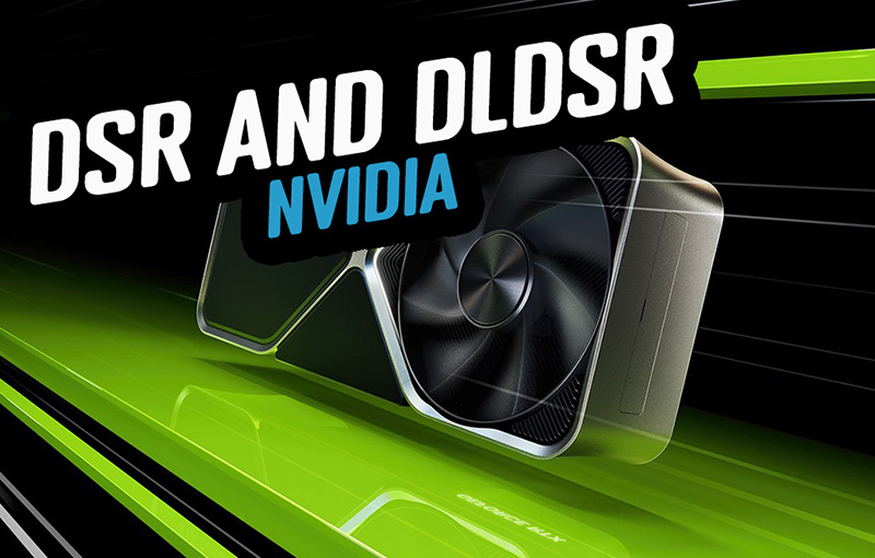
DSR / DLDSR
Keep in mind that right now there are no NVIDIA graphics cards with DP 2.1 output, and so the maximum you are going to get from even the most recent cards is DisplayPort 1.4 and DSC. We tested support for NVIDIA DSR / DLDSR which can sometimes work on monitors with DSC (Display Stream Compression), but not always. We found that these technologies were not available on this screen, even if you drop down to a lower refresh rate like 60Hz or a lower resolution. There are no settings in the OSD menu to disable DSC either, so no way to force availability of these technologies even if you were prepared to run at a much lower refresh rate. Some people might like that flexibility, but disabling DSC would leave you with a lot less bandwidth headroom. You’d be lucky to squeeze 4K @ 120Hz (at 8-bit colour depth) out of it.
DSR/DLDSR is a lot less relevant on this screen anyway as it is already natively 4K, and has a high pixel density. DSR / DLDSR is more commonly aimed at use on lower resolution monitors with 1080p or 1440p resolution, where you can upscale the input image to 4K to improve sharpness and image clarity. In theory you could use it here to push beyond 4K but with the panel already offering a high resolution and density natively, its a lot less relevant. There is no benefit by the way in running the screen at a lower resolution and using DSR to upscale to 4K, you might as well just run at 4K natively which should be equally / less demanding on your system anyway. So in summary, the lack of DSR / DLDSR support is not a big issue on a native 4K screen of this size anyway in most cases. There may be some scenarios where it would have been useful to have it available, like if a game title didn’t support 4K for instance.
It is impossible to know at this stage whether future NVIDIA graphics cards will allow DSR/DLDSR to function on this screen when they release DP 2.1-capable cards. The logic is that with DP 2.1 is that if it can support UHBR20 speeds (80Gbps) then you could power 4K @ 240Hz without needing DSC at all, which in theory would then allow you to use DSR/DLDSR. That would require NVIDIA to release UHBR20 capable graphics cards, and for the configuration between those new, un-released and untested graphics cards to function as expected with this monitor. If NVIDIA only offer UHBR10 or UHBR13.5 cards, you won’t be able to avoid DSC anyway which will likely leave you in the same position as now for support for these features. There’s a lot of variables in there so we will have to wait and see.
QD-OLED panel benefits for gaming
The OLED panel provides super-deep blacks and a basically infinite contrast ratio which is of course excellent for gaming too. The per-pixel level dimming and high contrast ratio also make it well suited to HDR gaming, and we will measure HDR performance a bit later. The very wide viewing angles of this technology are also excellent and make the screen suitable for viewing from many different positions if you need. These wide viewing angles importantly include the freedom from things like the pale/white “IPS glow” that you get on darker content on that common LCD technology. There’s none of that here on the OLED panel.
Gaming extras and settings

One other nice feature is that if you prefer playing games on a smaller monitor, the FO32U2P offers an emulated 24.5″ sized screen which is available via the ‘tactical switch’ button on the monitor. It takes around 6 seconds to switch over but then you have a smaller screen area to focus on. This might be useful for competitive gaming, and this mode runs at a native 1920 x 1080 resolution and up to 240Hz refresh rate. You can choose the location of the smaller window from within the ‘Game Assist’ section of the OSD menu, as shown below.

There is unfortunately no support on this screen for Black Frame Insertion (BFI) which can be useful for reducing perceived motion blur in gaming. We will look at the response time and motion clarity performance in a moment, but BFI is not a widely available feature right now. Asus have started to add it via the scalers on their recent OLED screens including the competing ROG Swift PG32UCDM, although it’s pretty limited in its operation and support right now. For instance it’s only available at 120Hz maximum, which then delivers you a motion clarity equivalent to 240Hz normal mode anyway. It could be useful if you can’t push 240Hz from your system though, and we would like to see other manufacturers investigate the inclusion of BFI in the future.
| Other Features | |
| NVIDIA DSR / DLDSR support | |
| Black Frame Insertion (BFI) | |
| Emulated gaming sizes | 24.5″ 1080p mode |
There are a whole range of other gamer-related settings available within their own dedicated section of the OSD menu to play around with too.

Our thanks to the following manufacturers for support in the build of our new test system:
| AMD Ryzen 9 7950X | Buy AMD Ryzen 9 CPUs here on Amazon | |
| Asus ProArt B650-Creator | Buy Asus B650 motherboards here on Amazon | |
| Corsair DDR5 RAM | Buy here on Amazon | |
| Corsair H100i Elite Capellix AIO cooler | Buy Corsair coolers here on Amazon | |
| Corsair iCUE RGB Elite Fans | Buy here on Amazon | |
| NVIDIA RTX 3090 | Buy NVIDIA RTX graphics cards here on Amazon |
| We may earn a commission if you purchase from our affiliate links in this content – TFTCentral is a participant in the Amazon Services LLC Associates Programme, an affiliate advertising programme designed to provide a means for sites to earn advertising fees by advertising and linking to Amazon.com, Amazon.co.uk, Amazon.de, Amazon.ca and other Amazon stores worldwide. We also participate in a similar scheme for Overclockers.co.uk, Newegg, Bestbuy and some manufacturers. |
Response Times
As discussed in our detailed article about Response Time Testing – Pitfalls, Improvements and Updating Our Methodology we are using an improved and more accurate method for capturing G2G response times and overshoot, based on figures that are more reflective to what you see visually on the screen in real-World usage. Our article linked above talks through why this is better and how we arrived at this improved method in much more detail.

The above G2G response times are consistent at all refresh rates, including 240Hz, 120Hz and 60Hz and during VRR situations with changing frame rates. Thanks to the QD-OLED panel the response times are super-fast and near-instant, with an average of only 0.51ms G2G measured. The best case was an incredibly impressive 0.35ms and the overall response times were as expected from an OLED panel.
All transitions can keep up easily with the frame rate demands of 240Hz, and in fact this screen could comfortably keep up with >1000Hz if the panel could support it! Let’s hope OLED refresh rates are driven much higher in the coming years, as it’s a really well suited technology for that. We already know there are plans to produce panels up to 480Hz so higher refresh rates are definitely coming! There is also no visible overshoot evident which is great news too, so overall there was nice and clean pixel transition times.
Motion Clarity – Pursuit Camera Photos
We captured some pursuit camera photos of the screen at a variety of refresh rates, designed to capture real-world perceived motion clarity. This gives you a good indication of how the screen looks in real use, beyond raw measurements.

Despite the amazing pixel response times you still get large amount of blur at 60Hz due to the sample-and-hold nature of the OLED screen, you can’t expect miracles just because it’s got fast response times. There are major and obvious benefits in motion clarity as you increase to 120Hz high refresh rate mode, and this brings it on par with 120Hz OLED screens such as the popular 42″ sized displays like the LG 42C2 and LG 42C3 TV’s, and the Asus ROG Swift PG42UQ.
Like with other 240Hz OLED screens we’ve tested, moving up to 240Hz offers another significant and noticeable improvement in motion clarity, and the moving image is now sharper and cleaner. Tracking of moving content is now much easier and clearer. This really was excellent motion clarity and very impressive. If you can push the screen up to 240fps in your games, which will be a challenge of course in many situations at 4K, you will benefit from excellent clarity and smoothness as well as improved system latency due to the higher frame rate supported. There is no overshoot or any associated artefacts or trails at any refresh rate like you might get on LCD screens which was excellent. The motion clarity will be the same as the other 240Hz OLED monitors in the market, unsurprisingly given they are all using 240Hz OLED panels. This motion clarity is very similar to a good 360Hz LCD panel so is very impressive.

Here’s some further comparisons of the motion clarity with other common OLED refresh rates, including the latest 360Hz panels which are currently available in 27″ screen size at the moment. Gigabyte have their own 27″ 1440p 360Hz OLED monitor being released as well with the AORUS FO27Q3.
Lag
Read our detailed article about input lag and the various measurement techniques which are used to evaluate this aspect of a display. The screens tested are split into two measurements which are based on our overall display lag tests and half the average G2G response time, as measured by our oscilloscope. The response time element, part of the lag you can see, is split from the overall display lag and shown on the graph as the green bar. From there, the signal processing (red bar) can be provided as a good estimation of the lag you would feel from the display. We also classify each display as follows:
Lag Classification (updated)
- Class 1) Less than 4.17ms – the equivalent to 1 frame lag of a display at 240Hz refresh rate – should be fine for gamers, even at high levels
- Class 2) A lag of 4.17 – 8.33ms – the equivalent of one to two frames at a 240Hz refresh rate – moderate lag but should be fine for many gamers. Caution advised for serious gaming
- Class 3) A lag of more than 8.33ms – the equivalent of more than 2 frames at a refresh rate of 240Hz, or 1 frame at 120Hz – Some noticeable lag in daily usage, not suitable for high end gaming


There is an extremely low lag on the FO32U2P measured at 0.33 ms total display lag, and leaving us with only 0.20 ms of estimated signal processing lag. This is perfectly fine for competitive gaming. This is a little higher at 60Hz refresh rate, measured at 3.67ms total display lag but actually very good compared with many screens. Remember that it is the lower number (0.33ms) that will be relevant for VRR gaming as well, even where frame rates drop. The 60Hz figure is only applicable for fixed 60Hz input sources.
Console Gaming
The screen features offers a 4K resolution and support for high refresh rates including 4K @ 120Hz, making it very well suited to modern games consoles like the Xbox Series X and PlayStation 5. Gigabyte have included two full-bandwidth HDMI 2.1 ports, delivering 48 Gbps speed and therefore supporting the max bandwidth capabilities of the two consoles.
The support for 4K resolution (natively here) means you can make use of HDR from the Xbox where that mode is only available at 4K, which is of course one of the key capabilities of this screen. The QD-OLED panel with its amazing contrast and blacks comes in to its own here for HDR gaming, providing an excellent image quality and HDR experience. More on HDR in a moment.
| Console Gaming | |
| Native panel resolution | 3840 x 2160 “4K” |
| Maximum resolution and refresh rate supported | 4K @ 120Hz |
| 4K at 24Hz support | |
| 4K at 50Hz support | |
| HDMI connection version | 2.1 |
| HDMI connection bandwidth | 48 Gbps |
| HDMI-CEC auto switch | |
| HDMI-VRR (over HDMI 2.1) | |
| Auto Low Latency Mode (ALLM) | |
| HDR10 support | |
| Dolby Vision HDR support | |
| Ultra high speed HDMI 2.1 cable provided |
We confirmed via an Xbox Series X that 4K 120Hz works fine which means you have access to HDR gaming from that console, which is great news. There is support for 4K 50Hz and 24Hz content along with VRR and HDMI-CEC. The only gap really is that there is no support for Dolby Vision HDR content on this screen, something that is supported from the competing Dell Alienware AW3225QF already, and that should be added later this year to the Asus ROG Swift PG32UCDM as well.
Further recommended reading
HDR Testing Methodology Explained
Performance is measured and evaluated with a high degree of accuracy using a range of testing devices and software. The results are carefully selected to provide the most useful and relevant information that can help evaluate the display while filtering out the wide range of information and figures that will be unnecessary. For measurement, we use a UPRtek MK550T spectroradiometer which is particularly accurate for colour gamut and colour spectrum measurements. We also use an X-rite i1 Pro 2 Spectrophotometer and a X-rite i1 Display Pro Plus colorimeter for various measurements. Several other software packages are incorporated including Portrait Displays’ Calman color calibration software – available from Portrait.com.
We measure the screen at default settings (with all ICC profiles deactivated and factory settings used). The results presented can be interpreted as follows:
HDR accuracy section
- Greyscale dE – this graph tracks the accuracy of each greyscale shade measured from 0 (black) to 100 (white). The accuracy of each grey shade will be impacted by the colour temperature and gamma of the display. The lower the dE the better, with differences of <1 being imperceptible (marked by the green line on the graph), and differences between 1 and 3 being small (below the yellow line). Anything over dE 3 needs correcting and causes more obvious differences in appearance relative to what should be shown. In the table beneath the graph we provide the average dE across all grey shades, as well as the white point dE (important when considering using the screen for lots of white background and office content), and the max greyscale dE as well.
- RGB Balance and colour temperature – the RGB balance graph shows the relative balance between red, green and blue primaries at each grey shade, from 0 (black) to 100 (white). Ideally all 3 lines should be flat at the 100% level which would represent a balanced 6500k average colour temperature for all grey shades. This is the target colour temperature for desktop monitors, popular colour spaces like sRGB and ‘Display DCI-P3’ and is also the temperature of daylight. It is the most common colour temperature for displays, also sometimes referred to as D65. Where the RGB lines deviate from this 100% flat level the image may become too warm or cool. Beneath this RGB balance graph we provide the average correlated colour temperature for all grey shades measured, along with its percentage deviance from the 6500k target. We also provide the white point colour temperature and its deviance from 6500k, as this is particularly important when viewing lots of white background and office content.
- ST 2084 EOTF (PQ) tracking – this graph tracks the PQ curve in HDR mode, akin to gamma measurements in SDR. The yellow line represents the ideal PQ curve, while the grey line plots the monitors measured performance.
- Luminance, black depth and contrast ratio (top right hand table) – measuring the brightness, black depth and resulting contrast ratio of the mode being tested. The luminance figure captured here is from a standard 10% APL window area measurement, although further luminance measurements are included in a separate section to capture “peak brightness” and the luminance at other APL areas. This section also measures the black depth on the screen and the resulting contrast ratio.
For HDR, any local dimming is left enabled, and so we measure the black depth adjacent to a white test image and calculate the “local contrast ratio” from there. We also measure the black depth towards the edges of the screen, away from the white test area in order to calculate the “maximum full frame contrast ratio” across the whole panel. These figures will often be different on LCD screens with local dimming, as this dimming can be more effective for dark areas further away from light areas.
HDR Brightness section
- The peak luminance of a white test pattern is measured at different APL (Average Picture Level) areas, ranging from a small 1% window which represents small image highlights, right up to a 100% APL which is a full white screen. This tells you how high the luminance of white is on the screen, with this typically getting lower as the APL increases in size. Comparisons are also provided against other screens where relevant..
HDR colours section
- Gamut coverage (2D) – we provide measurements of the screens colour gamut for HDR relative to the very wide Rec.2020 colour space. Coverage is shown in absolute numbers as well as relative, which helps identify where the coverage extends beyond a given reference space. A CIE-1976 chromaticity diagram (which provides improved accuracy compared with older CIE-1931 methods) is included which provides a visual representation of the monitors 2D colour gamut coverage triangle as compared with Rec.2020. The higher the coverage, the better.
- dE colour accuracy – a wide range of Rec.2020 colours are tested and the colour accuracy dE measured. An average dE and maximum dE is provided along with an overall screen rating. These numbers are calculated based on the colour tone and hue, and ignore any luminance error. The lower the dE the better, with differences of <1 being imperceptible (marked by the green area on the graph), and differences between 1 and 3 being small (yellow areas). Anything over dE 3 needs correcting and causes more obvious differences in appearance relative to what should be shown. dE 2000 is used for improved accuracy and providing a better representation of what you would see as a user, compared with older dE methods like dE 1994, as it takes into account the human eye’s perceptual sensitivity to different colours.
HDR

Being a QD-OLED panel, the FO32U2P is well equipped to handle HDR content with its per-pixel level dimming allowing for true blacks, a basically infinite contrast ratio and the avoidance of all blooming and halos. In these regards it can easily surpass any Mini LED backlit LCD monitor. However, it cannot reach the same luminance levels as Mini LED screens, and carries a “peak brightness” spec of 1000 nits, which will then also lower as the content on your screen changes and the APL increases which is normal on this technology. This is one key area where Mini LED screens can look brighter and deliver a more impactful HDR experience.
Being a QD-OLED panel it does also suffer from a reduced perceived black depth and contrast due to the lack of a polarizer and the Quantum Dot layer, which is evident in brighter lit rooms. For HDR content viewing you’d ideally want to be using the screen in a darker room if you can, to maximise the HDR impact and reduce this issue.
HDR Modes

Unlike many monitors there are a large number of HDR modes and settings available to choose from. In the menu you will find options for ‘HDR’ (which seems to act similar to familiar True Black 400 modes), HDR Game, HDR movie, HDR HLG and HDR Vivid. Some of these modes give you access to other configuration settings for brightness, contrast, light enhance, color enhance and dark enhance. A couple of the modes are fully locked down. Outside of the settings shown in the HDR menu (pictured below) there is also the OLED Care > APL Stabilize setting which is set differently for each mode.

Each of the preset modes are basically just a pre-defined combination of all these settings as far as we can tell and so here’s a quick summary of how each of them is set up. Where a hyphen is shown, that means the setting is unavailable and locked:
Default settings in each HDR mode
| HDR mode name | Brightness | Contrast | Light enhance | Color Enhance | Dark enhance | APL Stabilize |
| HDR | – | – | – | – | – | Middle |
| HDR Game | 100 | 52 | 0 | 0 | On | High |
| HDR Movie | 100 | 50 | 0 | 1 | On | Middle |
| HDR HLG | – | – | – | – | – | Middle |
| HDR Vivid | 100 | 52 | 1 | 1 | Off | High |
You may notice that when you open the OSD menu and go to the picture section, the menu lists a “CT” (colour temperature) at the top. There isn’t actually any control over the colour temp when using HDR mode, and this label seems to be listed based on whatever you had last selected during SDR mode. Actually it doesn’t have any impact on the HDR image, white point etc as we tested selecting several different colour temp modes in SDR before we enabled HDR, and none of them made any difference to the resulting colour temp in HDR, despite the menu having a different mode listed here. Basically you can ignore this label, it doesn’t have any bearing on HDR colour temp and should probably be removed in a future firmware update to avoid confusion.
New and updated HDR testing
We have been working hard over the last few months to extend our HDR testing to provide even more thorough data and analysis. HDR is primarily all about 3 things – contrast, brightness and colours, and so we’ve split this section of the review in to distinct sections to allow us to more thoroughly consider each performance area.
PQ EOTF Tracking and Greyscale
Click between each tab to see results and analysis for each of the HDR modes


There’s a lot of different modes and combinations of settings here but we can draw a few conclusions from these first measurements. All the modes have a pretty good colour temperature and white point being only around 2 – 4% too warm across all the HDR preset modes. That means that the image is close to the D65 (6500K) target which is good news, and this results in a good greyscale accuracy in each of the modes. The best mode for colour temp accuracy is the default ‘HDR’ mode, which seems to be akin to a common “HDR400 True Black” mode you’ll see on other modern OLED monitors. There are no settings to change the colour temp within HDR though keep in mind.
The second observation is that the ‘APL stabilize’ setting in the OLED Care menu, which is individually configured in each of these HDR preset modes, is what impacts the luminance capability of the screen. There’s more on how that impacts peak luminance capabilities below, but we can see it in the above EOTF graphs too where the PQ curve is tracked. In the default mode, movie and HLG modes that APL stabilize setting is on ‘middle’ and the PQ tracking is generally very good. It’s the most accurate in the default mode again – at least based on these industry standard 10% APL measurements. Movie mode tracks the PQ EOTF nicely as well, although it is raised a little in the darker shades near black due to the ‘dark enhance’ setting being turned on in that mode. That does not raise blacks, it just enhances the near black shadow detail which you may find useful especially when you’re viewing the screen in a brighter room or during the daytime.
On the other hand the HDR Game and Vivid modes have the APL stabilize setting on ‘high’ which causes the PQ tracking to skew significantly. At this 10% APL measurement used here, the grey line of the monitor’s measured luminance is significantly higher than the yellow target line, which means grey shades are lighter than they should be. This leads to an overall brighter looking HDR image, although it’s moving further away from the artistic intent.
We will look at brightness accuracy and try and identify which is the optimal mode, and the brightest mode in a moment.
HDR Brightness
Peak White Luminance


If we look at the common peak white luminance measurements you can see what impact the ‘APL stabilize’ setting is having in this area too. Only the HDR Game and Vivid modes reach up to the panels >1000 nits capability, getting to 1072 nits maximum as the setting is on ‘high’. The other 3 modes all cap out at around 484 nits where it’s set on ‘middle’.
It’s a similar situation to many other screens where a ‘Peak 1000’ mode and a ‘True Black 400’ mode are provided, and which we investigated in detail recently. It’s common on those screens for the P1000 mode to deliver the higher peak luminance, but actually for the TB400 modes to look brighter in many situations because of the EOTF tracking and the luminance of mid grey shades. Loads more info on that topic and our measurements in this article. We need to do some further testing to establish if that is also the case on this monitor, and compare the different modes in more detail which we will do in a moment.
To add more measurements and data to our HDR testing we are now introducing some new sections which will help provide a more complete and accurate view of HDR luminance performance in real usage, across a much wider range of test situations and accounting for the accuracy of greyscale and EOTF tracking.
Luminance Accuracy

Let’s just explain the EOTF graphs a little further here before we consider the luminance accuracy of this screen further. In the left hand image above you have an EOTF graph tracking the PQ curve for HDR. Along the horizontal X-axis you have the greyscale from 0 (black), through different shades of grey which get progressively lighter, to 100 (white). The vertical Y-axis is the PQ value, but basically you can think of this a bit like luminance. As you move up the value the screen has a higher luminance. This graph is just a logarithmic conversion of what an actual luminance graph would look like, which is included on the right. You can see the same greyscale 0 > 100 along the bottom but the vertical Y-axis is now luminance measurements directly.
The problem with the luminance graph is that the line is very flat until about greyscale 20 when it then starts to rise on the curve, even though visually you can identify differences in the image for those darker grey shades. In fact small differences in dark shades are more discernible by the human eye than the same differences in lighter shades. The curved graph is harder to read and compare which is why it’s converted to the PQ EOTF graph typically instead. Both graphs are measuring the same thing, but they’re presenting the data in a different way. The EOTF graph on the left is easier to identify where there are errors in not only the lighter shades, but also in the darker shades.
One other thing to note it that you will see in both cases when the lines reach greyscale value 70 (light grey) the yellow target line flattens out completely which would mean that if this is followed exactly by the monitor, all those grey shades from 70 to 100 should actually have the same luminance, and would therefore look the same. Those lightest grey shades get clipped and lost and become white basically. This is how it’s defined in the HDR PQ standard but it is down to the display manufacturer to determine the “roll-off” point. Often you will see the luminance drop a little lower and more gradually level off rather than take such a sharp turn at greyscale 70. That can then help preserve lighter grey tonal values. This is especially useful in situations where the peak luminance of white is lower, like for instance on OLED screens where the APL is high.
Think of it this way – for small 1% APL you might have a full luminance range of 0 – 1000 nits to play with on an OLED monitor, and so clipping light grey shades above greyscale 70 isn’t a major problem as they will be very bright at that point (nearing 1000 nits) and it’s going to be very hard to tell them apart anyway. For a large 100% APL the screen might only be able to reach perhaps 250 nits peak white and now you have a much smaller 0 – 250 nits range to play with. The display manufacturer might choose to clip the grey shades later on by rolling off the luminance more gradually since it’s going to be easier to tell the differences between those lighter grey shades when white is reaching only a much lower 250 nits peak.
Below we’ve just compared two of the HDR modes here as we try and hone in on the optimal configuration for HDR.
Default ‘HDR’ Mode – Luminance Accuracy


To consider the “luminance accuracy” further of the HDR modes we need to consider the EOTF and luminance performance at a range of different APL’s. Our recent investigation of OLED HDR brightness has revealed that we can’t just rely on a single 10% APL measurement any more.
As well as providing some EOTF graphs at a few different APL’s beyond just the typical 10% APL measurement, we’ve been working on a useful way to measure and represent what we are going to call the “luminance accuracy” of the HDR modes. The tables above are a simple approach which tracks the luminance error. Each grey shade being measured is shown across the top of the table starting from 0 for black, and going through the grey shades until you reach 100 for white. Measurements are taken at a range of different APLs shown down the left hand side, from 1% up to 100% and the measured luminance of each grey shade is compared with the target it should be reaching.
The difference in luminance, whether that’s a positive number where it’s brighter than intended, or a negative number where it’s darker than intended is then captured in the table and colour coordinated. The blue areas are where the luminance is higher, and the pink areas are where it is lower. Ideally for a fully accurate greyscale performance all these squares would be white, which would reflect the ability to achieve the intended luminance for all the different grey shades, and at all the different APL areas. Having said that, as we said earlier it is quite common to have a gentler roll-off for luminance on the higher APL situations, as the absolute peak luminance that can be reached is much lower than at small APL levels, and rolling off a bit earlier helps preserve some light grey details. As a result, some pink-coloured error for larger APL’s in the mid to light grey shades is perfectly acceptable.
As a recap of earlier, the default ‘HDR’ mode (similar to typical ‘True Black 400’ modes) had better EOTF tracking in our initial measurements when we were using the industry standard 10% APL, but because the ‘APL stabilize’ setting is configured to ‘middle’ the luminance capability is limited to around 484 nits. We can see from the measurements above that the luminance across the greyscale is very accurate for the smaller APL of 10% and below. As the APL increases higher we start to see some variation in the luminance away from the target for the lighter grey shades particularly between 55 and 65 but this is within the realms of acceptable, and actually beneficial as the earlier roll-off is used to preserve light grey shade detail. This default ‘HDR’ mode is very accurate for luminance, it just can’t get very bright as it caps out at ~484 nits peak.
‘HDR Game’ Mode – Luminance Accuracy
We know from our earlier measurements that this mode was able to reach up to the full 1000 nits potential of the panel, but the EOTF tracking was pretty poor earlier, with an overly bright greyscale. We can delve in to that in more detail here:


You can see the immediate problem with this mode which is that the grey shade luminance is far higher than it should be for all of the smaller APL’s. Especially for those low APL below 10% there are some huge errors which mean that the accuracy is poor, at least relative to the artistic intent and the way the content was mastered with the intention of being viewed in a dark room environment.
Unlike other modern OLED panels where these “Peak 1000” type modes are often too dark, and luminance in grey shades is a lot lower than intended, the FO32U2P goes the other way and the grey shades luminance is much higher than it should be. This applies to dark shades as well as lighter shades. You can see this in real-world content as well and for once the mode that can reach the highest peak brightness looks visually brighter in content as well.
With so much emphasis placed on HDR brightness nowadays by users who want an HDR image that wows and dazzles them, this overly bright EOTF tracking is likely to be a preferrable choice and could possibly even be classed as a “good thing” to many users. Many people will prefer this to the alternative of the image being too dark. In both situations the PQ tracking is inaccurate and off, but while on most screens (including the Asus, Dell and MSI models) it’s darker than intended, here on the Gigabyte model it’s brighter than intended.
Innaccurate, but potentially preferrable to many users?
We should also consider here that the PQ standard and what is deemed “accurate” is built on an assumption that the content will be mastered AND viewed in a dark room environment. That will not however be a relvant usage scenario for many users. It might be a little more relevant in the TV space where you might use the TV more in the evening and in a dimly lit lounge. But for desktop monitors, what is “accurate” for brightness may not actually be what the user really wants for their optimal enjoyment of HDR content. You will often hear complaints about HDR content being too dim, affecting not only shadow detail (often hard to make out) but also lighter content. This is very often related to the viewing environment and ambient lighting.
This brighter image setup, although not “accurate” may help some users though when they’re using the screen in ambient lighting conditions other than a dark room, like during the day time for instance. This brighter configuration is more geared towards more typical, everyday users. In the darker shades it helps bring out shadow detail more clearly, and it also makes the overall HDR image brighter in the mid to lighter shades. In real-world content the image popped more and looks nice and bright. It does not appear overly brighter or washed out thankfully.
We would like the choice and better user control
Many users will be interested in “accuracy” though, and may even want to use their screen in dark room conditions. Our testing is also geared around measuring display accuracy and performance. We are trying to balance the data-based negatives of these measurements which show innaccuracy of brightness, with the context of what might be appropriate or even preferrable for end-users here.
We would ideally like to be able to choose this configuration for ourselves if we wanted to enhance brightness for certain scenarios, rather than it being forced on us in the ‘HDR Game’ mode all the time as it is here.
You can turn off the ‘dark enhance’ setting to reduce the darker shade luminance a bit which we’ve provided measurements for in the tabbed tables above. That makes some minor changes to the darker shades. However, the ‘light enhance’ setting is already at level 0 in this mode so you can’t really correct those brighter-than-intended lighter grey shades. You can turn the ‘light enhance’ setting up higher to increase the light shade brightness even further if you really want!
We would like to be able to get more accurate luminance and EOTF tracking across the APL range while still being able to reach the 1000+ nits peak brightness. That would be the ideal configuration and the most “accurate”, but seemingly it’s very difficult for display manufacturers to get right. If we had that option available as a baseline, from there we welcome additional settings like ‘light enhance’ to boost greyscale brightness further if you want to. That would give you the flexibility to have an accurate mode for darker rooms, but one that can still reach the 1000 nits peak luminance. And then the settings to boost dark shade and light shade brightness further if you want to view HDR in more well-lit rooms. You can tweak other settings like the brightness control if you want, although it doesn’t change the EOTF tracking.
As it is right now, we are forced in to the brighter mode, although on balance we think this is a probably the better approach than it being too dark for most average users. If it’s going to be innaccurate in PQ tracking, this is almost certainly the better way to be.
We expect there is also an element here of Gigabyte deliberately configuring the ‘HDR Game’ mode in such a way as to avoid the darkening of the image that has impacted other OLED screens previously in their ‘Peak 1000’ modes – including the other current 32″ 4K models available. We are not sure at this stage if or how the performance can be adjusted on those other models, but it’s possible this was a deliberate choice as they had to choose one way or the other.
If you want a more “accurate” setup in darker room conditions and don’t want the overly bright image, the ‘HDR’ mode is available instead but we expect most people will probably welcome the brighter and more impactful appearance of the HDR Game mode.
Testing the default ‘HDR’ mode but with APL Stabilize turned up to high
You might think to yourself then “can I just use the default ‘HDR’ mode where the PQ tracking is accurate and turn the APL Stabilize setting up to ‘high’ to boost the peak brightness?” Based on some feedback from our Patreon supporters we tested this scenario as well.
Default ‘HDR’ mode with APL Stabilize on ‘High’


Unfortunately this does not provide that performance. You do get a higher peak white luminance, reaching up to ~1056 nits now for the smallest APL. So from that point of view, the change to the APL Stabilize setting has done what you would expect. However, the PQ tracking now behaves like it does on other OLED monitors with a “Peak 1000” mode (discussed a lot more in this article), where the luminance accuracy is good for the smallest APL, but is darker than intended as the APL increases. You can see this larger error in the luminance accuracy table and greyscale luminance graphs.
So basically you have an option here to configure a mode that behaves a lot like those peak 1000 modes, but which many people find looks too dark. It will reach higher peak values in certain situations than the APL ‘medium’ mode, but overall it looks darker and has darker mid grey shades. You can see this from the ‘APL medium vs high’ tab which compares the average greyscale luminance for each mode.
Greyscale Luminance


Another good way to represent the luminance is on the above graphs. Here we have considered an average of the measurements across the mid to light grey shades between values 45 and 75, and you can see a visual representation of which shades that covers with the gradient bar under the table on the left. This basically excludes the much darker shades, and also those that are near white, and often where clipping then occurs on OLED screens since they can’t get anywhere near the 10,000 nits upper limited defined for the PQ EOTF. These grey shades from 45 – 75 are the interesting area in terms of where problems arise in real-world brightness, and which will make up a significant portion of any brighter real-world HDR content areas.
On the graph itself the dotted grey line shows the average target luminance that should be reached for those grey shades, while the pale blue line tracks the average measured luminance. Ideally these lines would match if there was no error in the luminance and it was completely accurate. You can see here that for the smallest APL’s the lines meet closely and the achieved luminance is as intended for the different grey shades. This reaffirms what is shown in the pink/blue tables earlier. In the default ‘HDR’ mode for the larger APL’s the luminance drops a little below the target, although as we said earlier this small deviance is acceptable to account for intended roll-off and to protect light grey shade detail.
You can see from the ‘HDR Game’ graph that the achieved luminance is higher than intended, especially for the smaller APL’s. This reaffirms what we presented earlier in the pink/blue data tables and on the PQ graphs.
The most interesting here is the graph on the ‘modes comparison’ tab where the measured average greyscale luminance from each mode is compared. You can see that the ‘HDR Game’ mode offers a higher greyscale luminance than the default mode at all APL. It’s a small difference for the larger APL, but for those smaller APL the luminance is much higher. In practice this results in a brighter looking HDR image.
We’ve also provided a comparison from the Gigabyte’s ‘HDR Game’ mode against the MSI MAG 341CQP that we are also reviewing at the moment, and which is basically has the same HDR performance as all their other QD-OLED monitors we’ve reviewed recently. That can therefore be used as a proxy for their 32″ MPG 321URX, and is representative of many of the other competing screens with a ‘Peak 1000’ mode that are too dark in this mode. You can see on this graph where the target greyscale luminance line should be, and conveniently both screens can reach the same peak white luminance so this is the same target line for both screens. The MSI model starts by matching this target for the smallest APL but then gets progressively more dark than intended for the larger APL. The Gigabyte on the other hand starts off much brighter than intended for the smallest APL, and then tails off until it matches the target at 50% APL. It then drops slightly below the target for the largest APL. You can see how the Gigabyte screen has a significantly higher luminance for the greyscale in all situations than the ‘Peak 1000’ modes on competing screens at the moment.
Colour Brightness
We’ve already measured the peak white luminance of the screen above, and then delved in to the luminance of the greyscale which has a direct impact on mid tones and overall image brightness during real use. We have also included our additional tests below based on our new testing methodology explained in our detailed article here. These tests are designed to include measurements of colour brightness, based on measurements of RGBCMY colours. For colours, the greyscale measurements earlier will also be relevant to account for all those mid-tones and different shades of colours. As a brief explanation about these measurements this section includes:
- A scale and score based on perceived ‘brightness’ of the display instead of a raw ‘luminance’ measurement. This uses the XCR model developed by Samsung Display and accounts for both the luminance of the colours but also the colourfulness which is impacted by the colour gamut. XCR and its importance is explained in a lot more detail in our article.
- The scores are now directly related to how you would perceive and feel the brightness of the display. Where a score is twice as high as another score, it means it should appear approximately twice as bright. You can’t treat luminance measurements in the same way as our article explains.
- We will include measurements and brightness scores for colours, not just for white. More important for real-world HDR experience and content.
- Evaluation of the performance and brightness of these colours as the APL changes, including for “peak brightness” capabilities at the smallest APL. This shows where colours remain bright as well as just white measurements, or where you can sometimes get washout issues, or colours which cannot reach as bright as you might expect.
- Comparisons between different displays and panel technologies where applicable


You can see on this graph that the brightness of colours can still be high even for the smallest APL measurements and the smallest HDR highlights in content, which is a strength of QD-OLED technology. To put it in to perspective more, we’ve also provided a graph showing the same results but from a modern WOLED panel that has a higher 1300 nits peak brightness spec. You can see that while the brightness of white can reach higher on this panel, the brightness of colours reaches a peak at around 25% APL and cannot get any brighter. This can lead to some washout of the image and colours for smaller APL scenes where the white is boosted, but colours cannot keep up. In practice, along with the smaller colour gamut of those panels compared with QD-OLED, this can lead to less colourful looking images during some HDR scenes. This will of course vary depending on the WOLED panel you’re comparing it to, and keep in mind that this example is one of only a couple of modern WOLED screens with the increased 1300 nits peak brightness spec.
We’ve also provided a comparison of the colour brightness of the FO32U2P against the MSI MPG 321UPX which shows they basically reach the same peak colour brightness. We know from earlier that because of the PQ EOTF tracking, the Gigabyte model will look brighter in mid-tones and real-world situations than the MSI though.
Colour Accuracy
Click between each tab to see results and analysis for each of the HDR modes


We can also consider the colour accuracy in each mode which is measured above. All of the modes provide very good colour accuracy of HDR colours, and they’re all quite similar to one another except the ‘HDR Vivid’ mode which moves further away from the target and is a bit less accurate.
HDR performance summary
There’s a lot of information to take in from this HDR section, especially given there are so many nodes and setting combinations available on this particular screen. We will summarise the findings here too:
- Each HDR preset mode is a set combination of settings, which are also configurable individually in many of the modes
- With the exception of the Vivid mode which we probably wouldn’t recommend, all of the modes have decent colour temp and white point, as well as very good colour accuracy
- The ‘APL stabilize’ setting within the OLED Care menu is what impacts the brightness of each HDR mode. This affects the peak luminance that can be reached, but also the luminance accuracy and EOTF tracking
- There may be reason to use each of the provided modes depending on your usage. The default ‘HDR’ mode (with the default APL Stabilize medium setting) is akin to a ‘True black 400’ mode you might find on other monitors and provides the most accurate setup, EOTF tracking (at all APL) and luminance. However, it cannot reach the full brightness potential of the panel, capping out at around 484 nits. Its additional settings are all locked down in this mode though.
- If you stick with that ‘HDR’ mode but switch the APL Stabilize up to ‘high’ it then behaves like familiar ‘peak 1000’ modes on other OLED monitors
- The ‘HDR Movie’ mode behaves very similarly to the default mode, but you can change the settings if you want. The ‘dark enhance’ setting is also turned on by default, which makes near-black shadow detail brighter and probably easier to see. That makes it a bit easier to use than the default ‘HDR’ mode in brighter room conditions. It’s still capped in peak brightness though.
- The ‘HDR Game’ mode provides access to the full brightness of the panel, reaching up to >1000 nits. Unlike most OLED monitors with these modes, this preset is brighter overall than the other modes as it has been configured differently by Gigabyte. For smaller APL the luminance of grey is higher than intended, and so is still not “accurate”, but at the same time this is likely to be preferrable for many users anyway. At larger APL it is still slightly brighter than the other modes too which is good, so overall this mode is brighter.
Conclusion
This has been a really interesting screen to test and review and it’s another great addition to the 32″ 4K OLED monitor market. As with the other competing models we’ve tested, the combination of 4K resolution, a 32″ screen size and 240Hz refresh rate is excellent, and rightfully very popular in the market. The screen had excellent response times and motion clarity, super low input lag, excellent support for modern consoles and a very wide range of gaming features and extras. The only things missing really are an added BFI blur reduction mode, and support for Dolby Vision HDR content.
Away from gaming the text clarity is very good thanks to the updated gen2/3 pixel shape and the higher pixel density and this makes it very useable for other uses. We prefer the semi-glossy screen coating of these QD-OLED panels and the overall image quality is very good, but you need to be mindful of your ambient lighting because of the risk of raised blacks and reflections.
There’s a good range of modes available which are generally very well configured, including useable and well set up modes for sRGB, Adobe RGB and DCI-P3 emulation. We would have liked a bit more flexibility with the settings for each mode, but they are at least nice and accurate out of the box. SDR brightness is typical for a modern OLED monitor with uniform brightness behaviour being a positive inclusion for desktop work. It was also interesting to see the option to move away from uniform brightness mode if you wanted to for SDR, which might be useful to some people for SDR gaming and multimedia, as long as you can live with normal ABL dimming. HDR we’ve talked about a lot above, but we think a lot of users will prefer the brighter appearance of this screen, along with the accurate greyscale temp and colours, than on competing 32″ OLED models which are comparatively quite a lot darker.
Obviously one of the key differentiators of this particular monitor is the inclusion of DisplayPort 2.1 connectivity. It’s hard to test the potential benefits of this fully at this stage, especially since some of the key features people want to use are NVIDIA technologies (DSR / DLDSR) and they don’t have any DP 2.1 graphics cards even announced yet! Likewise on the AMD side there’s no consumer cards yet that let you get to the “DSC-free” target that this connection could potentially support.
For now, the screen is of course perfectly usable with current DP 1.4 cards, and you’ll probably have to wait until you can go DSC-free in your data signal. It’s ready to cover that in the future, although we will need Gigabyte to stay on top of future compatibility testing, bug fixes and firmware updates when new GPU’s arrive. It’s good to see them at the forefront of adopting this new connectivity in the monitor space though.
There was also a very good range of features like USB type-C, KVM switch, PiP/PbP and so on. The comprehensive set of OLED Care technologies should help mitigate image retention risks, and it was great to see Gigabyte offering a 3 year warranty that includes burn-in cover to give you added peace of mind.
| Where to Buy |
| ____ |
The final consideration will of course be price, and you can keep an eye on availability and pricing using our affiliate links above. There is also the FO32U2 version which is a very similar screen, minus the DisplayPort 2.1 interface but may be available at a lower price point. If you’re after a 32″ 4K OLED and are attracted by the unique inclusion of DP 2.1, then we think the FO32U2P is well worth looking at.

| Pros | Cons |
| 32″ 4K 240Hz combination is great for gaming | No BFI blur reduction mode |
| Wide range of features and great connectivity options | No Dolby Vision HDR support |
| DisplayPort 2.1 connectivity with UHBR20 speeds is currently unqiue to this monitor | Emulation modes could offer more flexibiity and user control |
We may earn a commission if you purchase from our affiliate links in this article- TFTCentral is a participant in the Amazon Services LLC Associates Programme, an affiliate advertising programme designed to provide a means for sites to earn advertising fees by advertising and linking to Amazon.com, Amazon.co.uk, Amazon.de, Amazon.ca and other Amazon stores worldwide. We also participate in a similar scheme for Overclockers.co.uk, Newegg, Bestbuy , B&H and some manufacturers.