Exploring OLED Brightness – Improvements, WOLED vs QD-OLED and the Need for New Metrics and Specs
Originally published 15 February 2024, last updated 20 February 2024
With thanks to Luke Hellwig, Dale Stolitzka, Chirag Shah and Charles Poynton for their input and support
Introduction
The brightness of OLED displays is one often-cited limitation of the technology relative to competing Mini LED backlit LCD displays. Advancements are being made in brightness capability as new generations of panels are produced, panel design improves, power consumption is reduced, and new methods for handling the heat from the panel and reducing image retention risks are developed. However, it’s not very easy to understand how an OLED monitor will perform in this area, especially in today’s world of HDR content. How bright and impactful will HDR content look on the screen? Is there a metric that can give us an indication? How does this vary between WOLED and QD-OLED technology panels?
The HDR brightness capability of an OLED display from a marketing point of view has been largely distilled down to a single metric for now, that being “peak brightness”. It’s a fairly simple and crude measurement and normally a single data point that represents the brightest the panel will be able to reach in theory. It’s based on a measurement of a white test pattern but tells only a very small part of the overall brightness story of the panel in real terms and in real use.
Despite this a lot of focus is given to just this one number. It’s really the only number we have usually from a product marketing point of view to give us information about this performance area.

OLED Brightness and the impact of APL
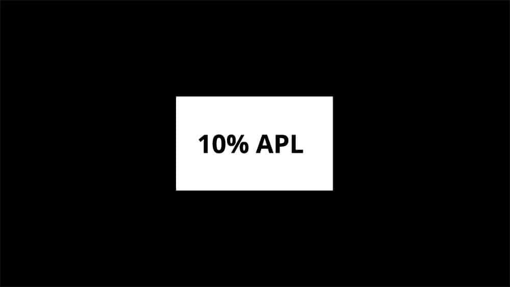
Hopefully you will already be aware of one limitation of this spec related to how OLED peak brightness varies depending on the APL (Average Picture Level) of the image, and how much of the screen is bright at any given time. If not, we’ve included a brief explanation below. That’s one area though where the single figure for “peak brightness” can’t tell the full story, and you are generally reliant on third party testing and reviews to understand how bright the panel is in other situations and for other APL. We are seeing some instances where specs now include peak brightness for other APL like for example 3%, 10% and 100% area windows, which gives us a better view, but is far from widespread.
Even then this is still only part of the story, and different displays can look quite different in real use. There’s a lot more to screen brightness than just the peak white measurement this spec provides. Why can one display look and feel brighter than another when they have the same “peak brightness” spec? Why can one display look brighter than another even though its spec might even be lower?! How can reviewers and testers provide metrics and data that capture the real-world brightness of these displays and tell you much more about a screen’s performance?
These are all questions we wanted to tackle with this study.
A brief explanation of APL and its impact on “Peak Brightness”
The “peak brightness” spec you will normally see advertised only applies for a certain type of image when discussing OLED panels. Quite widely understood already is that this “peak brightness” will vary depending on the area of the white test sample being measured, normally referred to as the APL (Average Picture Level). Technically, APL is an older term originally used to describe the signal level, rather than the luminance level and area. It has become so widespread in its usage in the market that we will stick with “APL” here.
Because of the way power can be distributed on an OLED panel to the pixels, if only a small area (a small APL area %) needs to be lit up then more power can be focused to that part of the image and the brightness can therefore be pushed higher. If a larger area needs to be lit up for a larger % APL then the power has to be shared across more pixels and the maximum brightness that can be reached is lower. A 100% APL (full white window) would therefore be the dimmest, as the power is being shared to all pixels.
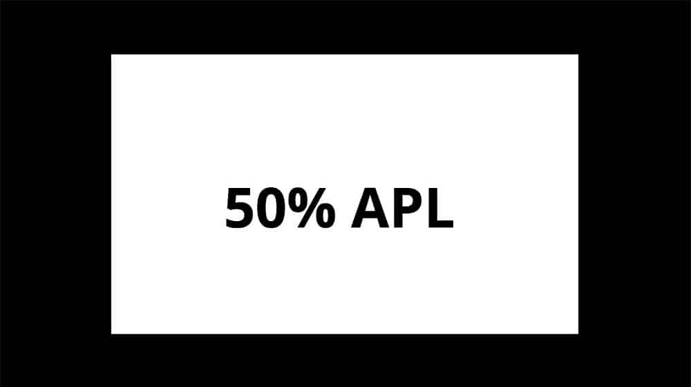
Like is the norm for other display specifications, the “peak brightness” spec you see advertising an OLED panel will only apply for the best-case small APL %, typically a 1 – 3% APL window area. This tells you how bright it can reach for small highlight areas which is useful, but doesn’t tell you how the screen will perform in other situations.
Advancements in monitor “peak brightness” specs
As a quick bit of background, in the monitor market the vast majority of OLED panels released so far have had the same peak brightness spec of 1000 nits. That’s been the maximum for the last couple of years regardless of whether they were WOLED panels from LG.Display, or QD-OLED panels from Samsung Display.
We’re now starting to see a new generation of LG.Display WOLED panels appear on the market which have a 1300 nits peak brightness spec instead, although QD-OLED panels continue to carry the 1000 nits spec even for their 3rd gen panels this year, the same as that featured on their 1st gen panels back in 2022. So, does that mean the WOLED panels are brighter and better for HDR? Not necessarily…
Current Peak Brightness Specs for Monitor Panels
LG.Display WOLED = 1300 nits
Samsung QD-OLED = 1000 nits
You will find higher peak brightness specs in the TV space. For instance, the 3rd gen Samsung QD-OLED panels can reach up to 3000 nits. Reaching this kind of luminance for close up viewing on a desktop monitor is impractical and somewhat unnecessary, and there are more significant challenges with heat dissipation on a smaller sized monitor panel to worry about as well. Some improvements are being made to the brightness specs for larger APL (explained below) which helps, but these “peak brightness” specs still only tell us one part of the HDR brightness story.
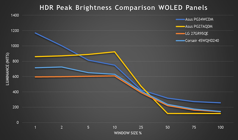
This is a graph above shows our normal peak luminance measurements for 4 different WOLED panels we have reviewed. The Asus ROG Swift PG34WCDM is using a 2nd gen monitor WOLED panel with a 1300 nits peak brightness (for 1% APL) and you can see that it nicely out-performs the other models which are all using 1st gen panels with a 1000 nits spec, although once calibrated to a D65 white point, non reach quite that high. The Asus ROG Swift PG27AQDM reaches 860 nits for a 1% APL for instance.
You can also see the advancements made for full field white (100% APL), increased from around 140 nits for the 1st gen panels in the best case, to around 260 nits on the 2nd gen panel which is good news.
LG.Display provide the following specs themselves for example for their 27” WOLED panel modules. Note the difference with colour temperature though, with the cooler 8500K colour temp boosting the brightness, but producing a noticeably cooler image overall.
LG.Display WOLED Panel Peak brightness specs

| Panel generation | At colour temp | 1.5% APL | 10% APL | 25% APL | 100% APL |
| 1st gen WOLED 27” panel | 8500K | 1000 | 800 | 450 | 150 |
| 2nd gen WOLED 27” panel | 6500K | 1300 | 800 | 450 | 275 |
These improvements can help, and it’s good to see the spec being broadened to include other APL sizes in some places too. However, the “peak brightness” spec is still very limited in its relevance to real-world perceived brightness, and there are other significant aspects to this which simply cannot be accounted for in this spec.
The distinction between ‘luminance’ and ‘brightness’
For the purposes of this article and future display analysis, now is a good time to make a distinction between the terms ‘luminance’ and ‘brightness’. These two terms are often used interchangeably in the industry, but there is a difference that will become more important throughout this article.
- ‘Luminance’ is a value measured by an instrument of the luminous intensity of light emitted from a light source, with the familiar unit of measurement being cd/m2, or commonly in nowadays, nits. This ‘luminance’ measurement has been used to show through simple measurements what the brightness capabilities of a display are, and is a physical measurement.
- ‘Brightness’ refers to what a person perceives, feels and experiences when light hits the retinal rods and cones. Since it is usually a subjective evaluation, it is difficult to measure and quantify like luminance is, but it represents the degree of brightness and darkness that a person actually feels. The ‘brightness’ a person perceives is influenced not only by the luminance of the display, but also by other factors such as the colourfulness and vividness of the colours which we will explore later. Brightness is a perceptual attribute.
Comparing QD-OLED and WOLED
Peak White Luminance
An interesting comparison is to compare a QD-OLED monitor against a WOLED monitor. Here are the two models we will use:
- MSI MEG 342C QD-OLED – a 34” ultrawide QD-OLED model, using a first generation QD-OLED panel with a 1000 nits peak luminance spec.
- Asus ROG Swift PG34WCDM (reviewed here) – a 34” ultrawide WOLED panel, using a second generation WOLED monitor panel with MLA (Micro Lens Array), and has a peak luminance spec of 1300 nits.

These are just two examples and the performance will vary of course between different panels and displays. Some overall conclusions can be drawn around “WOLED vs QD-OLED”, but keep in mind that this will vary depending on the screens being compared. This is an interesting comparison for this study because on paper, the WOLED monitor seems to offer a spec that may be interpreted to mean its “30% brighter” than the QD-OLED panel. As we touched on earlier, there’s actually a lot more to the “brightness” of the display than just luminance of white.
A traditional comparison of the HDR “brightness” capabilities of the two screens based on their peak white luminance measurements might look something like this:

Here we’ve measured the peak luminance of a white test sample at different APL (Average Picture Levels), where a white window is made progressively larger, starting at a small window covering 1% of the screen, and eventually reaching a full 100% white screen. This is the widespread approach for measuring an OLED screens “brightness” and is used across the industry.

Some initial observations and assumptions we might make using this existing method would be:
- The WOLED panel can reach a higher peak luminance than the QD-OLED when considering the 1% APL window size. This is what is commonly used to identify the “peak brightness” of an HDR display. It doesn’t quite reach the panel spec of 1300 nits, but reaches 1180 nits here, compared with 1016 nits of the QD-OLED panel. A heavy emphasis is placed on “peak brightness” in the display market, and this data would suggest that the WOLED screen has a 16% higher luminance than the QD-OLED monitor. Depending on the monitor, this could reach up to 30% higher if it were to reach the full 1300 nits spec.
- The WOLED panel has a higher luminance than the QD-OLED panel as the APL increases as well, with a noticeable difference at 10% APL where the WOLED panel reaches 756 nits, compared with only 460 nits of the QD-OLED. That’s 64% higher luminance by these common measurements!
- For 50% APL and above, the luminance is basically the same and the conclusion you might draw from this is that they are equally bright in practice.
- Overall this common measurement approach to HDR brightness would suggest that the WOLED panel has the clear advantage and is “brighter” overall.
What is missing from this data is the luminance of colours
The above standard testing approach for HDR brightness only captures one aspect of a display’s luminance capability though, as it is only measuring the luminance of white. This has presumably come about as the de facto approach as it is a direct follow-on from how SDR luminance has been measured over the years. When considering a display’s luminance range for general SDR desktop and office use, in a defined standard colour space (sRGB), the luminance range of white is pretty relevant and is a useful metric.
But in today’s world of trying to measure and articulate “brightness” for multimedia, wide colour gamut displays, and especially HDR content, it’s not enough. What about the brightness of the colours? As you’ll see in a moment, this can be significantly different.

Here we have taken the exact same measurements of luminance with our colorimeter, measuring both screens and using the 1% APL test pattern which would capture the panel’s peak luminance capability. Rather than only capture the white test sample data as before, we have repeated this same test for a range of colour samples, those being RGB (red, blue, green) and CMY (cyan, magenta, yellow).
You can see at the top that the white luminance mirrors the data earlier, with the WOLED panel reaching 16% higher than the QD-OLED panel. But when we compare the luminance of the colours there is a drastic difference. Suddenly the QD-OLED panel delivers much higher luminance for these colours, despite previously it looking like the WOLED panel would be the brighter of the two based on conventional, narrow measurement approach of only white.

You can see from the table above that in every instance, the luminance of the colours is around 140% higher on the QD-OLED panel, so 2.4x as high as on the WOLED panel. Keep in mind as well for now that we are simply measuring the luminance of the colours using our colorimeter. There is another element to this that we will discuss later in terms of how the human visual system perceives colour “brightness” that we need to explore.
The Pixel Structure of the OLED Panels Matters
So why is the luminance of the colours so much higher on the QD-OLED panel than the WOLED panel, in this example when measuring “peak brightness” and using a 1% APL test pattern? It’s all down to the pixel and panel structure of the two competing OLED technologies.
Since QD-OLED panels (shown on the right) reproduce images using only the three primary colours of light (R, G, B), the maximum white luminance a display can reach is therefore the same as the sum of R, G, and B peak luminance each of those colours can reach. This means that in practice the exact colour can be displayed at any luminance which is very important for HDR content. This is referred to as an “additive” approach.
QD-OLED Panel Luminance Measurements (1% APL)

As an example, here are the measurements for luminance of the QD-OLED panel for the red, green and blue colours separately. You can see that the total of those individual colour luminance measurements equals the white luminance peak (1016 nits) we had measured. This applies for all APL window sizes too.
On the other hand, WOLED panels use an additional white subpixel in their panel structure to boost luminance and minimise average power distribution in certain situations, and so as you can see from our luminance measurements, this can lead to higher peak white luminance measurements, but the luminance of colours is substantially less.
WOLED Panel Luminance Measurements (1% APL)

Taking the same measurements from the WOLED panel you can see that the sum of the RGB colour luminance measurements is much less than the separate measurement for white luminance. When displaying white, the white sub-pixel of that panel technology is used to boost the luminance a lot, but for colours the luminance is much lower.
An additional challenge with WOLED is that as the overall luminance of the image increases, the proportion of white increases, and the colours expressed can be less accurate or become limited. A “washout” of the colours can appear in which the saturation of the colour decreases. This “white boost” is needed more so for the smaller APL where the panel is being pushed to overall higher peak luminance.
If we refer back to our earlier graph then of the standard luminance measurements of both displays, we could now draw the following conclusions based on this new data:
- The WOLED panel does indeed have a 16% higher luminance for white, but when displaying colours this same advantage does not apply
- In fact, the luminance of colours is around 140% higher (2.4x) on the QD-OLED panel than on the WOLED panel which is massive! The colours look brighter, and you also get less washout of the colours at higher brightness levels, so vividness and saturation are maintained. On top of this, colours look more colourful when they are brighter.
The difference in colour luminance is not as drastic for larger APL images and lower peak brightness levels
We can refer back to our earlier graph showing the peak white luminance at different APL sizes on both screens:
We’ve already shown how the luminance of colours can be quite drastically different to the measured luminance for white when we compared the 1% APL data, that being the brightest the display can reach. For lower APL, where luminance is not as high and where the “boost” from the white sub-pixel on WOLED is needed less as a result, the difference is less drastic.

This graph above has the same horizontal scale for luminance, but this time the data is from a 10% APL measurement. You can see that the white luminance is a lot higher on the WOLED panel – 64% higher in fact and this was one of the most obvious differences in our original white luminance measurements between the two panels.
However, the QD-OLED panel still remains marginally higher for colour luminance measurements at around 5 – 9% more than the WOLED panel. So, despite the initial white luminance suggesting the WOLED panel would be far brighter, the reality when it comes to colours is quite different.

This is less drastic than the ~140% higher colour luminance for QD-OLED at the smaller 1% APL but it still shows that the panel has higher colour luminance, even though the industry-standard white luminance measurement suggests the WOLED panel would be much brighter.


For even larger APL like the 25% APL shown above, you can see that the luminance of colours on the WOLED panel are much closer to the QD-OLED panel, or in some cases exceed the QD-OLED panel now. The APL is large enough now, and the overall panel brightness is low enough that the white pixel boost is needed much less. We obviously don’t know for sure how LG.Display’s signal processing is working, but they would presumably be trying to use an “additive” approach wherever possible, and minimising the “white boost” element to help maintain accuracy and avoid washout challenges.
We know from our previous measurements at 1% APL that the WOLED panel could reach the following colour luminance levels:
WOLED Panel Luminance Measurements (1% APL)
So, this suggests that the panel could reach up to around 417 nits using an additive approach from the mixture of RGB, but anything above that is where the white boost from the additional sub-pixel is likely to be needed. That aligns with the data shown above, as for 25% APL the WOLED panel reaches 427 nits for white luminance and so should barely need the white boost to reach that.
When it comes to comparing the colour luminance then, the WOLED panel can keep up with the QD-OLED panel and the overall slightly higher brightness of the more modern panel can therefore be realised for colour luminance as well at this stage. This results in the WOLED panel having a 13 – 19% higher luminance than the QD-OLED panel for white and for colours.


For the full 100% APL the white luminance is basically the same between the two panels, and as a result the RGB colour luminance is also basically the same. This is well within the range in which the WOLED panel can use an additive approach to reach that white luminance, and doesn’t need to rely on the white boost like it does for the smaller APL.
You may note that the CMY colours still have a higher luminance on the QD-OLED panel than the WOLED, even though the RGB luminance were all basically the same. This is likely because to get to CMY colours, you have to combine 2 from the RGB mix. The QD-OLED panel is already developed with an additive approach in mind and is accustomed to handling the power distribution properly to achieve this mix. The WOLED panel on the other hand has been developed and optimised to make use of the white pixel boost, and struggles more with the additive approach in terms of signal processing and power allocation. As a result, the QD-OLED panel has higher luminance for those CMY colours which are an addition of 2 of the RGB colours.
Colour Luminance at different APL’s summary
So summarising all this:
- The most obvious differences in the luminance of colours between the two panels here is for the highest luminance and peak highlights, and therefore on the smaller APL samples.
- For smaller APL window sizes this is where the WOLED panel can reach higher luminance for white, but that is achieved through the use of the white sub-pixel “white boost” and associated signal processing. The colours cannot get nearly as high in luminance, and the QD-OLED panel performs significantly better with its alternative pixel structure and panel design.
- There is a cross over point where the APL is large enough that the WOLED panel can use an RGB additive approach to reach the white luminance as it is now low enough, and the corresponding luminance of the RGB colours is the same. The QD-OLED panel still has the advantage where additive colours like CMY are needed though.
We can plot the luminance for both panels for the colours as follows where you can see that at a certain point the WOLED panel’s colours luminance cannot increase any further, whereas the QD-OLED panel continues to go higher. This is from anything smaller than 25% APL in these examples. The actual luminance measurements in nits varies between R, G and B, but the trend and the shape of the graph lines remains the same:


Luminance only tells one part of the ‘Brightness’ story
You may think then that the simple solution is to include measurements of the luminance of colours as well as for white, but this only tells one part of the story. As we talked about earlier, ‘luminance’ is not the only factor that influences how our visual system perceives the ‘brightness’ of a display. Luminance activates the “achromatic response channel” as it’s sometimes referred to as.
Another important factor we need to try and account for is the colourfulness, vividness and hue of the colours. This is influenced by the colour gamut, or colour space of the display and when we consider this aspect, it activates the “chromatic response channel”. Even when luminance remains constant, the perceived brightness increases with the colourfulness and saturation of the colour, in what is known as the well-documented but tricky-to-pronounce “Helmholtz-Kohlrausch Effect” (Wikipedia link).
Basically, the wider the colour gamut, the brighter the image can look. Even where two displays are measured with the same luminance using a measurement device, if one has a wider colour gamut than the other then you will perceive it to look brighter.
Here is a good example of the effect taken from the Wikipedia page:

Each colour on the top row has approximately the same luminance level and yet they do not appear equally bright or dark visually. The yellow (second from the left) appears to be much darker than the magenta (right-most). However, when the top image is converted to grayscale, we have the image on the bottom–a single shade of gray.
Red circles showing the same luminance, but different perceived brightness

Above is a simulated image to demonstrate this effect, although keep in mind the appearance of these red circles will also depend on the display you’re using to view them. The idea though is that the four red circles would have the same measured luminance, but those that are more saturated are perceived to be noticeably “brighter” by the viewer.
Another simple way to see this in action yourself if you have a wide gamut monitor is to display a test image, or a colour pattern, and switch the monitor between its wide gamut and sRGB emulation mode if it has one, while keeping the brightness setting the same. The brightness of white should look the same, but you will notice that the more vivid colours in wide gamut mode look brighter, even though actually the luminance is the same.

The above is another good example where the black and white version of this Monet painting looks visually darker, whereas the colour version looks brighter to the viewer. Especially with heavily saturated elements like the red sun in the sky.
Luminance measurements do not directly translate to how we visually perceive brightness
One other important and commonly overlooked aspect of this is that the scale for luminance measurement with a measurement device (like a colorimeter) does not directly translate to how our visual system perceives brightness. Like when we discussed display gamma and the value in “gamma corrected response times” in our display measurements, the human eye is far more sensitive to differences in luminance at the darker end of the range than the lighter end.
A simple example would be that a display that reaches 1000 nits peak white luminance would not look twice as bright to a viewer as a display that measures 500 nits white luminance. Our visual system does not perceive it in the same way as these raw luminance measurements.
This is important as you will often see displays marketed based on their “peak brightness” spec, which is actually just the peak luminance of white as we discussed earlier. But statements like how the new 1300 nits WOLED panels are “30% brighter” than the previous generation of 1000 nits WOLED panels are only true from a raw luminance point of view. They will not look and feel 30% brighter in reality to the user.
Likewise, the raw luminance measurements for the colours as discussed above do not account for how our visual system perceives those colours and how “bright” they look in reality. You may note for instance that the luminance measurements for blue are very low relative to the white luminance, but in reality, the difference visually is far less pronounced. This is why we can’t simply start measuring colour luminance alongside white luminance.

If we plot the luminance measurements for the QD-OLED panel on its own as shown above, we can consider the relationship between the different colours. If we used only the luminance data, it doesn’t provide a realistic picture of what we actually experience visually. The balance between the different colours relative to the standard white measurement is off, as it is not accounting for the chromatic component and is not considering the colourfulness or colour gamut of the sample being measured.
Additionally, you cannot draw conclusions easily between the figures in terms of how they compare to one another. The 1016 nits of white does not really appear 4.2x brighter than the red colour measurement of 242 nits on this monitor.
We can also plot the same for the WOLED panel on its own:

Again, the 1180 nits of the white measurement does not really look over 11x brighter than the red colour at 100 nits that this luminance data alone would suggest.
The two flaws with standard luminance measurements of colour
These are therefore the two flaws with trying to use only standard luminance measurements for colour:
- The measurements cannot account for the colour gamut, colourfulness and saturation of the colours
- The scale cannot be used to articulate real-world perceived brightness differences
Having said that, even on their own, the luminance measurements still clearly show the differences in colours between the WOLED and QD-OLED panels caused by the different pixel structures. If we refer back to our graph from earlier when measuring peak luminance and 1% sample windows you can see that even based solely on luminance measurements of the colours, the QD-OLED panel has higher readings than the WOLED panel so it’s certainly a start.
A new model for representing display ‘brightness’ is needed
What we really need is a measurement approach and scale where:
- The % differences between two data points is actually the approximate % difference you would perceive visually. So, on that scale if one figure was 30% higher than another, that would actually translate to roughly a 30% perceived, visual difference in brightness. That’s likely to be far more useful as a metric than trying to compare raw luminance differences, and would then translate back to real-world performance.
- It should also take into account how we perceive the different colours, account for the chromatic component, and adjust the output numbers accordingly. The scale would then also “balance out” the different colours relative to one another, and account for how we perceive these visually, rather than being based only on a pure luminance figure from a measurement device.
- It should also account for the colour gamut and vividness of the colours, so even where two luminance figures might be the same, it accounts for which would look and feels brighter as a result of that vividness.
XCR (eXperienced Color Range)

One very good approach was a new H-K brightness model that was developed at RIT’s Munsell Color Science Lab with funding by Samsung Display (the panel manufacturer as opposed to Samsung Electronics the display manufacturer). Applying the H-K effect model to the perception of brightness in displays is referred to by Samsung Display as ‘eXperienced Color Range’, shortened to ‘XCR’.
XCR is based upon a mathematical model of human visual performance obtained from psychovisual experiments. This approach can meet the requirements we outlined above, and importantly accounts for the influence of colour along with luminance.

XCR is a complex calculation which takes data for luminance and colour gamut and provides a metric that accounts for both in order to predict the perceived brightness. It was derived from psychophysical direct brightness matching experiments and performs well on several recent data sets and studies of display brightness. It’s been adopted recently as the global standard by the Semiconductor Equipment and Materials Institute (SEMI). They are an industry organization in which over 2,500 semiconductor and display companies from around the world participate. SEMI officially adopted the method of XCR as an international standard on Q3 2023.
- If you want even more detail on XCR then various whitepapers and studies are available including a useful one here
Using XCR to compare the two tested displays
We calculated the XCR scores for the two monitors being compared here, and plotted them in the below comparison, based for now on the “peak brightness” applicable for a 1% APL measurement. We used the equations cited in the Information Display article (May 2023) in a compiled programme to calculate these scores:

The XCR score accounts for the luminance being measured, the way we perceive these colours visually and also the colour gamut of the panels. It also creates a score that importantly allows direct comparison now between the two displays in terms of how much brighter you will perceive the screen to be. XCR addresses the previous limitations when we only had the luminance data.
You can now directly calculate the estimated perceptual difference between the two displays in terms of perceived brightness. So, for example, red will look and feel approximately 37% brighter on the QD-OLED panel (199 XCR score) compared with the WOLED panel (145 XCR score).
When we provided these tables earlier we calculated the ‘% higher luminance’ based on the luminance figures alone. Now, we can provide a ‘% higher perceived brightness’ instead which is approximately how much brighter you will perceive it to be.
Previous data
Luminance measurement comparison between QD-OLED and WOLED displays (1% APL)

New data
XCR Score comparison between QD-OLED and WOLED displays (1% APL)

You can see that if we compare the XCR scores of the two displays, the WOLED panel appears 6% brighter for white visually to the viewer, not the 16% that a simple luminance measurement might initially suggest. Again, this is a reflection of how our visual system perceives luminance changes. That 6% brighter appearance on the WOLED panel is a result of the higher peak white luminance of 1180 nits, compared with 1016 nits on the QD-OLED. It’s clear that for white, the WOLED panel in this particular example can reach higher luminance and this translates to a higher perceived brightness too. When it comes to colour brightness, it’s a different story though.
The very large luminance differences measured for the colours (on average 142% higher on the QD-OLED) translates to a smaller XCR difference average of 36%, but now the figure relates directly to a visual, perceived difference. So, the colour red for instance was 142% higher in luminance (242 nits vs 100 nits), and this translates to an approximate 37% increase in perceived brightness as calculated from the XCR score. This is actually also taking in to account the difference in colour gamut between the two displays which we will explore a bit more in a moment.
This is still a significant figure, but the differences can now be compared based on perceived brightness differences, which is more relevant and meaningful to consider.
We can also re-plot the graphs of colours compared with white, and go from this – previously from just luminance:
WOLED Panel
To this, now based on XCR scores:

These XCR graphs now accurately represents the comparative perceived brightness between different colours. White would be perceived as around twice as bright as red based on the XCR score, not the 11x as bright as the luminance only figures suggested before.
We can do the same for the QD-OLED panel:
QD-OLED Panel
From the above, to this below now based on XCR scores:

You can see that the colour perceived brightness on the QD-OLED panel are much closer to, or sometimes even brighter than the white brightness, largely a result of their increased luminance but also from their increased colour gamut.

Another way to present the difference between two displays is like in the above stacked graph where the bottom section shows the XCR scores for the RGBCMY colours on the WOLED panel, and the upper section includes the additional area covered on the QD-OLED panel. The percentage figures then confirm how much higher the perceived brightness is on the QD-OLED panel for each colour.
So, when comparing two displays the combination of measuring colour luminance, and then calculating that in to an XCR score can be very useful. It provides a much better indication of overall screen brightness in real-use, and not just for displaying white, while at the same time giving you comparison figures that translate roughly to real-world perceived brightness differences.
Considering different APL and fair comparisons
As before, this varies by APL and the above is only comparing the two screens at their peak brightness capability and for a 1% APL. In real-world content, this small an APL may be rare, and the comparison at other larger APL area may be more relevant and is equally important. It’s interesting to compare the “peak” figures here though as those are so widely referenced in the industry today and the one, single figure which manufacturers and consumers seem to rely on. The point really, is that there’s a lot more to it than just peak white luminance.
To provide a more complete picture when considering HDR brightness we can provide the average brightness difference between the two panels at different APL’s as follows:
Average of colour brightness XCR scores for RGBCMY


You can see that the colour brightness benefit is most obvious for the smallest APL, but between 10 and 100% APL the two panels are closer here. The QD-OLED still have a small brightness advantage for colours for many of the APL areas, but the performance is a lot closer. It’s those “peak brightness” situations where there’s the most significant difference in the XCR brightness scores for colours between the two technologies.
The importance of colour gamut on perceived brightness
The XCR scores compared above between the WOLED and QD-OLED panels account for the differences in measured luminance, but also the differences in the colour gamut of both displays. That’s an additionally important aspect of this topic.
This is especially relevant when considering the perceived brightness difference between an SDR display (which operates with an sRGB colour gamut) and an HDR display (which has a much wider colour gamut).

Above shows the measured colour gamut of the WOLED and QD-OLED displays we’ve been comparing in a familiar format we use in our reviews. The CIE diagram at the top shows the monitors colour gamut coverage area (white triangle) relative to the sRGB reference space (red triangle). Beneath that is a table showing the colour space coverage of various reference spaces.
You can see that the QD-OLED panel has a wider colour gamut area than the WOLED panel, reaching 141.9% relative coverage of sRGB, compared with 127.4% of the WOLED panel. You can see the triangle extends a bit further into green and red shades, but blue remains basically the same. Another good measure here is the coverage of the very large Rec.2020 (aka BT.2020) colour space where the WOLED panel covers ~74%, but the QD-OLED panel covers ~82%. This is made possible by the Quantum Dot coating, and you will see similarly high coverage from QD coated LCD monitors too.
We can directly measure the impact of this wider colour space on perceived brightness as well. If both screens are set to show the same coloured pattern, and at the exact same luminance (as measured by the colorimeter) we can then obtain an XCR score which shows the impact of just the wider colour gamut. Here both screens were set to 100 nits for red, and then for green and for blue:
Both screens calibrated to 100 nits luminance for each colour

You can see that even though both screens measure the same 100 nits luminance for each colour sample, the QD-OLED panel will appear 3% brighter than the WOLED panel for reds, and 2% brighter for greens. For blue, the WOLED panel extends slightly further in this example and so looks 1% brighter for blues. This difference is purely down to the wider colour gamut and nothing else. Remember those percentages are obtained from the XCR score so are directly relatable to perceived brightness differences.
We can also make the same comparison between an SDR display operating within the sRGB colour space (here we’ve assumed an ideal 100% coverage), and a typical wide gamut display operating in the DCI-P3 colour space (again assumed ideal 100% coverage). Again, both screens are showing the same luminance for the red, green and blue samples.
sRGB vs DCI-P3 gamut, calibrated to 100 nits luminance for each colour

In this scenario the wider colour gamut of the DCI-P3 screen will look 4% brighter in red shades and 5% brighter in green shades. Since both colour spaces have the exact same blue coordinate, there is no difference at all in perceived brightness there.
sRGB vs Rec.2020 gamut, calibrated to 100 nits luminance for each colour

If we had a hypothetical display that could cover the full Rec.2020 colour space, it would look brighter for red, green and blue colours than an SDR / sRGB display. This goes to show how the increased coverage of Rec.2020 is important to perceived brightness. Both WOLED and QD-OLED can cover DCI-P3 well, but reaching beyond that in to wider colour spaces continues to impact perceived brightness.
Colour Volume
We wanted to touch on another useful measurement metric that can account for both colour space and luminance in a single model. You are hopefully familiar with ‘colour gamut’ already. In the past, the display industry used this measurement to indicate colour expression ability, which indicates the coverage of the colour area that can be expressed with a fixed luminance.
Here’s the traditional colour gamut coverage diagrams again for the two OLED displays being compared here, based on CIE 1976 that we showed earlier:
If we consider colour gamut then the easiest metric to compare would be coverage of the very large Rec.2020 colour space, with the WOLD panel reaching 74% and the QD-OLED panel reaching 82%.

At that time colour gamut was introduced, there were standard dynamic range (SDR) images mainly, so a 2D colour gamut alone was enough to display’s performance. Recently, however, content has been developing to show realistic images at various luminance in the modern world of High Dynamic Range (HDR) displays. Therefore, the display also requires more performance to represent accurate colours in a wide range of luminance levels and the 2D colour gamut model alone can be limited in indicating the capabilities required by HDR for the display’s colour expression capabilities.

To overcome this, a method of displaying colour reproducibility in three dimensions (3D) by adding a luminance level to a two dimensionally defined colour gamut is used, which gives us the measure of ‘colour volume’, or sometimes called ‘display volume’.
At the moment there is no industry consensus on how to best measure colour volume in the modern HDR world. For now, the most common approach is called CIE L*a*b*. The calculations for this are normalised to the relative white luminance measurement of the display, but the good thing about this is that it gives % figures which are hopefully simple to understand, relate back to 2D gamut measurements, and compare between different displays.
An alternative approach uses a method called ICtCp which is normalised to a fixed luminance value and has its benefits, but the standard resulting output is presented in a “millions of colours” figure so is a little harder to relate to we think. We continue to explore this topic and try to identify useful data for our future reviews.
We are able to measure colour volume of these displays as well through a series of 140 measurement points, here taken at 10% APL:

You can see that although the WOLED can cover 101.6% of the DCI-P3 colour space in a traditional 2D gamut measurement (i.e. at a fixed and low SDR luminance), once you account for the luminance range for an HDR image the coverage only reaches 67%. This is often referred to as “volumetric collapse”, and is again a result of the white boost on those panels, and the inability to reach higher colour luminance levels relative to the white luminance range. Think of it this way, at low luminance levels the full colour range can be produced and it can cover all of the DCI-P3 colours nicely. As the luminance increases, and especially as it gets nearer to its peak white luminance capability, the white boost is being used and the full colour range can no longer be realised. The washout effect we talked about earlier becomes more apparent, and you get a much lower colour volume figure.
The QD-OLED panel on the other hand can maintain the DCI-P3 coverage for its full luminance range, resulting in a 116% colour volume and more vivid, bright and colourful images overall. The same difference can be easily compared between the Rec.2020 colour volumes. You can see why a 2D colour gamut figure on its own cannot tell the full story when it comes to HDR colours.
The colour volume measurements can also be represented by a CIE L*a*b* diagram as follows where you can see just how much more of the volume the QD-OLED monitor can fill, than the WOLED monitor:
QD-OLED monitor Colour Volume

WOLED monitor Colour Volume

Colour volume % could also be a useful additional metric to help capture the overall luminance and colour capability of the screen in a single, easy to compare number. We do feel that the colour volume diagrams are sometimes a little hard to interpret and compare though generally but can be provided alongside the numbers easily enough. We do however want to explore this topic further to ensure the results are meaningful and fair, as currently it could create unfair comparisons where the measurements are relative to the different white luminance measurements of a display.
HDR “Brightness” tests need to be more varied
This all goes to show that the current widespread measurement approach for “HDR brightness” is very limited. Measuring only white luminance and then trying to compare the difference between displays is incomplete; or perhaps even misleading when it comes to representing the true “brightness” of the display.
It’s equally important to try and measure the luminance of the colours and to articulate the “brightness” of a display’s colours taking in to account the colourfulness, colour space and how our visual system perceives the different colours too.
As a result, this is how we intend to measure and report on HDR brightness and performance in our reviews moving forwards:
Updating our testing approach
At TFTCentral we’ve been exploring how we might make use of all of this in our future testing. Importantly we’ve been considering how we can take the data that comes from the XCR model and present it in a way that would be meaningful for our audience and as simple to understand as possible. We want to be able to more accurately capture, measure and compare HDR brightness and colour performance across different displays and provide a more complete and meaningful picture to help you choose your next monitor.
We’ve seen above how XCR is a good way to compare the perceived brightness between two displays instead of just relying on white luminance measurements as is the standard today. A good way to represent the peak brightness capability of the display could be using the graphs like those we showed earlier, and included again below.
Here’s the calculated XCR scores for the QD-OLED monitor again from before for the “peak brightness” at 1% APL:
Here is the graph from the WOLED panel below which shows that colours are not as bright relative to the higher white brightness.
These graphs give you an indication of the relative peak brightness of colours as well as white and alongside familiar specs like “peak luminance” (1000 nits and so on) should give you an indication of how bright a screens colours will appear too.
Taking this a step further another simple way to try and represent this in a single metric and an easy to understand approach would be to plot the XCR scores on a graph like we do already for white luminance. Here’s the hopefully familiar graph for white luminance on the QD-OLED monitor, the current standard approach:

If we convert this to XCR scores to capture peak ‘brightness’ instead of peak ‘luminance’ it would look like this:

We could also take an average of all of the XCR scores for RGBCMY colours and plot that on the graph as a single combined single line to represent “colour brightness”:

This graph now gives you a representation of not only the “white brightness”, but also the “colour brightness” overall. Remember with this being based on XCR scores the differences between different figures can be used to consider approximate perceived differences. So, an XCR score of 200 would look roughly twice as bright as a score of 100 and so on.
If we use the same approach to plot the XCR scores from the WOLED panel we get this:

This graph again demonstrates how after a certain APL window size smaller than ~25%, the only way the display can get to a higher luminance is by using the white boost from the white sub-pixel, and the colours can no longer get any brighter. The difference between the WOLED and QD-OLED panels for those smaller APL’s and the peak brightness levels is again evident.
Conclusion and TL;DR Summary
Measuring display brightness in HDR situations is complicated and needs improvement:
- Industry specs for HDR “peak brightness” usually focus on only a single figure, applicable for only the smallest APL window sizes (i.e. peak highlights). This performance cannot be maintained on an OLED screen when that APL changes.
- There have been some marketing steps towards providing “peak brightness” specs for other APL sizes as well (like for full field white 100%) by some manufacturers which gives you a somewhat better view of how an OLED screen might perform in HDR situations other than just the smallest highlights.
- However, these specs are incomplete as they are only accounting for peak white luminance
- Colour luminance and perceived colour brightness are being left out entirely
- It’s simple enough to measure colour luminance as well, but this is also incomplete on its own
There are two problems with capturing only luminance figures.
- Colour luminance measurements cannot account for the effect caused by higher saturation and colourfulness, and the impact of colour gamut on how we perceive the colours visually. A wider colour gamut can make the colours look and feel brighter, even if the luminance measurement from a measurement device is the same. This is one reason why a wide gamut screen can look and feel brighter than a standard gamut screen, or why HDR content can look and feel brighter than SDR content.
- It’s not possible to directly compare two luminance figures and consider how much brighter one would appear visually to a viewer, as the scale does not allow that. 1000 nits luminance does not look and feel twice as bright as 500 nits. Likewise the luminance measurements between different colours, or compared to white, cannot be directly compared in the same way. A luminance for blue would normally be much lower than the white luminance for instance, but the visual difference is not as significant.
The XCR (eXperienced Color Range) model looks to address these limitations
- It provides a score that represents perceived, visual brightness (not just luminance)
- It provides a scale where values can be directly compared. If an XCR score is twice as large, that now means it would be perceived as twice as bright
- It takes in to account the chromatic element for colour measurements and provides a score that can now allow direct comparison between different colours and white.
- The perceived brightness of colours is not only impacted by a luminance figure you can measure, but by the colourfulness and saturation of the colours. This is influenced by the display’s colour gamut and the XCR score also accounts for this effect.
Using XCR scores will allow us to update our future testing methodology to provide a more complete and accurate view of a display’s HDR brightness and performance. Additionally, colour volume is a useful metric which considers both luminance and colour for HDR displays which we also plan to adopt in our testing more widely.
What conclusions can we draw about QD-OLED vs WOLED?
There’s a lot of information to absorb in this article, but we can summarise some of the key findings about the two competing OLED panel technologies when it comes to their HDR performance:
- QD-OLED monitors have a wider colour gamut than WOLED monitors. Note that there are no changes expected to this in even the forthcoming WOLED panels in the 2024 / 25 roadmap, they all have the same colour gamut coverage specs. This means the colours will look a little brighter simply as a result of the higher saturation, even if a luminance measurements were equal between the two.
- WOLED panels can reach a higher peak white luminance than QD-OLED panels now with the latest generation. LG.Display’s spec is 1300 nits vs Samsung Display’s 1000 nits. This is applicable only for small APL window sizes, and represents only the luminance of white.
- For larger APL above 50%, and for full field white of 100% APL the two technologies seem very similar in white luminance capability and specs.
- While the white luminance is higher on the WOLED panels, the luminance of colours is significantly lower than on QD-OLED panels. This is overlooked in current “peak brightness” marketing and measurement approaches, but can have an impact on real-world perceived brightness and colourfulness during HDR content.
- The panel structure of QD-OLED with a true RGB additive approach means that they can reach much higher colour luminance than even the latest WOLED panels – around 142% higher in fact in the case of peak colour luminance (in the example monitors we measured). This reduces as APL gets larger but QD-OLED offers higher colour luminance generally for bright HDR highlights and even up to around 25% APL.
- WOLED panels can only reach their higher white luminance using the “white boost” from their additional white sub-pixel, but for occasions where this is needed (smaller APL <25%) it can lead to some wash-out of the image and the brighter colours cannot be achieved as well.
- If we translate the luminance measurements of colours, and also account for the colour gamut of the two technologies in to an XCR score, we can more accurately compare the two panel technologies and consider their perceived, visual brightness.
- The QD-OLED panel will look and feel around 36% brighter for colours than the WOLED panel for smaller APL, and especially when considering the “peak HDR brightness” that has long been the comparison point for product marketing and across the industry.
- To consider HDR content more generally, the two are more equal in perceived brightness for larger APL although the QD-OLED panel still has the edge in many cases where colours are “additive” (i.e. not just a simple red, green or blue).
- QD-OLED can have a much higher colour volume than WOLED which is another useful measure that considers both the colour gamut, and the luminance capabilities of the panels. The WOLED panels show “volumetric collapse” at higher luminance levels where the white boost is utilised a lot more. The QD-OLED panel can achieve significantly brighter colours than the WOLED panel for HDR overall. Colour volume measurements and comparisons remain an ongoing industry discussion point, and we are investigating the fairest and more useful way to represent this data in our reviews and testing.
All in all, HDR experience is heavily impacted by the small bright highlights in the image. It’s not about making large areas of the screen bright at once, it’s about specular highlights, small bright areas and impressive colours that pop while at the same time delivering deep, dark blacks that create an amazing contrast and dynamic range. We can conclude from this study that despite headline marketing specs suggesting otherwise, QD-OLED monitor panels can look and feel brighter in practice in some situations than WOLED panels. It’s not just about pushing peak white luminance, it’s about the brightness of colours and the overall image, and the QD-OLED panel can deliver a better experience there. That’s evident in the raw luminance measurements, the new XCR scores and in colour volume measurements. These results could of course vary between different panels and screens.
It’s all very well panel manufacturers pushing luminance higher on the new OLED panel generations, and technologies like MLA are helping to make that possible in the WOLED space for instance. But this is generally only chasing peak white luminance specs, for the purposes of being able to market the higher “peak brightness”, when in fact the colour luminance cannot keep up. We want to see improvements made to colour luminance as well as white luminance from these panels, as well as advancements in colour space, both of which will impact real-world perceived brightness and HDR experience. This may require a shift to an additive pixel layout and approach perhaps.

If you’ve enjoyed this article and found it interesting, please consider supporting our work to help us continue to make new content for you.
Further Reading and Thanks
A huge thanks to Luke Hellwig, Dale Stolitzka, Chirag Shah and Charles Poynton for their invaluable input and support in the creation of this study and article. Further information about XCR and related studies can be found here:
- An Advanced Color Model for Evaluating New Display Technologies (17 May 2023 – Luke Hellwig, Dale Stolitzka)
- Samsung Display Insights and News
We may earn a commission if you purchase from our affiliate links in this article- TFTCentral is a participant in the Amazon Services LLC Associates Programme, an affiliate advertising programme designed to provide a means for sites to earn advertising fees by advertising and linking to Amazon.com, Amazon.co.uk, Amazon.de, Amazon.ca and other Amazon stores worldwide. We also participate in a similar scheme for Overclockers.co.uk, Newegg, Bestbuy , B&H and some manufacturers.