Does OLED Have a Black Crush Problem? Understanding and Testing OLED Shadow Detail
Originally published 10 February 2026, last updated 27 February 2026
Introduction
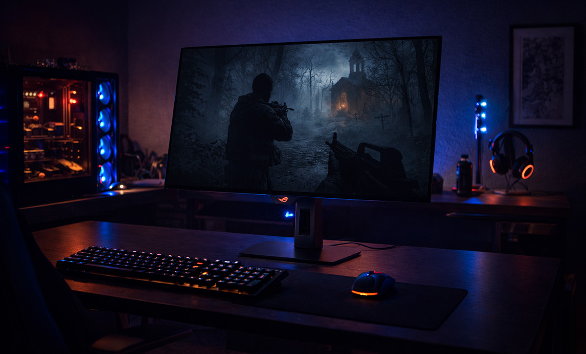
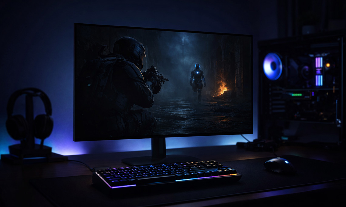
Do OLED monitors have a black crush problem? Recently we’ve been looking in to some of the issues we’ve spotted during our testing in the area of shadow detail, that being what level of detail you can discern when viewing darker content – the near-black detail of the image. In real world usage this will determine what detail you can make out in darker games and movie scenes or when using professional applications with dark content and subtle variations in dark shades.
The challenge faced by any display is how easily the user can see that detail in dark content. In many cases we have seen displays lose the ability to show near-black detail altogether, leading to what is commonly referred to as “black crush”. The detail simply gets “crushed” or “clipped” to black, and you can’t make out subtle variations in dark content at all. This is often more of a challenge on OLED monitors for reasons we will explore in this article.
What kicked this article off was a couple of recently reviewed OLED monitors which exhibited this black crush problem more noticeably than usual, and so we started by exploring those two screens to try and identify some possible causes for the issue, ways it might be improved, or identify an underlying reason for it. Our investigation then evolved more broadly in to the question of how we might measure this area more thoroughly in our future reviews, and whether we could identify any patterns between different OLED technologies. We also identified some interesting “oddities” with screen behaviour which needed exploring further.
Why is black crush an issue on OLED monitors when they can offer such amazing contrast and true blacks? Is there a pattern to black crush? Do WOLED and QD-OLED panels behave the same? How can we evaluate and compare the results in more detail in our future reviews? We’ll look to answer all those questions in this article today.

Variables impacting shadow detail visibility
Shadow detail visibility has a lot of variables, some of which make things complicated when trying to create a standardised testing approach. Near-black, dark shade visibility and contrast will be commonly impacted by the following areas:
- Viewing environment and ambient lighting – a darker environment will likely allow you to make out a little more detail in the darker shades. Conversely, more ambient lighting can make it hard to make out detail. The positioning of light sources can also have an impact, if they’re facing the screen then additional glare and reflections can reduce visual detail in darker scenes and “raise” blacks.
- Visual adaptation – if you’re viewing the screen in a completely dark room, you may need to allow your eyes time to adjust properly before you can make out some of the darkest shades. This is the period it takes your eyes to adapt fully to the ambient lighting levels. Likewise if you then turn the lights on, a period of time is required while you’re eyes re-adjust to the ambient lighting levels. More “adapted” vision for your viewing environment will allow for more detail to be visible.
- Viewed content – clearly this will vary significantly. For instance if you’re playing an overall darker game and your eyes have had chance to adjust, you are likely to be able to make out more detail in those dark scenes than if the same shades were instead included as part of an overall brighter image with high contrast between bright and dark areas.
- Individual visual variations – this can vary between different people, so it’s important to try and come up with a testing approach that is as objective as possible, and not overly subjective.
More Detail: Adaptation and Local Effects
Adaptation is both global and local: the retina and visual system adjust sensitivity based on the luminance of the visual field and local regions. Local adaptation means that the threshold for detecting a near-black detail depends not only on a pixel’s luminance but also on its immediate surround and the overall scene context.
From a display point of view shadow detail can also be impacted by:
- Panel technology – this can have a significant impact. We’re generally considering OLED panels in this article which can deliver a true 0.00 nits black. If we consider an LCD which can’t produce true black that could impact things in different ways. There could also be differences in visible shadow detail between VA, TN Film or IPS LCD panels.
- Screen brightness level – how bright you set your screen will impact visible shadow detail to a degree. With a consistent gamma performance, if you are set at max brightness, each grey shade will be a higher luminance than if you were running at a very low screen brightness for instance, potentially making some more of the darker shades visible.
- Gamma configuration – screen settings can have an impact beyond just the brightness setting. Gamma in particular will have a significant impact as it directly changes the luminance of different grey shades relative to black and white. A lower gamma (e.g. 1.8 instead of the common 2.2) would typically bring out some further darker shades, but at the same time will make lighter shades brighter. A higher gamma like 2.6 will normally crush a lot more dark shades. Some preset modes will be configured to different gamma curves as well, so that can have an impact on the visible shadow detail.
- Contrast setting – the contrast setting, which adjusts digital white levels on a display usually, can also sometimes affect things. It’s very rare that the default contrast setting on a monitor isn’t the optimal, so we would rarely suggest changing this though.
- Calibrated profiles – calibration using professional devices can make adjustments to the gamma curve to correct areas that are an issue, often helping bring out near-black shadow detail without having to resort to wholesale adjustments to the gamma setting. You’ll often see improved shadow detail with a calibrated ICC profile active, although those aren’t recognised and used in every scenario. That can help for professional colour-aware applications, but generally won’t be used for games or movies for instance.
What dark detail should we be able to see?
We need to first of all consider what level of detail we should be able to see in ideal display conditions. This can be complex, especially with OLED displays and their ability to display true black (0.00 nits). We’ve tried to summarise this as simply as possible, but for those who like the additional detail, you can also see the pop-out blue boxes.
Detectable luminance threshold
The first question is what is the lowest luminance you could reasonably expect to discern? As we covered above, this will vary depending on viewing environment, visual adaption and other factors but based on various studies over the years, a general guideline would be:
| Ambient Lighting Condition | Ambient Illuminance (lux) | Effective Black Level (nits) | Minimum Detectable Increment (nits) |
| Fully Dark Room | ~0 | 0 (OLED), 0.05 – 0.5 (LCD) | 0.001 – 0.005 |
| Dimly Lit Room | 30 – 100 | 0.1 – 1 (reflections) | 0.01 – 0.1 |
| Normally Lit Office | 300 – 500 | 2 – 5 (reflections) | 0.1 – 0.2 |
- Dark Room (Dark-Adapted, Scotopic vision) – Subjective tests indicate that black levels below 0.005 – 0.01 nits are visible to 90% of viewers in dark surround conditions, with thresholds as low as 0.001 nits reported for large field-of-view displays.
- Dimly Lit Room (Mesopic Vision) – Detection thresholds rise compared to scotopic (dark room) conditions, with minimum detectable increments typically in the range of 0.01 – 0.1 nits, depending on adaptation, background complexity, and spatial context.
- Normally Lit Office (Photopic Vision) – In a normally lit office, ambient illuminance is typically 300 – 500 lux, with reflected luminance from surfaces and displays also a consideration. It becomes more complicated as you have to account for ambient lighting, reflections, raised blacks etc. The minimal detectable luminance level could be in the range of 0.1 – 0.2 nits, but for the purposes of this article, we should probably ignore these kind of bright environments, that’s a complexity to worry about another day.
We think it’s probably fair to assume your average OLED monitor owner is a home-user, probably using the screen most in the evening, in more dimly lit room conditions, or in light-controlled spaces. “Dimly lit” seems to be a fair classification to consider for these kind of displays for a typical usage environment and so the common minimum luminance you should be able to detect is probably between 0.01 and 0.1 nits.
At this stage we should say that in our day to day office environment which we would classify as dimly/moderate lit, we’re able to discern luminance down to around that 0.01 nits mark in test scenarios that we will explain later. This falls within those common expectations and studies nicely. We think it’s safe to take this as a “typical” minimum luminance level that will be visible to an average OLED monitor user.
More Detail: Scotopic, Mesopic, and Photopic Vision
1. Scotopic vision (dark-adapted): Mediated by rods, dominant below ~0.01 cd/m². Highly sensitive to low light, but poor spatial resolution and colour discrimination.
2. Mesopic vision (dim light): Both rods and cones contribute to vision, spanning ~0.005–5 cd/m². Sensitivity and colour perception are intermediate and complex, with significant individual and contextual variability.
3. Photopic vision (bright light): Mediated by cones, dominant above ~5–10 cd/m². High spatial resolution and colour discrimination, but less sensitive to small luminance increments at low levels.
The complexities of display gamma
This is where it starts to become more complicated. A gamma curve such as 2.2 maps digital input values to luminance output. It’s a power law that ensures mid‑tones look natural to the human eye. It should be well understood that unlike LCD’s, OLED displays can go to true black / zero luminance. That’s great for contrast, but it creates a steep perceptual cliff at the bottom end of the gamma curve. It means that at very low code values (like RGB 1 – 5 out of 255), the luminance increments are fractions of a nit. These are often below the human eye’s detection threshold in normal viewing that we discussed above, and so shadow detail collapses into black or gets “crushed”. Based on what we talked about above with the detectable luminance threshold. any RGB shade that is less than ~0.01 nits is likely not visible.
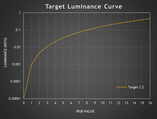
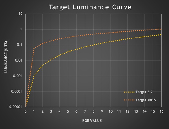
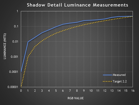
Above is a target luminance curve based on a 2.2 gamma and a 200 nits displays, showing just the first 16 RGB grey scale values from 0 (black) along the horizontal x-axis. The dotted orange line represents the target luminance for each grey shade if the black depth is a true 0.00 nits like it is on an OLED panel.
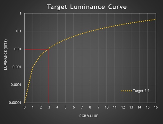
As we identified earlier, 0.01 nits is probably about the limit that you could perceive in a dimly lit room and so if you follow the line across at that point on the vertical Y-axis, you can see it’s RGB 3 that would likely be the first that’s visible when the screen is configured to this luminance (the exact target luminance is 0.0114 nits).
So, on an OLED screen like this, if the 2.2 gamma curve was followed accurately and exactly then the best case first shade visible would be RGB 3. Anything lower would be crushed to black! If the luminance was lower, like 120 nits for example, this shifts the target gamma curve downwards and the first visible shade expected would now be RGB 4 (0.0129 nits target). So if gamma is followed accurately, on an OLED screen the loss of some shadow detail is expected and intended!
Obviously an OLED true black, 0.00 nits capability is excellent for contrast and blacks, but it creates challenges with shadow detail and display calibration – OLED’s strength is also its weakness.
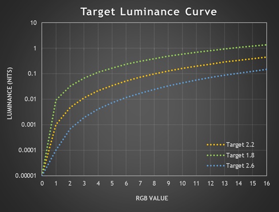
You can also see the variation in target luminance for alternative gamma curves. At a calibrated 200 nits luminance, gamma 1.8 improves things a little and in theory RGB 2 now becomes the first easily visible (target = 0.0324 nits), perhaps even RGB 1 (0.0093 nits) in the right viewing conditions. Gamma 2.6 makes things worse, causing more black crush as RGB 6 would be the first value visible (0.0117 nits).
What about an LCD?
On the other hand, if you had an IPS LCD monitor with a typical 1000:1 contrast ratio that is configured to a 200 nits luminance, “black” on that display would be measured at 0.2 nits. Assuming a perfect calibration based on a 2.2 gamma relative to that black point, RGB 1 would then have a target of 0.201 nits, RGB 2 would have a target of 0.205 nits and so on – these values are clearly above the perceptual limits we discussed earlier, and so you should be able to discern each step in theory, assuming accurate configuration and assuming the screen followed the 2.2 gamma exactly.
This is where the true black capability of an OLED panel creates a problem, as those same low RGB values are so close to 0.00 nits that they’re visually undetectable in typical viewing conditions.
The challenges of factory calibration
So even if configuration was perfect, an OLED panel would expect to crush the first few RGB values anyway because of the much lower, 0.00 nits floor for black. On top of that you’ve then got to account for viewing environment, ambient lighting, reflections, individual viewer variations etc.

An additional challenge for any OLED display is factory calibration. How does a display manufacturer account for this known “intended” crushing of some detail? How do they account for so may variables and make adjustments to improve perceptual shadow detail? What devices can they even use for this calibration when even super top-end calibration tools have a minimum black level range which can’t get that near to 0.00 nits, and near-black measurements are “noisy” and difficult to take?
You’ve then got other variables like panel variance, age, and OLED material degradation to worry about. OLED subpixels as they are just being turned on (near-black) are not perfectly linear, often have manufacturing variation and show drift with temperature and age. All in all, it’s incredibly complex to factory calibrate an OLED display for shadow detail. We should still expect strong performance from any display produced of course, but it doesn’t mean we can’t appreciate the complexities and realise that this isn’t an easy thing to get right.
Approaches to improve perceptual shadow detail

To overcome these challenges with shadow detail, it’s possible for display manufacturers to deliberately “break” or “bend” the gamma near black, veering away from a strict gamma in favour of improving “perceptual gamma” for the near-black shades, typically in the RGB 1 – 5 range. This is all assuming the display manufacturer is focusing on improving shadow detail in the first place.
It’s a balancing act between mathematical fidelity and perceptual usability and not without its own challenges, a key one being to avoid raising blacks at the same time and retaining the true 0.00 bits black depth and amazing contrast that OLED is famous for. Some approaches that can be taken include:
- Alternative gamma curves: Adjusting tone mapping curves to ensure shadow detail is preserved, even if it means breaking the mathematical gamma. For instance they may follow closer to a 1.6 – 1.8 gamma near black before re-joining the intended 2.2 gamma curve a little later. They may also use other gamma approaches like the sRGB gamma curve for instance.
- Shadow detail lift / near‑black compensation: Many TVs and monitors deliberately deviate from strict gamma below ~5% stimulus, expanding those steps so they’re perceptually distinct.
- Perceptual transfer functions (PQ, HLG): HDR standards use curves based on human vision rather than pure power laws, allocating more code values to near‑black regions.
- Dithering / temporal modulation: Some OLEDs add subtle noise or flicker to help the eye perceive gradations that would otherwise be invisible. This is used quite often on OLED TV’s, but not on monitors as it can introduce artefacts and visible flickering of shades from up close.
- Calibration options: Professional monitors sometimes offer “shadow detail” controls that lift the bottom end slightly, trading absolute black for usable gradation.
- Black floor offset – some OLED calibrations can introduce a deliberate black offset, removing the assumption that black = 0.00 nits to ensure the low RGB values are then a higher luminance and therefore more visible.
The sRGB Gamma curve
One approach we’ve seen fairly often in recent times is to configure a certain preset mode to the similar, but different ‘sRGB gamma’ curve instead of the normal 2.2. This is typically used only for the sRGB emulation modes, but in our experience usually does a great job of improving perceptual shadow detail. We’ll look at some examples from recent screens later as well.
An sRGB transfer function changes the near-black behaviour significantly compared to a pure 2.2 gamma, and it does so specifically to make very low code values more visible.
| Target luminance (nits) | ||
| RGB value | 2.2 gamma | sRGB gamma |
| 0 | 0.0000 | 0.0000 |
| 1 | 0.0010 | 0.0607 |
| 2 | 0.0047 | 0.1214 |
| 3 | 0.0114 | 0.1821 |
| 4 | 0.0214 | 0.2428 |
| 5 | 0.0350 | 0.3035 |
If everything was accurately configured, the same 200 nits OLED configured to an sRGB gamma curve would now expect to show RGB 1 as easily visible (target = 0.061 nits), but also of significance is the increased luminance for all the other dark grey shades, making them brighter and more visible in general.
sRGB gamma has been around for a long time and helps account for older CRT displays, brighter room conditions and uncalibrated consumer displays. It’s less common in the consumer LCD and OLED monitor market, although we have seen more screens configured to this gamma in recent times due to the challenges with 2.2 gamma on OLED screens especially.
Common Tests for Shadow Detail
In the past in our reviews we have followed a simple approach to evaluating shadow detail. In SDR mode, with a full black background we have viewed a test pattern which shows individual square samples for each RGB grey shade, looking closely to establish which is the first shade that is visible to the naked eye. The pattern we use is similar to this commonly used test at Lagom.nl (see below screenshot), although we can also replicate these tests using Portrait Display’s Calman software with different patch sizes and background, and for SDR testing we usually use a combination of both approaches.
Typically the first visible greyscale shade falls easily within the first 15 RGB values, so the Lagom test is sufficient in many cases. Beyond that if we need more granular detail we can use Calman to generate specific grey shades anywhere from 0 (black) to 255 (white).
In the past we’ve set the screen at its maximum brightness setting for these tests, although moving forward we will look to standardise the luminance for more accurate comparisons between displays.
For HDR it’s a little more complicated as you can’t view an SDR test pattern like the Lagom test within HDR mode and consider that a fair representation of what actual HDR content would look like. That will only show you how HDR mode handles viewing SDR content. Instead, we have mastered a similar test pattern in HDR10, allowing us to view the grey scale shades that would be applicable for HDR content. Again we can do this using our pattern generator with the Calman software if needed and we typically use both approaches.
We have a standard rating system for shadow detail considering the common results we’ve seen to date:
| First visible grey shade | Shadow detail rating |
| 1 | Excellent |
| 2 | Very good |
| 3 | Good |
| 4 | Reasonable |
| 5 | Moderate |
| 6 | Weak |
| 7+ | Poor |
What we’re looking for
What we’re looking for in an ideal world is good shadow detail under what we could consider to be the “normal” screen modes and configuration. This means we want the screen conforming to an appropriate gamma, while still offering good shadow detail. It could be argued that following the gamma curve precisely is “best” and that some black crush is therefore acceptable and expected. We think that for the vast majority of consumers they would much rather have better shadow detail, even if this veers from the precise gamma curve near black. In the case of OLED we’re therefore looking for display manufacturers to have made adjustments and perceptual optimizations near black in one way of another to improve detail.
Changing the gamma across everything to something else like 1.8 for example is not a “fix”, unless you’re specifically wanting to work with a different gamma. For most cases that means we want a mode which as close to 2.2 gamma as possible but adjusted near black to compensate. Using the sRGB gamma curve for instance is a decent approach we’ve seen used in some cases already.
An Updated Testing Approach
Moving forward we will be looking to expand our shadow detail testing methodology to provide more thorough evaluation and provide more detail for readers. This will consist of:
1. Subjective visual testing
We will continue to use RGB shade tests in both SDR and HDR mode to visually identify the first visible grey shade, and give it a rating (as discussed earlier) accordingly. We will look to standardise this to testing at 200 nits, to provide a fairer comparison between different modes and between different screens.
Our previous testing has been conducted at maximum screen brightness, which is commonly very similar between different OLED monitors anyway, so it will not impact previous results much regardless. We’ll standardise this to 200 nits to ensure consistency moving forward. This could just as easily be at 120 nits or 150 nits for example, but we’ve selected 200 nits as a likely more common luminance level for gaming and multimedia.
We discussed earlier all the variables that can come in to play when considering shadow detail and it’s not possible to account for all scenarios and use-cases of course. To try and create a repeatable and meaningful evaluation we will conduct these visual tests in our normal office environment, which we would consider to be a proxy for a standard dim-to-moderately lit room. Let’s consider this an “average” conditions as opposed to (for example) observing the screen under a dark room lab environment where the results will have little relevance to other situations and what we’d consider to be a “typical” viewing environment.
We’ll rate the screens based on these subjective assessments in our reviews, but you will also be able to use the direct luminance measurements data (explained next) if you want to consider potentially other use-cases and environments.
2. Detailed near-black measurements
We’ve also created a new test which allows us to measure the luminance of just the first 16 RGB shades in detail, plotting those on a luminance/gamma graph like the example above to provide a simple way to interpret the data. It’s like honing in on a small section of a normal overall gamma graph from the full 0 – 255 range, so we can see the detail more accurately for the near-black shades and evaluate the performance. Trying to do this on a full 0 – 255 gamma curve is impossible.

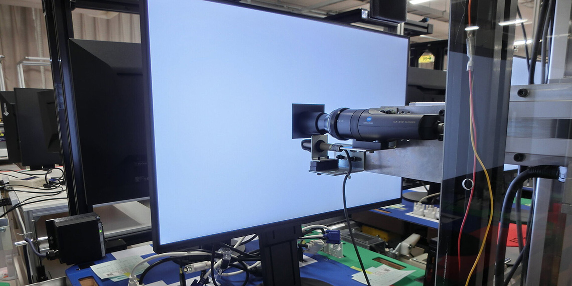
We’ll use our UPRTek MK550T spectroradiometer for this, as it has a lower luminance threshold than many other devices and can reach down to 0.001 nits. For OLED monitors we’ll exclude RGB 0 (black) from the data as that’s below the devices minimum measurement capability, but we’ll include any measurements that are above the 0.001 nits limit of our measurement device. Multiple samples can be taken to ensure accuracy and reduce near-black measurement errors.
Interpreting the results and some examples
If we consider the example graph above, the blue line represents the luminance measured, while the orange line represents the target luminance for each RGB shade at the listed gamma (2.2 in this case). If the blue line is above the orange line like in the above example, it means the luminance of those grey shades is higher than intended, and this may help with shadow detail as it makes those shades brighter.
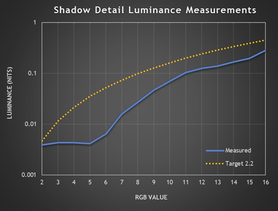
If the line is below the target line like in this example above, the luminance is lower than intended and this is likely to impact shadow detail and crush some shades to black. Note that the luminance line stops at RGB 2 in this second example as we found measurements below that for RGB 1 was likely meeting the accuracy limit for our device, so in those situations we could truncate the X-axis scale to start from RGB 2 if required.
Identifying the first visible grey shade
As discussed earlier, in our testing space, in our normal lighting conditions what we’ve found is that the first visible grey shade corresponds to a grey luminance of around 0.01 nits. In a fully dark room once your vision is fully adapted, you may be able to make out even darker shades and luminance levels but everyone’s viewing environment is going to be different and it’s going to be hard to score what is ultimately a somewhat subjective test. We’re going to continue to test shadow detail in our normal lighting conditions which we think will represent a fairly typical usage environment and we’ve found that we can usually make out the first grey shade when it reaches around 0.01 nits of luminance.
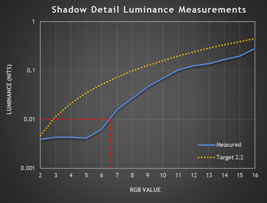
Referring to our graph again above, this makes it quite simple to match up our visual observations with the measurements from the spectroradiometer, as we can follow the Y-axis line for 0.01 nits across, and where that meets the blue luminance measurement line is basically the RGB value we’d expect to be able to see. In the case of the above, we would expect to see RGB 7 as the first visible shade (and we do!).
These graphs allow us to evaluate what is happening more clearly, as well as identify if shades are being over-brightened or over-darkened in some cases. This near-black detail is hard to evaluate when only considering a normal gamma graph and data, which has less granular measurement and a graph with a much larger scale.
Interpreting the data to account for other scenarios if needed
If you wanted to consider what might be visible in other viewing environments you could trace a line across from a different point on the Y-axis. Like in a fully dark room where you’ve adjusted to the light, maybe you’d draw a the line across from half way between 0.001 and 0.01 to represent being able to distinguish a luminance a little lower around 0.005 nits.
As we talked about earlier, changing the brightness to something other than the 200 nits we’ve standardised the testing at it could impact shadow detail further. The first grey shade to reach 0.01 nits may be different if you have the screen set very bright, vs the screen set very dark. If you lowered the luminance, the blue measurement line will move down the Y-axis further.
Some considerations
We should say that it’s possible shadow detail will vary between different units and samples to a point, with ageing, wear and bedding-in time. We can only test the sample we have, but from what we’ve seen so far the user observations in this area tend to be very similar, and consistent to our findings. Remember that different individual configurations, viewing environments etc can also play a role.
Testing various monitors
Asus ROG Strix XG27AQWMG
Our original testing of this screen was using a pre-production sample but we have now updated the results to reflect a mass production unit we have now been sent.
Let’s have a look at an example monitor then, the Asus XG27AQWMG (full review here), as this is one which has been criticised by some users for its high levels of “black crush”. The screen was tested in SDR mode, configured to a ~200 nits luminance (Uniform Brightness turned on) and we evaluated both the native gamut mode (Preset = Racing, colour space = Wide gamut) and the ‘sRGB Cal’ preset mode which offers an sRGB emulation. Refresh rate was set to the native 280Hz and we were running the latest MCM104 firmware.
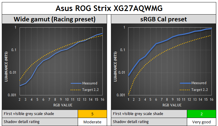
In the native wide gamut mode the shadow detail was moderate, and the first visible grey shade we could make out was RGB 5. You can see the reason for this is the luminance of shades 1 – 4 is lower than the threshold we could detect (at ~0.01 nits), causing some minor unexpected black crush beyond the expected loss using 2.2 gamma on an OLED.
Above RGB 5 the luminance is closer to the target for a 2.2 gamma and remains accurate. The Y-axis line for 0.01 nits luminance meets the measurement curve around RGB 4.5, which again confirms why the first shade we could make out was RGB 5.
| Measured luminance (nits) | ||
| RGB value | 2.2 gamma | sRGB gamma |
| 0 | below limit | below limit |
| 1 | below limit | below limit |
| 2 | 0.0026 | 0.017 |
| 3 | 0.0033 | 0.0360 |
| 4 | 0.0062 | 0.0523 |
| 5 | 0.0182 | 0.1052 |
| 6 | 0.0333 | 0.1927 |
| 7 | 0.0439 | 0.2308 |
| 8 | 0.0697 | 0.2863 |
In the sRGB Cal mode (right hand graph above) it is much easier to see shadow detail, and the first visible shade was now RGB 2 which was very good. We’ve added in RGB 1 to the X-axis on this graph as that’s now measurable and you can see where the 0.01 nits Y-axis line crosses the blue measurement line, again confirming the association between our visual observations and the measurements.
Refresh Rate Impacts Shadow Detail
One interesting observation we found through our testing is that the refresh rate setting has an impact on the shadow detail! This is a topic explored from a slightly different angle in recent times by Rtings.com who were evaluating gamma shift at lower refresh rates.
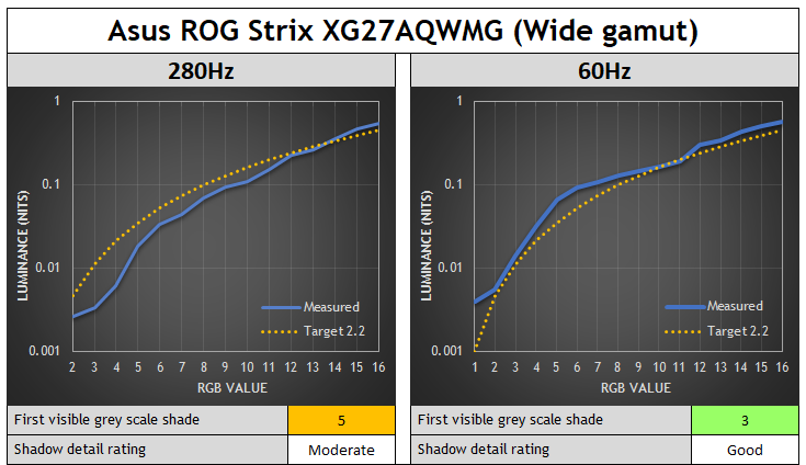
On the XG27AQWMG in native wide gamut mode the shadow detail improves as you lower the refresh rate, and the luminance of those darker shades is more accurate as well. In the native wide gamut mode if we dropped the refresh rate to 60Hz, we could now see RGB 3, as the under-luminance was now improved somewhat and the measured luminance tracks the 2.2 gamma target more closely overall for the darker shades.
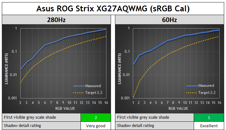
In the sRGB Cal mode the shadow detail was already very good at the native 280Hz, but when dropping down to 60Hz we could now see RGB 1 as well and shadow detail was excellent now. There was also some additional brightening of other dark shades which made them a little easier to see in darker content. The near-black gamma curve has been adjusted in this ‘sRGB Cal’ mode to compensate for potential black crush.
The gamma configuration in this mode seems to be configured to the sRGB gamma curve and is closest to that when running at 60Hz.
Gigabyte MO27Q28G
Let’s have a look at another recent example monitor, the Gigabyte MO27Q28G (full review here), which is another that has been criticised by some users for its high levels of “black crush” on later firmwares, despite our original testing showing stronger performance in this regard. This uses the same 27″ 1440p 280Hz Tandem WOLED panel as the Asus XG27AQWMG tested above, just with a matte anti-glare coating instead of glossy.
The screen was tested in SDR mode, configured to a ~200 nits luminance again (APL stabilize setting = low) and we evaluated both the native gamut mode (Preset = Custom) and the specific ‘sRGB’ preset mode. We’ll consider different refresh rates here as well. We were using the latest F07 firmware.
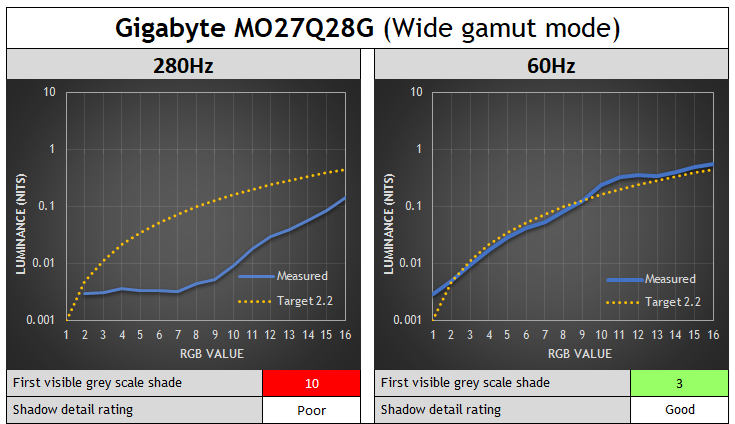
In the wide gamut mode at native refresh rate the screen has really poor shadow detail and a lot of black crush and you can see the luminance is a lot lower than intended for these darker shades. It’s actually the same luminance for shades up to RGB 7, only after that does it start to increase in luminance further, reaching our visible threshold only at RGB 10.
Like the Asus equivalent WOLED model, the gamma and shadow detail vary depending on the refresh rate though. Dropping down to 60Hz improves the near-black detail substantially. In the native gamut mode the luminance now follows the 2.2 gamma curve very nicely and accurately, although without any real compensation adjustment to address the expected crushing of the first few shades with this gamma on an OLED panel that we talked about earlier. Still, we can now make out RGB 3 at 60Hz.
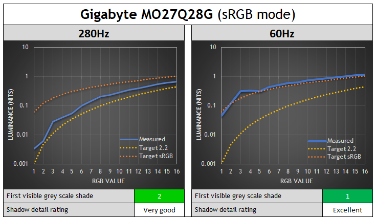
The sRGB preset mode is far better, being a closer match to the 2.2 gamma target line at 280Hz with some slight additional compensation adjustment to luminance which brings out the RGB 2 shade visually in this mode, although actually it seems the target for this mode is the sRGB gamma curve. You can see an improvement when dropping to 60Hz, and you can now make out shade 1 even which is excellent, and other dark grey shades are a little brighter as well which makes them easier to see. You can see from the measurements at 60Hz that this mode is configured to very closely follow the sRGB gamma curve.
It looks like in native gamut mode the screen is configured to a 2.2 gamma, and in the sRGB mode it’s configured to sRGB gamma; but the performance is only accurate at 60Hz, and anything above that starts to veer away from the intended gamma and causes black crush. We’ll cover the reasons for this a bit later.
Fixes for the Gigabyte MO27Q28G
If you find the black crush too severe in native wide gamut mode, then switching to the sRGB mode or also the DCI-P3 mode helps significantly at 280Hz. You get much better shadow detail, and in the case of the DCI-P3 mode the colour space is pretty close to native as well.
The ‘Black Equalizer’ setting is also very useful on this screen for tweaking things, even in the native mode. You can move this up from the default 10 to 12 and improve shadow detail nicely, without raising blacks. Beyond that you start to get some minor black raise, but experiment to see what looks better to you.
Other WOLED monitors tested
Those were two recent Tandem WOLED monitors which we’ve found had weaker shadow detail recently. For good measure we’ve also re-visited some other WOLED panels that we’ve reviewed:
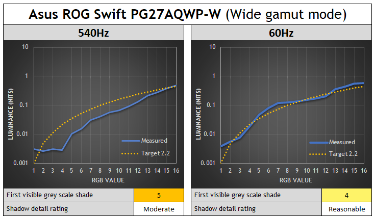
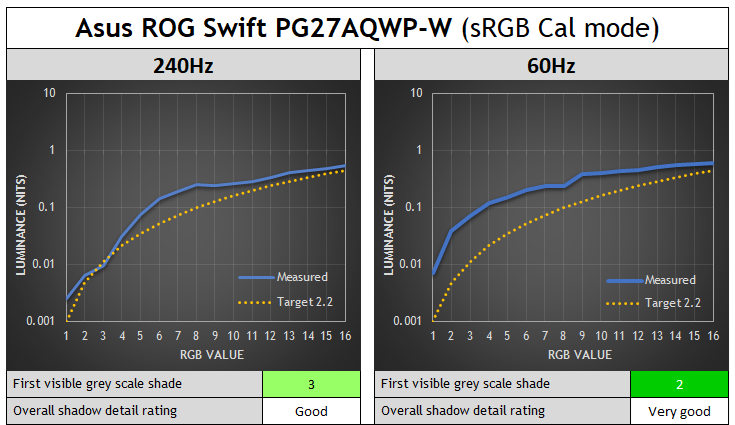
Asus ROG Swift PG27AQWP-W – 4th Gen Tandem WOLED
Asus ROG Strix XG32UCWMG – 3rd Gen WOLED
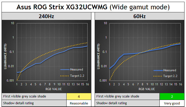

You can see the same pattern for these two WOLED screens, the gamma shifts at lower refresh rates and is closer to the intended target gamma, helping to bring out shadow detail more. Referring to some similar measurements at Rtings.com in their article here, we can see this is a general pattern across all WOLED panels it seems. Gamma varies at different refresh rates on WOLED panels.
QD-OLED monitors tested
Another interesting observation is that this seems to be “a WOLED thing”. We tested various QD-OLED monitors as well using the same approach and you can see the results below – variable gamma doesn’t impact QD-OLED in the same way. Rtings.com drew the same conclusions in their study, and on QD-OLED panels the gamma doesn’t seem to be tied to refresh rate in the same way. It doesn’t vary, and so you don’t get different shadow detail performance at different refresh rates.
We saw some minor luminance variation which might occasionally impact shadow detail by one RGB shade, if at all, but it was basically the same luminance at each refresh rate. Related, but in our VRR flicker testing we had also observed that unlike WOLED panels, gamma was not tied directly to frame rates, the flicker on QD-OLED behaved differently.
This means that if a manufacturer configures gamma correctly and makes adjustments to account for the OLED capabilities near black, it should be consistent at different refresh rates and during VRR situations. Obviously there’s still a risk of black crush if they don’t adjust near-black gamma or don’t calibrate it well, but at least it’s not variable like it is on WOLED panels.
Here’s a couple of examples:
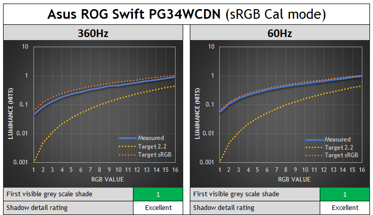
Asus ROG Swift PG34WCDN – 5th Gen QD-OLED (review here)

Asus ROG Swift PG27UCDM – 3rd Gen QD-OLED (review here)
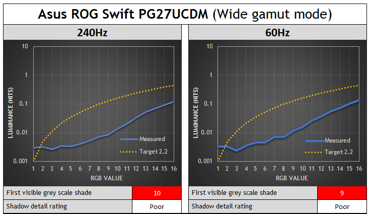
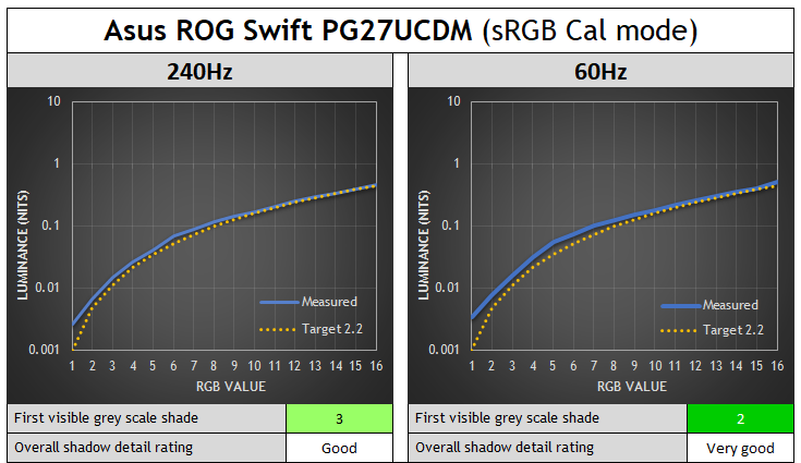
Although the shadow detail is poor on this screen, the gamma is still very consistent at different refresh rates.
Why is there gamma shift on WOLED panels?
Why is this happening on WOLED screens? This looks to be a similar observation to what we saw with VRR flicker in our extensive testing of that, where on WOLED panels the gamma was tied to the frame rate. You commonly saw the screen get visibly brighter as you lowered VRR frame rate from native down to something lower. This was visible in darker shades, but either not happening or not detectable in lighter shades in most cases.
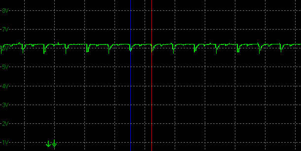
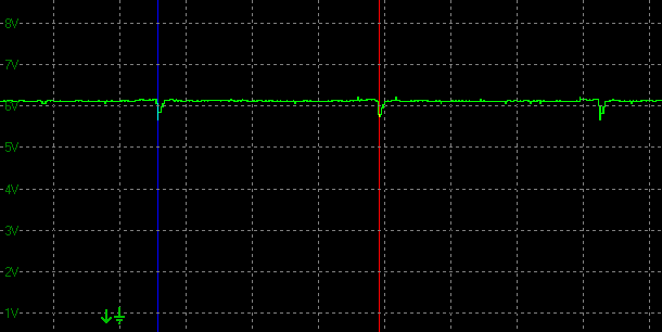
We’re not sure of the exact technical reason for why this happens on WOLED, but given it seemingly doesn’t impact QD-OLED, we expect it’s probably something to do with the additional white sub-pixel. Rtings.com felt from their studies that it was related perhaps to the small dips you see in luminance that are in sync with the refresh rate on an OLED monitor. For example you can see these small dips on a couple of examples below, but they’re always in sync with the refresh rate.
Small brightness dips at 280Hz on an OLED monitor
Less frequent brightness dips at 60Hz on an OLED monitor
Rtings.com suggested that it was the reduced frequency of those dips at lower refresh rates that lead to a slightly higher luminance as you lower the refresh rate, and therefore this shift in the gamma. From our measurements you gain around 2 – 3 nits or so of (white) luminance when dropping from 280Hz to 60Hz for example, so the luminance change is very minor overall. This minor variation in luminance doesn’t really explain the shift of gamma we see on WOLED panels fully, although the “charging time window” (the bit in between the dips) for each pixel shrinks as the refresh rate increases, making precise voltage control more challenging near-black than in the wider 60Hz window.
It’s probably related to that to some extent, although we see those same dips on QD-OLED monitors, and those don’t seem to suffer in the same way from this gamma variation. Perhaps this also comes back to the added white sub-pixel though, as that is a difference between the two technologies. We’re seeking some further information on this area and will update the article when we learn more.
Side note, we’d probably be able to put that theory to the test when we see the first RGB stripe WOLED panels later this year. Something is causing that gamma to fluctuate as refresh rate changes along with that small variation in luminance.
Factory calibration is at a single refresh rate
Monitors are factory calibrated and configured at a set fixed refresh rate, with a single gamma table stored. This is a scaler limitation and it’s standard to only calibrate at a single refresh rate, and therefore this can create challenges in situations where the gamma might fluctuate like it does on WOLED panels, as we’ve demonstrated in this article.
Our theory here, which we’ve validated with several display manufacturers, is that what is happening here is that these WOLED screens are being calibrated at 60Hz in the factory. That refresh rate shows a much better performance than the higher refresh rates. The Gigabyte MO27Q28G is a perfect example of this, it’s basically spot on to 2.2 gamma in native wide gamut mode, and basically spot on to sRGB gamma in the sRGB mode – but only at 60Hz.
This is because the factory calibration process involves instruments and external pattern generators that operate at 60Hz, especially for HDR calibration. That’s very common for those devices and so it’s a device constraint at play here. So, the screens end up being very well calibrated, but only at that 60Hz refresh rate. Beyond that, on WOLED at least, you then get gamma shift as the refresh rate varies, leading to unwanted luminance variation and black crush at higher refresh rates. Manufacturers are calibrating the screen well, it’s just not accounting for the refresh rate-linked gamma shift.
This same factory calibration process doesn’t matter on QD-OLED as the calibration at 60Hz is still relevant at other refresh rates as they don’t show this gamma shift, it’s just WOLED that seems to be variable, and therefore a challenge.
Can shadow detail be fixed and improved?
Talking about shadow detail in general, it’s absolutely possible to improve near black detail on OLED screens, but manufacturers will need to deviate from the true mathematical accuracy of a gamma like 2.2, and compensate in one way or another for near black shades. This might be through tweaks to the near black gamma, the use of the sRGB curve or other means. While it might not be deemed mathematically “accurate” by some users, we think the vast majority of people will prefer improved shadow detail and a “bending” of the gamma curve near black to compensate. We don’t think other approaches like temporal dithering would be wise on a desktop monitor due to other artefacts.
Adjusting gamma near-black, without raising black
Any adjustment to the gamma near black must of course avoid raising blacks at all – we want that amazing true black and contrast ratio on OLED to remain! We tested various monitors discussed in this article which feature an sRGB emulation mode, and show variable gamma at different refresh rates, but didn’t see any cases where the actual black point got raised. Black remained fully black and 0.00 nits thankfully.
QD-OLED calibration will be easier than WOLED
For QD-OLED monitors it seems we just need to see a more concerted effort in some cases to ensure shadow detail is strong and adjustments are made near-black to the gamma. Thankfully there doesn’t seem to be any gamma variation with different refresh rates or during VRR situations so manufacturers don’t need to worry about calibration and device limitations. Firmware updates could address issues identified in theory if manufacturers decided to provide updates in this area.
For WOLED monitors it’s going to be more tricky….longer term perhaps scalers can be adjusted to accommodate multiple gamma tables at different refresh rates, or perhaps dynamic gamma can be introduced to compensate for the shifts. If tools allow, maybe factory calibration can be altered to calibrate at native refresh rate instead of 60Hz, which should at least improve shadow detail at that common configuration. You would still have challenges related to the gamma shift to contend with at lower refresh rates and VRR though.
Once the underlying cause of the issue on WOLED is further understood, there may be other ways to mitigate the variation in the future, and perhaps the shift to an RGB-stripe sub-pixel layout will hold some promise. That remains to be seen and tested though. We’ve fed back our findings to several manufacturers for awareness and future consideration.
Conclusion and TL;DR
There’s a lot to take in here, but hopefully you’ve followed it all and it’s been interesting and useful. Here’s a summary to finish up, or for those who skipped right to the end:
- “Shadow detail” is the detail you can see in dark content, near to black. It’s a challenge on all displays, but especially OLED. Loss of shadow detail is commonly referred to as “black crush”.
- The visibility of this detail depends on many variable including viewing environment, visual adaptation, display settings and configuration.
- If an OLED display is calibrated and configured to follow the common 2.2 gamma curve exactly and accurately, some crushing of near-black detail is unavoidable and actually expected as the darkest grey shades are so dark and so near to black, that they’re visually indistinguishable.
- Display manufacturers may need to adjust the gamma curve near black to compensate for this expected crushing of dark shades, deviating from the true “accuracy” of the mathematical gamma curve, in favour of better perceptual gamma.
- Our new testing approach will combine standardised subjective assessments with more detailed objective measurements. The resulting graphs will allow you to identify how the luminance varies from the intended target, either making it darker than intended (and crushing detail) or lighter than intended (hopefully improving detail). Combining both tests allows us to rate the shadow detail performance of a display more thoroughly.
- We found that on WOLED panels the gamma, and therefore the shadow detail, is tied to refresh rate. Performance seems to normally be optimal at a 60Hz refresh rate, since it is normal for screens to be factory calibrated at this refresh rate. On WOLED panels gamma variation then occurs at other refresh rates and during VRR situations, normally leading to additional black crush and loss of detail at higher refresh rates.
- QD-OLED panels don’t suffer from this same variation and offer the same gamma performance at different refresh rates. Focus is still needed to ensure accurate calibration, and compensation for the known near-black shade crush on OLED panels though.
We’d like to see continued focus from display manufacturers to optimize and improve shadow detail on OLED monitors, compensating for the true black capabilities of the OLED panel where necessary and adjusting gamma near-black. This isn’t always an issue of course, and we’ve seen many good examples before, but we will be testing this more thoroughly in the future and evaluating displays in this important performance area. We realise there will be additional challenges on WOLED panels due to the variable gamma, which needs to be explored further and improved where possible.
We may earn a commission if you purchase from our affiliate links in this article- TFTCentral is a participant in the Amazon Services LLC Associates Programme, an affiliate advertising programme designed to provide a means for sites to earn advertising fees by advertising and linking to Amazon.com, Amazon.co.uk, Amazon.de, Amazon.ca and other Amazon stores worldwide. We also participate in a similar scheme for Overclockers.co.uk, Newegg, Bestbuy , B&H and some manufacturers.