Dell UltraSharp U4021QW

Introduction
This display might be a couple of years old now, actually part of Dell’s 2021 line-up of monitors, but it’s one of the few available screens of this size and resolution and something we’ve been keen to take a look at and consider for productivity and office uses. It’s a pretty niche monitor, and so still an interesting option to test and review.
The Dell U4021QW is a large 40″ sized screen with an ultrawide aspect ratio (very close to 21:9) and a high 5120 x 2160 resolution. Dell refer to this as “5K2K”, and it’s basically the ultrawide version of a 4K resolution, giving you about 33% extra screen real-estate to play with if we assume normal 100% scaling is used. The U4021QW is part of Dell’s ever-popular UltraSharp line-up of monitors, with a range of modern connectivity options and productivity-enhancing extras included.

 | Check pricing and availability in your region |
 |
Key Specs
- 40″ ultrawide size with ~21:9 aspect ratio
- Curved format with subtle 2500R curvature
- 5120 x 2160 (“5K2K”) resolution (140 PPI)
- IPS technology panel (LG.Display LM400RW1)
- Wide colour gamut with 98% DCI-P3 coverage
- 1x DisplayPort 1.4 and 2x HDMI video connections
- Thunderbolt 3 / USB type-C connection with DP Alt mode, 90W power delivery
- Easy-access USB type-C (with 15W power delivery) and USB data ports on the front of the screen
- Auto KVM function along with PiP and PbP support
- Stand with tilt, height and swivel adjustments
- Integrated 2x 9W stereo speakers
Design and Features
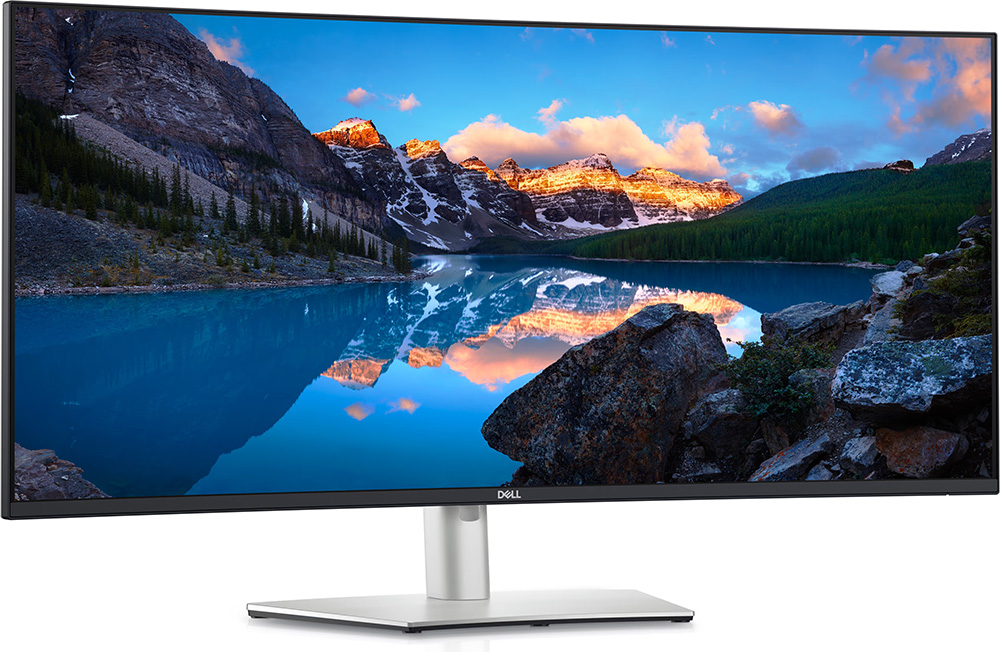
The U4021QW comes in a familiar UltraSharp range design with a black and silver finish. There is a 3 side “borderless” panel design with a thin plastic edge along the sides and top, but with a fairly thick black panel order before the image starts, there is a total black border of 11mm. Along the bottom edge is a more traditional black plastic bezel, with a shiny silver “Dell” logo in the middle. The total bottom edge measures 15mm thickness. The borders look pretty narrow and attractive though on the large screen size.
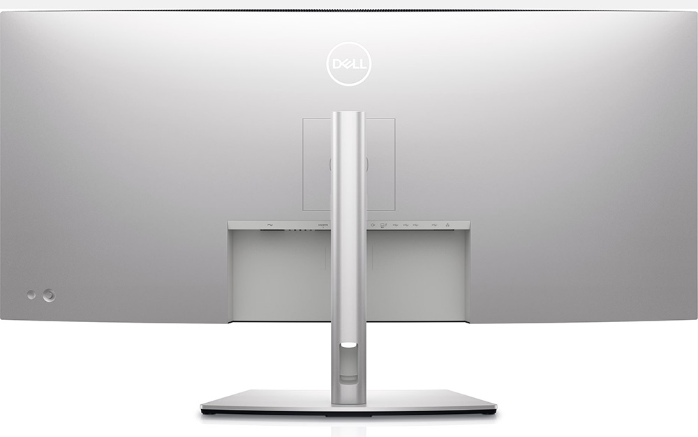
The rear of the screen is encased in a smooth silver coloured plastic. The stand attaches in the middle via a simple quick release mechanism, or can be removed in favour of VESA 100mm mounting if you’d rather. The monitor stand and foot are encased in the same silver-coloured plastic, but the monitor looks sleek and attractive, with a minimalist design suitable for professional and office environments. No sign of any RGB lighting or gaming styling here. There is a cable tidy hole in the back of the stand as you can see above. The OSD is controlled through a single joystick controller on the back left hand side of the screen (when viewed from behind), with a power on/off button also located next to it.
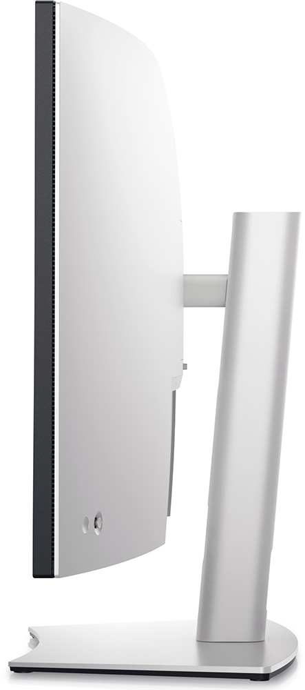
The monitor has a fairly deep side profile (24.8 cm with the stand) due to its large screen size so make sure you have a suitably deep desk to accommodate it. The stand provides tilt, height and side to side swivel adjustments (no rotation). These are mostly smooth and easy to operate, although height can be a bit stiff sometimes. The stand has a slight adjustment in the rotation plane of motion, so sometimes you have to re-position the screen to make it level. Because the screen is very large at 40″, it does wobble a fair bit on the stand as you change the viewing position or use the OSD controller. In day to day use it remains nice and stable though.
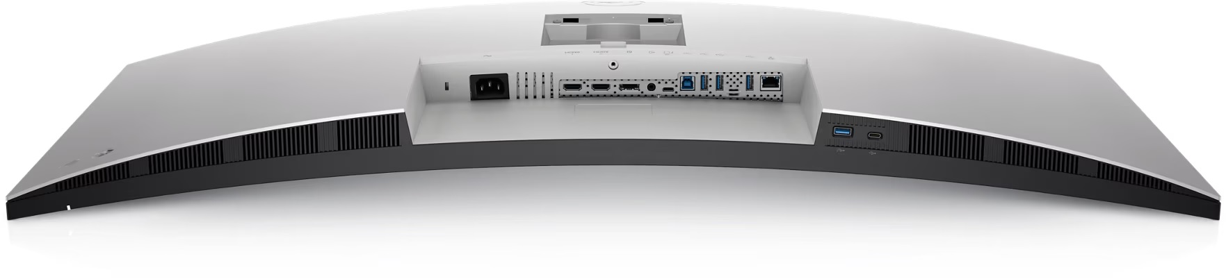
The connections are mostly located on the back underside of the screen as shown above (click for larger version). There are the video connections, USB ports and RJ45 Ethernet connection on the back, and then also an additional USB data port (with charging) and USB type-C (data and 15W power delivery only) on the underside of the screen for quick and easy access. Nice to see those included here we thought.


The OSD is controlled entirely through a single joystick controller located on the back right hand side of the screen (when viewed from the front). It’s split in to 10 sections down the left hand side, with the options available in each then shown on the right. Navigation is pretty quick, easy and intuitive thanks to the joystick. The range of settings feels a bit limited, but that’s probably relative to gaming screens we’re used to testing. There’s most of the things you might want here, although notable by its absence is any control for the gamma mode.
Testing Methodology Explained (SDR)

Performance is measured and evaluated with a high degree of accuracy using a range of testing devices and software. The results are carefully selected to provide the most useful and relevant information that can help evaluate the display while filtering out the wide range of information and figures that will be unnecessary. For measurement, we use a UPRtek MK550T spectroradiometer which is particularly accurate for colour gamut and colour spectrum measurements. We also use an X-rite i1 Pro 2 Spectrophotometer and a X-rite i1 Display Pro Plus colorimeter for various measurements. Several other software packages are incorporated including Portrait Displays’ Calman color calibration software – available from Portrait.com.
We measure the screen at default settings (with all ICC profiles deactivated and factory settings used), and any other modes that are of interest such as sRGB emulation presets. We then calibrate and profile the screen before re-measuring the calibrated state.
The results presented can be interpreted as follows:
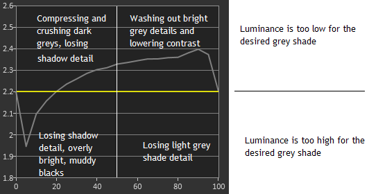
- Gamma – we aim for 2.2 gamma which is the default for computer monitors in SDR mode. Testing of some modes might be based on a different gamma but we will state that in the commentary if applicable. A graph is provided tracking the 2.2 gamma across different grey shades and ideally the grey line representing the monitor measurements should be horizontal and flat at the 2.2 level, marked by the yellow line. Depending on where the gamma is too low or too high, it can have an impact on the image in certain ways. You can see our gamma explanation graph to help understand that more. Beneath the gamma graph we include the average overall gamma achieved along with the average for dark shades (0 black to 50 grey) and for lighter shades (50 grey to 100 white).
- RGB Balance and colour temperature – the RGB balance graph shows the relative balance between red, green and blue primaries at each grey shade, from 0 (black) to 100 (white). Ideally all 3 lines should be flat at the 100% level which would represent a balanced 6500K average colour temperature for all grey shades. This is the target colour temperature for desktop monitors, popular colour spaces like sRGB and ‘Display DCI-P3’ and is also the temperature of daylight. It is the most common colour temperature for displays, also sometimes referred to as D65. Where the RGB lines deviate from this 100% flat level the image may become too warm or cool, or show a tint towards a certain colour visually. Beneath this RGB balance graph we provide the average correlated colour temperature for all grey shades measured, along with its percentage deviance from the 6500K target. We also provide the white point colour temperature and its deviance from 6500K, as this is particularly important when viewing lots of white background and office content.
- Greyscale dE – this graph tracks the accuracy of each greyscale shade measured from 0 (black) to 100 (white). The accuracy of each grey shade will be impacted by the colour temperature and gamma of the display. The lower the dE the better, with differences of <1 being imperceptible (marked by the green line on the graph), and differences between 1 and 3 being small (below the yellow line). Anything over dE 3 needs correcting and causes more obvious differences in appearance relative to what should be shown. In the table beneath the graph we provide the average dE across all grey shades, as well as the white point dE (important when considering using the screen for lots of white background and office content), and the max greyscale dE as well.
- Luminance, black depth and contrast ratio (static) – measuring the brightness, black depth and resulting contrast ratio of the mode being tested, whether that is at default settings or later after calibration and profiling. We aim for 120 cd/m2 luminance which is the recommended luminance for LCD/OLED desktop monitors in normal lighting conditions. Black depth should be as low as possible, and contrast ratio should be as high as possible.
- Gamut coverage – we provide measurements of the screens colour gamut relative to various reference spaces including sRGB, DCI-P3, Adobe RGB and Rec.2020. Coverage is shown in absolute numbers as well as relative, which helps identify where the coverage extends beyond a given reference space. A CIE-1976 chromaticity diagram (which provides improved accuracy compared with older CIE-1931 methods) is included which provides a visual representation of the monitors colour gamut coverage triangle as compared with sRGB, and if appropriate also relative to a wide gamut reference space such as DCI-P3. The reference triangle will be marked on the CIE diagram as well.
- dE colour accuracy – a wide range of colours are tested and the colour accuracy dE measured. We compare these produced colours to the sRGB reference space, and if applicable when measuring a wide gamut screen we also provide the accuracy relative to a specific wide gamut reference such as DCI-P3. An average dE and maximum dE is provided along with an overall screen rating. The lower the dE the better, with differences of <1 being imperceptible (marked by the green area on the graph), and differences between 1 and 3 being small (yellow areas). Anything over dE 3 needs correcting and causes more obvious differences in appearance relative to what should be shown. dE 2000 is used for improved accuracy and providing a better representation of what you would see as a user, compared with older dE methods like dE 1994, as it takes into account the human eye’s perceptual sensitivity to different colours.
Default Setup
The screen comes out of the box in the ‘standard’ preset mode, operating at the full native colour gamut of the panel and without either of the factory calibration modes active – we will look at those in a moment. There is a a modest brightness with the screen set at 75%, not too high or uncomfortable which is nice, although you can of course adjust this to your preference. There are no controls over any of the picture settings really in this mode other than the brightness and contrast. You can get access to the RGB channels in the ‘custom color’ mode if you needed to adjust the colour temperature and white point, but in no mode is there any control over the screen’s gamma. For those without a calibration device, you will be at the mercy of Dell’s factory gamma set up, let’s hope it’s decent!

In this default mode we had a pretty decent gamma, with 2.28 average measured and being overall pretty close to the 2.2 target. It was a bit high in mid grey shades which can lead to a little washing out of detail, but it was not too bad. Remember this mode hasn’t been specifically factory calibrated either, so we may be able to achieve better in those modes in a moment. There is no gamma setting in the OSD menu, so you’d need a calibration device to improve this further, although it’s not bad by default anyway and should be fine for most users.
The colour temperature across the entire greyscale was excellent though, with an average 6493K being basically spot on to the 6500K target. White point was also very close to the target being a very minor 1% out at 6465K. This resulted in a good greyscale accuracy as well, with dE 1.8 average measured. Out of the box the default brightness was a modest 175 cd/m2 and we had a good (for an IPS panel) contrast ratio of 1031:1 which was pleasing and on-spec. There is a good backlight adjustment range available from the screen as well, reaching up to 270 cd/m2 maximum down to a minimum of only 26 cd/m2. This affords you a good adjustment range for darker room conditions. The backlight adjustment was confirmed as flicker free, without the need for PWM which is of course a very good thing.

From a colour point of view let’s look at the top section of the above image. Firstly you can see that the screen’s native colour gamut extends quite a long way beyond the sRGB colour space reference, especially in green and red shades. There is an absolute coverage of the sRGB space of 99.2% which is great, but with the over-coverage this would be 127.6% relative coverage. As a result of the wide colour gamut of the screen, the accuracy of sRGB / SDR colours is of course impacted. We measured a dE of 3.6 average / 6.1 maximum, but that’s very normal for a wide gamut screen. Viewing sRGB / SDR content looks too saturated and vivid, so to work with that content you’d need a method for emulating the smaller colour space ideally. This can be achieved either through the provided screen emulation mode (tested in a moment), graphics card clamping, or calibration and profiling (carried out in a moment).
In the bottom section we have measured the screen’s colour gamut relative to common wide gamut colour spaces. You can see there is a good coverage of DCI-P3 at 96.9%, with only a small amount of over-coverage (101.7% relative). The backlight is obviously very close to this colour space natively. We have then measured the performance relative to Adobe RGB, a common colour space used in the professional and photography market. There is a pretty decent absolute coverage of this space at 94.8%, but a moderate over-coverage too (109.4% relative). You can see from the CIE diagram in the bottom left that there is under-coverage in green shades, but over-coverage in red shades compared with the Adobe RGB reference space.
The accuracy of Adobe RGB colours is reasonable, but has some problems especially in red and green shades due to that mis-match of the target colour space, and the monitor’s native gamut. To work with Adobe RGB content accurately you’d need to be able to calibrate and profile the screen with a calibration device, but also live with the small under-coverage of green shades which will not be possible to correct, as the screen’s backlight simply cannot produce those shades. As a result the U4021QW is not ideally placed to work with Adobe RGB content, but is more appropriate for DCI-P3 content (used in multimedia and HDR commonly) where the colour space is a closer match.
Factory Calibration Modes
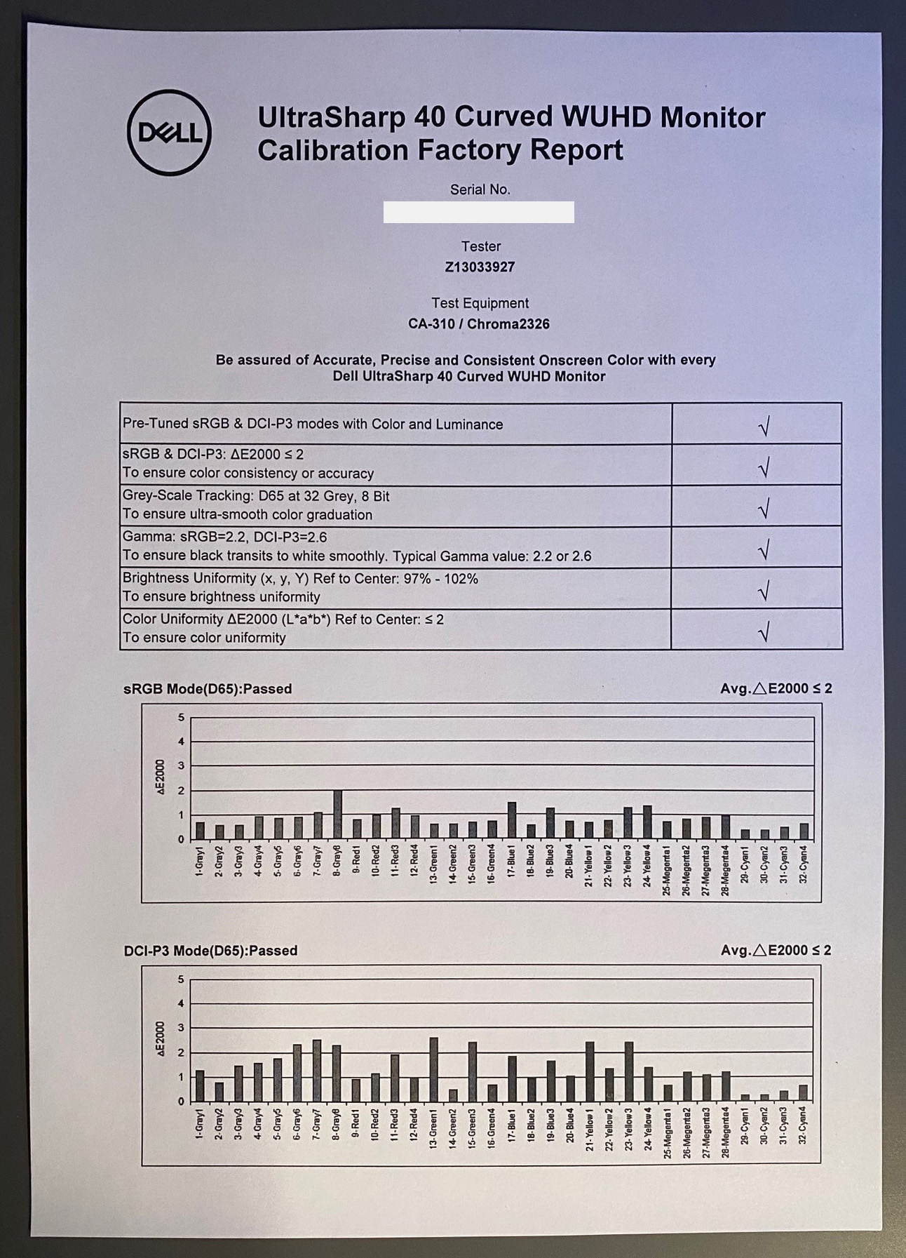
The U4021QW comes factory calibrated in two different modes, sRGB and DCI-P3. These are accessible via the OSD menu in the preset mode > color space section. A factory calibration report is provided in the box unique for your screen sample, confirming the factory calibration targets and performance. We will have a look at both modes here.
sRGB mode (including emulation)
According to the factory calibration report the screen has been calibrated to a 2.2 gamma, 6500K greyscale (D65) ad with a colour accuracy of dE 2000 <2. We measured the screen ourselves in this mode:

The setup of the sRGB mode was very good overall. While the factory calibration report suggested this has been calibrated to a 2.2 gamma, it looks like actually an sRGB gamma curve has been used. That’s not really an issue and is equally valid for an sRGB mode, and it’s very close to 2.2, just with the tailing off towards black that you see on the left hand side of the gamma graph. The colour temp and white point were exceptional, with an excellent balance of the red, blue and green channels as you can see from the middle graph, and a stable colour temp across the entire greyscale. This resulted in a very accurate greyscale with a dE average of only 0.7. The factory calibration had done an excellent job here.
Luminance was modest at 162 cd/m2, and the screen maintained its decent IPS contrast ratio at 990:1. Thankfully Dell allow you access to the brightness adjustment still in this mode so you can adjust this to your liking and to cater for your own ambient light conditions, as opposed to having it locked like you see on some monitors.

One disappointment with the sRGB emulation mode is that although it does clamp the colour space back from the wide native gamut of the screen, it goes a bit too far in red and blue shades and this results in a moderate 92.6% coverage only. This is a shame as we know the full sRGB colour space should have been possible from the backlight. If you have your own calibration device then profiling the screen in the native mode back to sRGB, and using that ICC profile in colour-aware applications should give you a more accurate coverage and result.
For general uses and typical day-to-day working with SDR content, the emulation mode is still decent enough though and it’s still ultimately very close to the sRGB reference space. It restricts the over-saturated native mode, and mutes the colours to an appropriate level for this kind of content. The colour accuracy is also very good thanks to the factory calibration with a dE average now of only 0.7. This represents a nice accurate sRGB mode for those wanting to work with this more common colour space.
DCI-P3 mode (including emulation)
According to the factory calibration report the screen has also been calibrated in the DCI-P3 colour space preset mode to a 2.6 gamma (the target for this colour space in content creation), 6500K greyscale (D65) ad with a colour accuracy of dE 2000 <2. We measured the screen ourselves in this mode:

The first thing you notice about this mode is that the brightness setting has been reduced significantly to 15% in the OSD menu, although thankfully you still have access to adjust it yourself if you want. This default low setting looks dark but it seems to be designed to reach the target luminance for the DCI-P3 standard which is 48 cd/m2. Although having said that, it’s a bit odd then that the sRGB mode hadn’t targeted that colour space’s luminance of 80 cd/m2. Anyway, we measured 51 cd/m2 in this mode so it was very close to that target and you still have access to adjust this if you want to or if you find it too dark. It still maintained its good IPS contrast ratio of 1055:1 in this mode too.
The gamma was accurate here, being very close to the 2.6 target (note the change in vertical scale on the y axis of the gamma graph), so that had been achieved nicely. Average colour temp across the greyscale was good at 6427K, but the problem was that this varied in light grey shades and white a bit too much. We had a too-warm white point at 6279K, but also a slight greenish tint to lighter grey shades and white due to the imbalance of the RGB channels. This resulted in a poor greyscale accuracy with a greenish tint to many shades being detected.

We had the same issue as we’d seen in the sRGB mode here with the colour space emulation, clamping the native gamut a bit too far and leaving us with only 91.6% coverage of the DCI-P3 space. This is a shame again, as it could have achieved nearer 96.9% based on the native gamut of the backlight, had this been clamped more accurately. The colour accuracy of this mode relative to DCI-P3 colours was very poor too, with dE 6.5 average measured. We re-ran this and validated it on a few occasions, but were not able to produce the results indicated from the factory calibration report.
The DCI-P3 emulation mode was useful if you wanted to run the screen at the high 2.6 gamma level, as in all the other modes there was no control over the screens gamma. However, it left a lot to be desired when it came to greyscale and colour accuracy unfortunately. This doesn’t feel like an accurate enough mode for those wanting to work with DCI-P3 content specifically unfortunately, so if you need to do that, you’d probably want to invest in a calibration tool to calibrate and profile the native gamut modes instead. Better accuracy and control should be possible in those modes.
Calibration


Calibration and profiling can produce very good results if you have a suitable calibration device and software. This was profiled to 2.2 gamma, 6500k colour temp and to the sRGB colour space. The screen was left in its native wide gamut mode, but this profile will be used in colour-aware applications (e.g. Photoshop) to map back to sRGB in this instance. The only real error was in 100% blue shade where the screen couldn’t quite cover the sRGB blue primary fully, but that’s very minor. Overall the calibrated results were excellent as you’d hope.
You can see the recommended OSD settings above that go along with this profile. Our calibrated ICC profile for this display is available now for our Patreon supporters and will be added to our main database in the coming months.
Office and General Use

Office, general and productivity uses is where this screen really offers some unique benefits. It’s the firsts screen we’ve tested with this rare “5K2K” resolution (5120 x 2160) and it was excellent to use in these kind of situations. This is basically a 4K resolution screen (resolution: 3840 x 2160) with an ultrawide format and near-21:9 aspect ratio, giving you some additional horizontal area to work with, but without needing to give up any vertical space like you would on most ultrawide screens. This is 33% extra in fact than a 4K monitor. That means if you want to work with 4K resolution content natively, you can do so, just with black borders down each side. Or you can enjoy the ultrawide format for multi-tasking, split-screen working and PiP/PbP situations.

To accommodate this high resolution, the screen size of 40″ is pretty comfortable, without becoming too large for a desktop monitor. It is very big of course, but we still feel that with the ultrawide format, it’s useable and comfortable for day to day office and productivity work. 40″ on an ultrawide is more comfortable than 40″ on a 16:9 aspect ratio display for desktop monitor use. With a pixel pitch of only 0.1828mm (138.92 PPI) it does result in a small font size, quite a lot smaller than common pixel pitches like 27″ 1440p (0.2335mm) and 34″ ultrawide 1440p (0.2316mm). We found that after a bit of getting used to, this resolution was useable at 100% scaling, although you will need to have decent eye sight and be sat pretty close to the screen for it to be comfortable. If you can use the screen at 100% scaling then you get a very large desktop area to work with, making use of the full resolution nicely. Some people may find this too small though and uncomfortable for extended periods of time. Going back to a 27″ 1440p monitor afterwards felt like big text!
The other option is to run the screen at 125% or maybe even 150% scaling, to make text larger, while maintaining a high pixel density to produce a sharp and crisp image. Running at 125% scaling feels like a sensible option if you find the fonts too small at 100%, and this would give you a desktop space equivalent to 4096 x 1728 which is still very large, and still more than common 3440 x 1440 ultrawide screens with this aspect ratio. This gives you a text size equivalent to 0.2285mm pixel pitch, making it very similar to the 27″ and 34″ resolutions mentioned a moment ago. This is likely to be the sweet spot for most users we expect. Keep in mind therefore that you lose some of the desktop space of the 5K2K resolution, but you do still maintain the pixel density benefits for a very sharp and clear image. This is the same thing you normally have to do on a 4K monitor as well by the way, as 125% scaling is common and comfortable on a 32″ 4K screen, or 150% scaling if it were a smaller screen like 27″. The high resolution and pixel density makes it well suited to highly detailed design and photo work.
The curve of the screen is subtle at only 2500R so it’s certainly less aggressive than many modern curved format screens. Personally I think this slight curve works nicely on a screen this size, bringing the edges a bit closer to your viewing position and making it more comfortable to use.
The screen has some decent connectivity options as well. You can connect two PC sources to your monitor and the integrated ‘intelligent Auto KVM’ feature detects the second connected PC and seamlessly switches controls over. Connectivity includes DisplayPort, HDMI and Thunderbolt 3 / USB type-C, giving you a wide range of modern options to choose from. That includes handy single-cable connectivity from Thunderbolt 3 and USB type-C compatible devices, as that port delivers DP Alt mode for video, and 90W power delivery as well.
There are 4 total USB data ports available, 3 on the back with the video connections and 1 on the underside for quick and easy access, which also includes battery charging. An additional USB type-C data port is located on the bottom edge as well with 15W power delivery (no DP Alt mode on this one). The two ports on the bottom front edge enable fast connection to peripherals, such as storage devices and mobile phones which is useful.
You can also view content from two input sources with Picture-by-Picture (PbP) and Picture-in-Picture (PiP), and use KVM (keyboard, video and mouse) to control both PCs with a single keyboard and mouse. Finally, an integrated RJ45 Ethernet connection acts as a LAN docking option if needed. This provides MAC Address pass-through, PXE Boot, and Wake-on-LAN.
The screen also has some reasonably decent speakers with 2x 9W built in to the screen. These sound better than common 2W or 3W speakers of course, but still lack much bass sadly. They should be fine for audio conferencing, the odd YouTube video or sound clip etc. There is also an audio line-out connection if you need, although note that it does not support headphones. An ambient light sensor and headphone connection were about the only things missing from this screen for office and general uses.
Uniformity
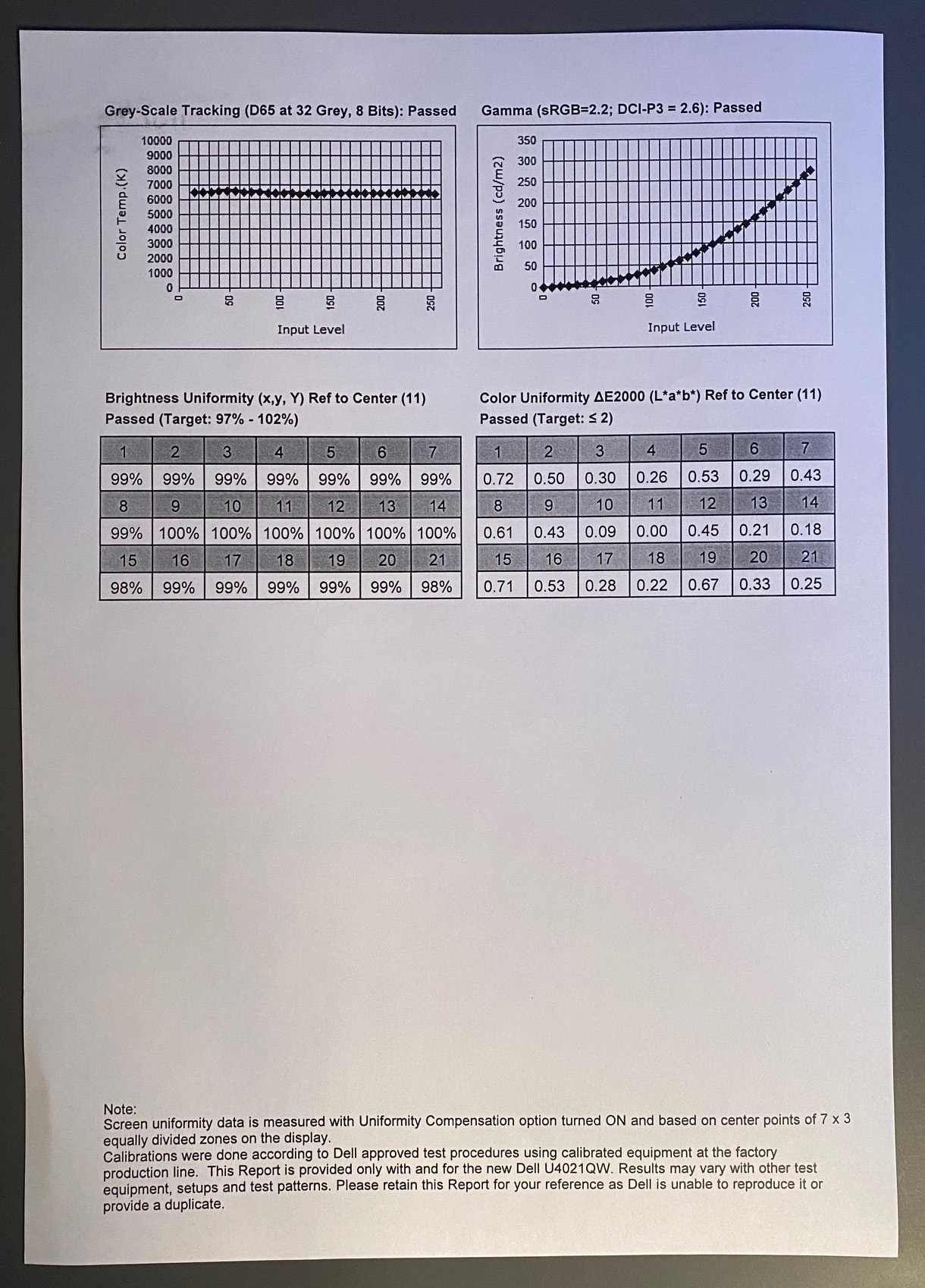
The U4021QW features a uniformity correction mode designed to help ensure a consistent and stable luminance and colour uniformity across the screen. This is available only if you’re using the ‘standard’ or ‘color temp’ preset modes though which is a pain, so you can’t use it with the sRGB emulation mode, or even with your tweaked ‘custom color’ mode.
We first of all measured the screen uniformity with this mode turned OFF. Measurements were taken in the ‘standard’ preset mode at default brightness/contrast settings, as the user manual suggests that the uniformity mode has been corrected at the default brightness level, so this would be the best way to observe its (hopeful) improvements.

With uniformity correction off we had a reasonable overall luminance, although the sides of the screen did show a drop in luminance by up to ~28% compared with the centrally calibrated region. The left hand edge showed the most noticeable drop, down to 134 cd/m2 minimum, compared with the central area that measured 171 cd/m2. A good portion of the screen (81%) was within a small 10% deviance of the target though which was decent.

We then turned ON the uniformity correction mode in the ‘standard’ preset, but it had very little impact at all to the overall uniformity sadly. The uniformity remained reasonable overall, with darker edges to the panel, especially on the left hand side. This mode didn’t seem to operate as advertised unfortunately, and there seemed little value in using it – especially when it’s not even selectable in the sRGB emulation mode or ‘custom color’ mode you might want to typically use.
Gaming
While this is not a gamer-oriented screen at all, we will still carry out some tests to establish if it would be ok for some light and casual gaming. This is a 60Hz-only panel so it lacks the high refresh rates and motion clarity of gamer-focused screens out there. There is also no support for variable refresh rates (VRR) at all, so you’re limited to traditional Vsync on/off operation. There is no HDR support on this screen either, even an acceptance of an HDR10 input signal so any kind of HDR gaming is also out of the question.
Dell do provide two overdrive modes in the OSD menu, ‘normal’ and ‘fast’, so we will test both of those to see how the pixel response times are. The large format screen size and high resolution could make it an interesting option for RTS and slower paced games potentially where you can live without the high refresh rates and enjoy the image clarity and resolution when you’re taking a break from work and general use. That is as long as the gaming experience is reasonable enough.

The response time performance in the default ‘normal’ mode was moderate for a 60Hz IPS panel. Most of the pixel transitions could keep up well enough with the refresh rate, with 87% compliance and an 11.1ms G2G average, but there were some slower transitions in the bottom left hand corner of the table. These are changes from light to dark shades and as is typical with many IPS panels, they were slower than the rest. This lead to a bit of increased smearing on lighter shades, but overall the motion clarity was pretty typical for a 60Hz screen to be honest. You obviously won’t get as clear and sharp an image as a high refresh rate panel, that’s the main drawback on this display compared with gaming screens. In the ‘normal’ overdrive mode there was very little overshoot at all, only being detected in a couple of transitions from white to light grey, but in practice there was very little visible at all which was great.
The ‘fast’ mode does improve the G2G response times down to a decent 7.0ms G2G average, but unfortunately this is at the cost of some very high overshoot which makes this mode unusable in practice. There are obvious and distracting pale and dark halos in motion content, and it makes the mode pointless.
We also measured the lag of the screen which was pretty high, again given this isn’t a gaming screen or in any way aimed at gaming. We measured a total average display lag of 25.7ms, which gives us an estimated signal processing lag of ~22.9ms. This is another reason why the screen isn’t really equipped to handle much gaming, although it could still be ok for some light gaming, RTS type games etc where speed and lag are less of an issue.
The screen might also be viable for consoles like the Xbox Series X and PS5 for the same genre of games, where you also might want to push image settings and 4K resolution and stick with a lower 60Hz refresh rate. The panels native support for 4K content (with borders down each side) and high pixel density could make this a viable option for those kind of games from modern consoles. The HDMI connections on this screen are only HDMI 2.0 but they are adequate to support 4K @ 60Hz with 8-bit colour depth and full RGB chroma still.
Conclusion
The Dell U4021QW was a fairly unique display offering and we really enjoyed using the large format and high resolution for day to day office use and for enhancing productivity. The screen size and ~21:9 ultrawide format were comfortable, although obviously on the large size still, but more practical and useable than 40″+ sized 16:9 aspect ratio monitors on your desk. The 5K2K resolution was great, and after a bit of getting used to we found this to be ok for 100% scaling use, giving us a very large desktop area to work with – basically 4K with some extra space on the sides. This was great for multi-tasking and design work, although we expect the small font size might not be ideal for everyone. Many people may prefer to run the screen at 125% scaling, but you still get a larger than normal ultrawide screen area to work with, plus the added benefit of the increased pixel density and image sharpness. All in all, the resolution was great here on this screen and we expect 5K2K would be attractive to many people.
For general, office and productivity work the range of connections and features was also very good, and it was pleasing to see USB type-C and Thunderbolt connectivity included. The added KVM function and support for PiP / PbP was also very useful. Plenty of USB ports including some easy access options on the bottom edge were also useful, and the speakers were reasonable. We would have liked more bass from the speakers really, and it was a shame not to see headphone support included from the audio output. The stand was also decent with a good range of adjustments available, and an overall sleek and attractive design to the monitor that will be familiar to anyone who’s seen or used an UltraSharp monitor in recent years.
| Check pricing and availability in your region |
|
Away from office and design type work, the screen struggled a bit more with multimedia and gaming. It’s not aimed at gaming at all so that’s probably not a surprise, although some people might of course want a monitor that could be used for both. The main limitations were the low 60Hz refresh rate, high input lag and lack of support for even basic features like VRR. It’s probably ok for some light gaming but it’s not really well equipped to handle this kind of usage. For movies and video the ultrawide format and high resolution are good, but there’s no HDR capabilities at all here which is a shame.
Default setup was overall very good, including a decent sRGB emulation mode that should be fine for working with standard gamut and SDR content. The DCI-P3 emulation mode was strange, as although it had an adjusted gamma suitable for that kind of content (2.6 instead of 2.2), the colour gamut was clamped too far, and the colour accuracy and white point were not accurate. For wider gamut content the native mode is better via the standard or custom color preset modes, and the screen actually has decent coverage of DCI-P3 colours by default anyway. It’s not however particularly well suited to working with Adobe RGB content for photography and professional use as it lacks the appropriate colour space coverage really. The uniformity correction mode seemed to offer nothing of any use sadly, which is a pity as that could have been useful on a monitor like this.
If you’re after a large format and high resolution screen to enhance your work and office environment, this is definitely an interesting choice. It’s available from most regions via Amazon, and you can check availability and pricing here.
| Pros | Cons |
| Large format screen but with comfortable ultrawide format. 5K2K resolution is great for productivity work, split screen working and multiple inputs | Lacking some refinement with colour space emulation and also accuracy for DCI-P3 mode |
| Good default setup including well calibrated sRGB mode | Uniformity correction mode seems to do nothing |
| Good range of inputs and connectivity options | Limited in other areas like gaming and multimedia, although these are not the target market |
We may earn a commission if you purchase from our affiliate links in this review – TFTCentral is a participant in the Amazon Services LLC Associates Programme, an affiliate advertising programme designed to provide a means for sites to earn advertising fees by advertising and linking to Amazon.com, Amazon.co.uk, Amazon.de, Amazon.ca and other Amazon stores worldwide. We also participate in a similar scheme for Overclockers.co.uk, Newegg, Bestbuy and some manufacturers.
Stay Up to Date
 |  |  | |
| Browser Alerts | Follow us on X (Twitter) | Subscribe | Support Us |
Popular Trending Reviews
 Dell Alienware AW3225QF February 29, 2024 The new 32″ 4K QD-OLED monitor from Dell, with a 240Hz refresh rate, Dolby Vision HDR and even eARC sound support
- Asus ROG Swift PG32UCDM February 14, 2024 One of the first 32″ 4K 240Hz OLED monitors released to market featuring a 3rd gen QD-OLED panel, USB type-C, KVM, and many Asus extras
- Dell Alienware AW2725DF February 17, 2024 Dell’s new 27″ QD-OLED gaming monitor, offering 2560 x 1440 resolution and the fastest current OLED refresh rate of 360Hz. Is this the new 27″ OLED king?
- MSI MPG 321URX February 23, 2024 The brand new and very competitively priced 32” 4K 240Hz OLED monitor from MSI. Offering an extremely impressive spec and set of features, at an attractive price point.
- MSI MPG 271QRX March 8, 2024 The new 27″ QD-OLED monitor from MSI with 1440p resolution and 360Hz refresh rate. Is this the best 27″ OLED monitor to buy now?


