Philips 329P1H
Introduction
This is a shorter format review but we have included as much of our normal testing and results as we can. We will of course still be carrying out our normal full, detailed reviews for the most interesting, complex and exciting new screens, but using this short format helps us cover a few additional models in the meantime. An explanation of the results and figures discussed in this short format review can be found here.

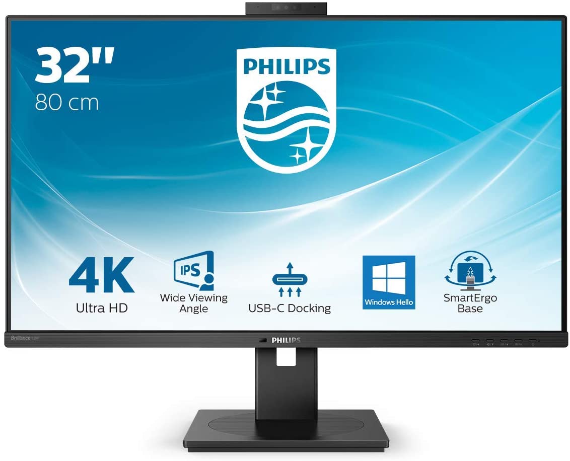
The Philips 329P1H is a 31.5″ sized display and offers a 3840 x 2160 Ultra HD (“4K”) resolution IPS technology panel. It’s marketed as an office monitor or home-working monitor in their P line (Professional) of displays and has a range of features designed to enhance productivity and user experience. This includes things like USB type-C docking and an integrated Windows Hello compatible pop-up webcam. We will talk about all the features a bit later on. It has a 3-side borderless design and has thin borders measuring only 9.5mm around the sides and top (total bezel + panel border) giving it a fairly sleek design. One of the key features of this screen is its high 3840 x 2160 Ultra HD (“4K”) resolution. This 4K resolution is a bit too high to use at native scaling (100%) on a screen even of this pretty large 31.5″ size, so you will probably want to use operating system scaling to ensure fonts and text are a sensible and readable size. 150% is probably unnecessarily large, with 125% scaling offering a nice balance on a screen of this size. That gives you comfortable text size which is very similar to a 27″ 1440p screen, but does give you the equivalent desktop real-estate area of a 3072 x 1728 resolution. So that’s quite a nice jump up from common 2560 x 1440 resolution screens in this approximate size range. The extra pixel density of the 4K resolution will provide a very sharp and clear image though for office and general uses. Just make sure that your software and games support scaling effectively as it can sometimes be a bit difficult to get it right. The IPS technology panel offers the kind of solid all-round performance you’d expect from this panel technology with good colours, a stable image and wide viewing angles. It also supports 10-bit colour depth if you’re specifically working with 10-bit content.
The 329P1H has a comprehensive set of features to enhance your experience and increase productivity. These include:
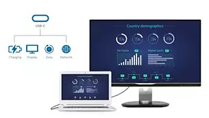
- USB type-C docking station (inc RJ45 Ethernet LAN) – this Philips display features a built-in USB type-C docking station with power delivery. With intelligent and flexible power management, you can power charge your compatible laptop directly and connect with a single, easy to use cable type. Its slim, reversible USB-C connector allows for easy, one-cable docking. Simplify by connecting all your peripherals like keyboard, mouse and even your RJ-45 Ethernet cable to the monitor’s docking station. You can watch high-resolution video and transfer data at super-speed, while powering up and re-charging your notebook at the same time.
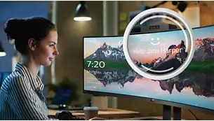
- Windows Hello compatible pop-up webcam – Philips’ innovative and secure 2.0 Megapixel Full HD webcam pops up from the top of the screen when you need it and securely tucks back into the monitor when you are not using it. The webcam is also equipped with advanced sensors for Windows Hello facial recognition, which conveniently logs you into your Windows devices in less than 2 seconds, which can be faster and certainly more convenient than using a password. It includes a microphone as well for simple video conferencing.
- Eye care measures – the now common use of a flicker free backlight is welcome as ever to avoid eye strain and issues associated with older PWM dimming methods. There are also a range of low blue light modes available in the OSD menu which we will look at a bit later. The displays meet TUV Rheinland Eye Comfort standard to prevent eye strain caused by prolonged computer use.
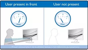
- PowerSensor motion detector – PowerSensor is a built-in ‘people sensor’ that transmits and receives harmless infrared signals to determine if the user is present and then automatically reduces monitor brightness when then user steps away from the desk, cutting energy costs by up to 80 percent and prolonging monitor life. This is useful if you are going to step away from your screen throughout the day.
- Ambient light sensor – uses a smart sensor to adjust the picture brightness depending on the light conditions in the room and help provide a comfortable brightness level while reducing power consumption. Note that we disabled this feature when testing and calibrating the screen below, but you can always turn it back on later to control the brightness of the screen without impact other areas of the setup.
- OSD menu – the menu has a decent range of options and navigation was quick via the pressable buttons on the bottom bezel. The first four sections of the menu are for the PowerSensor, LightSensor, LowBlue mode and input selection so you actually have to scroll down a fair bit before you get to the picture controls and more useful/commonly used options. Maybe these features should have been all within a single section and further down the menu software? Navigation took a little getting used to with the up/down buttons but was easy enough.
- Versatile but heavy stand – the stand provides a full range of ergonomic adjustments with tilt, height, swivel and rotate offered. Adjustments are pretty smooth although a bit stiff, but the screen remains stable on your desk. The stand is really heavy, surprisingly so, with a total screen weight of 12.2Kg.
- Integrated 2x 5W speakers – helping to again keep things simple the screen includes some modest integrated speakers which will be more than adequate for the odd video, mp3 or video chat. An audio out connection is included in case you’d rather connect headphones.
- Other connectivity – as well as the USB type-C we’ve mentioned above, there is also 1x DisplayPort 1.4 and 2x HDMI 2.0 connections offered, making connecting from PC’s and laptops simple, even if you don’t want to use USB type-C (or don’t have it). There are also 4x USB ports, 2 of which are located on the left hand edge of the screen tucked around the back a bit but easy enough access (one of those offers fast-charge capability).

Default Setup
An important thing to consider for most users is how a screen will perform out of the box and with some basic manual adjustments. Since most users won’t have access to hardware colorimeter tools, it is important to understand how the screen is going to perform in terms of colour accuracy for the average user.

Default setup of the screen is reasonably good with a fairly accurate overall average gamma (2.19) although this was a little low in darker tones which can lead to overly bright blacks and loss of some shadow detail. It was also a bit high in lighter shades leading some washing out of bright shades. The average colour temp was close to the 6500k target with a small 3% deviance, although the RGB balance was quite a long way off in lighter shades. For white background content like office work the white point colour temp was a bit too warm at 6072k (7% deviance). This led some some inaccuracies in the greyscale with an average dE of 2.1. We will need to correct the RGB balance, gamma and colour temp a bit through calibration for better performance, although out of the box it was reasonable and probably fine for most general users and office environments. Further explanation of these results and graphs is provided at the bottom of the page.
The screen was too bright out of the box as with most screens, measured at 254 cd/m2 so that will need adjusting from the default 70% brightness level in the OSD menu. The total backlight adjustment range was very good with a 372 cd/m2 maximum, and a 36 cd/m2 minimum adjustment, affording you good flexibility for darker room conditions as well. The backlight dimming was controlled without the need of PWM and so was flicker free as advertised. The contrast ratio was solid for an IPS panel at 1106:1 too.
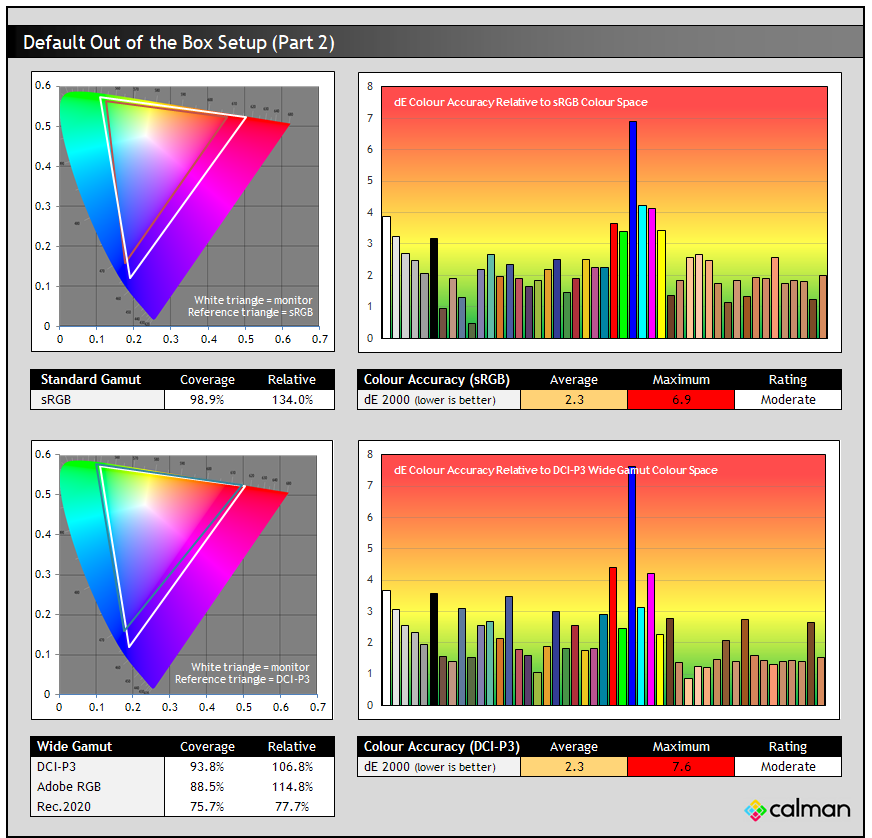
The screen has a wide colour gamut backlight with a spec listed of 128% sRGB (relative to CIE 1931) and 89% Adobe RGB (relative to CIE 1976). It gets a bit confusing for consumers when difference chromaticity references are used like this, we’d rather one standard was used for all these manufacturer specs. Oddly there is no DCI-P3 colour space spec provided, although that is probably the closest reference to the gamut the screen actually produces.
We measured a good 98.9% sRGB absolute coverage in the default mode, with an extension beyond that to 134% relative coverage. In our results here that is using CIE 1976 by the way. So this means that the native mode offers a colour space that extends a long way beyond the common sRGB reference. This leads to a moderate colour accuracy relative to sRGB content, with a dE average of 2.3. There is a maximum of 6.9 in blue shades where the produced blue colour from the backlight is quite a long way away from the sRGB blue primary shade. If you’re viewing sRGB content on this screen in native mode then that leads to some oversaturation of the colours. It makes them look more vivid and colourful which many people prefer, but may not be “accurate”. Red and blue shades will look the most different, and so if you’re planning to do any design or colour critical work with sRGB content this might cause a few challenges unless you can profile and calibrate the screen and your workflow.
In the lower section we also compare the monitors colour space against the DCI-P3 colour space. You can see that the screen offers a pretty good DCI-P3 coverage at 93.8% and the triangles match reasonably well, with the main difference being towards blue shades. Colour accuracy for DCI-P3 content is still not great because of the warmer colour temperature and the overly saturated blue shades. You can see here also that the Adobe RGB colour space coverage is basically spot on their 89% spec (88.5% measured). Further explanation of these results and graphs is provided at the bottom of the page.
sRGB Emulation Mode and Factory Calibration

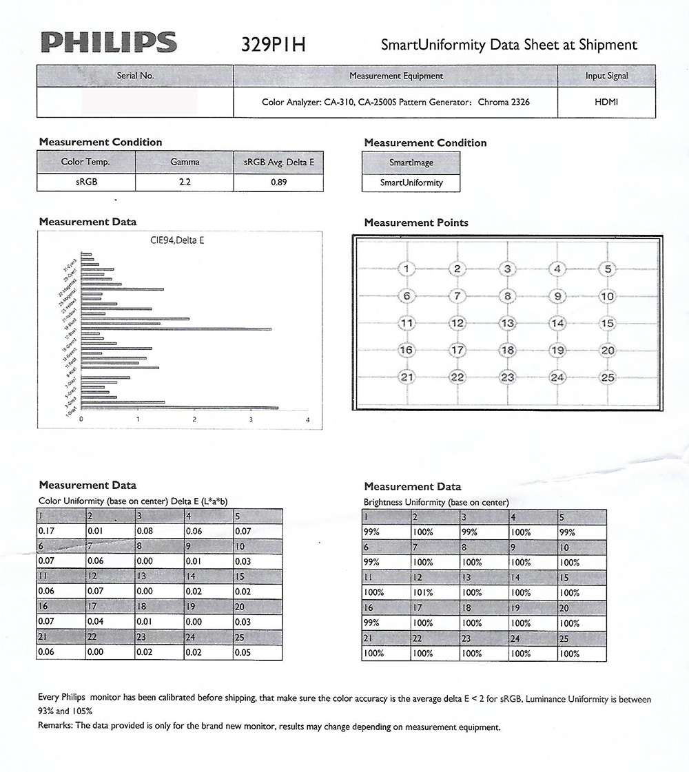
There is an sRGB emulation mode provided as well via the ‘sRGB’ colour temp mode in the menu although this has a major problem sadly. This actually carries a factory calibration, you can see a copy of the report provided with our sample [here]. This suggests a 2.2 gamma and 0.89 dE average, although you can see some larger deviances in some shades on their report. We measured the screen again in this sRGB mode, the results for gamma/greyscale/colour temp are shown above. This shows a more variable gamma curve with larger deviances in dark shades (average 2.05) being a bit of a problem, and resulting in some loss of shadow detail and overly bright blacks. Colour temp and RGB balance was a bit better than the default mode and white point was a bit closer to the target at 6263k (4% deviance). The image looked fairly decent and you could tell the gamut had been restricted to a smaller standard sRGB colour space.

The colour measurements showed a pretty good result. There was a decent emulation of the sRGB colour space, with a small under-coverage of sRGB at 93.3% measured, but very little extension beyond that reference space which was pleasing. You can see the two triangles in the CIE diagram match pretty nicely. This results in better colour accuracy when viewing sRGB content, and we measured a 1.7 dE average too.
The problem with this sRGB emulation mode, as with quite a few other screens, is that it is really inflexible. You are stuck at a maximum 100% brightness level, and cannot change that without moving out of this mode. This results in a very high 372 cd/m2 brightness which you cannot avoid. The only preset mode you can enable is ‘Smart Uniformity’ (uniformity correction) which lowers the brightness a bit down to around 302 cd/m2 but it’s still far too bright for comfortable use. This renders the sRGB emulation mode (and its factory calibration) unusable really, which is a shame as these features can be useful. You can read more about sRGB emulation, its importance and some workarounds if you’re an AMD user in our recently updated article about colour gamut.
Calibration


Calibrated results were very good as you would expect after profiling the screen. We made some useful changes to the screen settings to correct the brightness level and colour temperature, with the recommended OSD settings shown in the table above. After profiling the gamma, greyscale and colour accuracy were all very good. You can use our settings and try our calibrated ICC profile if you wish, which are available in our ICC profile database. Keep in mind that results will vary from one screen to another and from one computer / graphics card to another.
Low Blue Light Modes

We also tested the monitor colour spectrum using the UPRtek spectroradiometer, a high end device which captures accurate colour data of a display. Above shows the fairly typical spectrum in calibrated mode (at 6500k calibrated white point) with familiar high blue light peak.

There are some low blue light filter modes available in the OSD menu as well which can be useful if you’re working with a lot of office content, want to reduce the blue light output at certain times of the day and generally make the image more comfortable in these uses. We measured the maximum blue light mode (setting 4) which made the image a fair bit warmer at around 4537k and lowered the blue peak as you can see from the above spectral graph.
Uniformity

There is a supposed uniformity correction mode offered on this screen via the ‘Smart Uniformity’ preset mode so we tested that as well. Above is the uniformity of the screen without this enabled in normal conditions after calibration. You can see that the lower areas of the screen are a bit darker than the upper section, not to the point where it’s noticeable in day to day use but potentially an issue if you are wanting to do any colour critical work.

We enabled the Smart Uniformity mode from the menu which made a small impact to the brightness and contrast ratio of the display. We had to bump the brightness setting up by about 8 points to reach back to the same luminance as we had before, and the contrast ratio had taken a small hit dropping down to 921:1 but certainly nothing major. As you can see though this did nothing to improve the overall uniformity of the screen unfortunately and so offered no real benefit. This was the same in the sRGB preset mode where the screen had supposedly been factory calibrated for uniformity, so this feature didn’t seem to be working as intended sadly.
Gaming and Response Times

The P329P1H is not really aimed at gamers at all, but can handle some light gaming like RTS type games without much trouble. It’s 60Hz maximum refresh rate only so lacks the high refresh rate of proper gaming monitors that could bring about obvious improvements in motion clarity, frame rates and overall gaming experience. It does support adaptive-sync allowing for variable refresh rates from compatible NVIDIA G-sync and AMD FreeSync cards (48 – 60Hz VRR range), and helping systems cope with the varying frame rates likely to occur when powering the screen at its native 4K resolution. The support for 4K provides a nice sharp, crisp image with a high level of detail and so makes it a nice option for slower paced games. The IPS panel combined with a wide gamut backlight also helps provide a great all round image quality so if you do want to do a bit of gaming it looks pretty good. Just don’t aim to do anything too fast paced as there are certainly better gaming-focused screens available for that.
The screen has 4 overdrive modes and you can tell that the ‘Faster’ mode provides the best visual balance. The one higher mode (‘Fastest’) introduces too much overshoot with obvious pale halos so it not usable, but ‘Faster’ mode definitely looks a bit sharper and clearer than the lower modes. We measured the response times using our updated and more accurate gamma corrected method we recently wrote a detailed article about. This provides a more accurate reflection of the response times relative to how you would actually see and experience colour and brightness changes. You can see that the overall response times are not particularly good, with a 10.0ms average G2G measured although not terrible for a 60Hz IPS panel. Again, keep in mind this is not a gaming screen. There is at least very little overshoot in this mode apart from a couple of transitions where a bit of dark overshoot might appear, but this is not really visible in practice. The screen is only 60Hz as we said, so even with this relatively slow response time performance you get good refresh rate compliance with 93% of the transitions within that refresh rate window. There was also no lag on this screen with an estimated 0.1ms signal processing lag measured.
Conclusion
The 329P1H was a very versatile and well thought out office monitor and we were impressed by its range of features and overall performance. The inclusion of things like a USB type-C docking function, RJ45 Ethernet connection, motion sensor, ambient light sensor and integrated pop-up webcam were great, and set this screen apart from many mainstream office-type screens. One of the other key features is the 4K resolution IPS panel which provided very good all round performance, sharp and crisp images and a large enough 31.5″ screen size to make use of a bit of a bump in desktop space if you use 125% scaling (or maybe even 100% if you’re feeling brave). Default setup was decent and there were a good range of options in the menu to play with. The wide colour gamut and 10-bit colour depth will be useful to some users, but we were a bit disappointed in the provided sRGB emulation mode which was severely limited because of its inability to adjust the brightness control. This rendered it (and the factory calibration which applied to this mode) unusable sadly. Likewise we were a bit disappointed that the uniformity correction mode didn’t seem to work properly.
Even away from the primary target office work the screen is aimed at, the 329P1H did pretty well for gaming too. It’s 60Hz only so don’t expect anything amazing but the response times were decent enough, there was no overshoot in the optimal ‘Faster’ mode, VRR was supported up to 60Hz and there was also next to no input lag. So if you do want to do a bit of light gaming, play RTS-type games or just have a break from all your normal work then this screen can also handle that fine.
The Philips 329P1H is available in many regions now from Amazon (affiliate referral link) and if you’re looking for an office or home-working monitor with a great range of features and solid performance then you should definitely consider the 329P1H.

Testing and Results Explained
We will test and measure a range of aspects of these displays. By way of a brief explanation of what some of the results mean we thought we’d include this short guide:
Results Round-up section
- Maximum and minimum brightness – the full range in which the backlight can be adjusted using the monitor’s brightness control. At the upper end this can be important for gaming from a further distance, especially in brighter rooms and the daytime. At the lower end this can be important if you are using the screen up close for more general office-type work, especially in darker room conditions or at night.
- Recommended brightness setting – to achieve approx 120 cd/m2, which is the recommended luminance for LCD monitors in normal lighting conditions
- Flicker free – independently tested and confirmed whether the screen is flicker free or not and without PWM at all brightness settings
Setup and Measurements Section

Performance is measured and evaluated with a high degree of accuracy using a range of testing devices and software. The results are carefully selected to provide the most useful and relevant information that can help evaluate the display while filtering out the wide range of information and figures that will be unnecessary. For measurement we use a UPRtek MK550T spectroradiometer which is particularly good for colour gamut and spectrum measurements. We also use an X-rite i1 Pro 2 Spectrophotometer and a X-rite i1 Display Pro Plus for measurements in various ways. Various software packages are incorporated including Portrait Displays Calman Ultimate package. We measure the screen at default settings (with all ICC profiles deactivated and factory settings used), and any other modes that are of interest such as sRGB emulation presets. We then calibrate and profile the screen.
The results presented can be interpreted as follows:
- Greyscale dE – this graph tracks the accuracy of each greyscale shade measured from 0 (black) to 100 (white). The accuracy of each grey shade will be impacted by the colour temperature and gamma of the display. The lower the dE the better with differences of <1 being imperceptible (marked by the green line on the graph), and differences between 1 and 3 being small (below the yellow line). Anything over dE 3 needs correcting and causes more obvious differences in appearance relative to what should be shown. In the table beneath the graph we provide the average dE across all grey shades, as well as the white point dE (important when considering using the screen for lots of white background and office content), and the max greyscale dE as well.
- RGB Balance and colour temperature – the RGB balance graph shows the relative balance between red, green and blue primaries at each grey shade, from 0 (black) to 100 (white). Ideally all 3 lines should be flat at the 100% level which would represent a balanced 6500k average colour temperature. This is the target colour temperature for desktop monitors and the temperature of daylight. Where the lines deviate from this 100% flat level the image may become too warm or cool. Beneath this RGB balance graph we provide the average correlated colour temperature for all grey shades measured, along with its deviance from the 6500k target. We also provide the white point colour temperature and its deviance from 6500k, as this is particularly important when viewing lots of white background and office content.
- Gamma – we aim for 2.2 gamma which is the default for computer monitors. A graph is provided tracking the 2.2 gamma across different grey shades and ideally the grey line representing the monitor measurements should be horizontal and flat at the 2.2 level. Depending on where the gamma is too low or too high, it can have an impact on the image in certain ways. You can see our gamma explanation graph to help understand that more. Beneath the gamma graph we include the average overall gamma achieved along with the average for dark shades (0 – 50) and for lighter shades (50 – 100).
- Luminance, black depth and Contrast ratio – measuring the brightness, black depth and resulting contrast ratio of the mode being tested, whether that is at default settings or later after calibration and profiling.
- Gamut coverage – we provide measurements of the screens colour gamut relative to various reference spaces including sRGB, DCI-P3, Adobe RGB and Rec.2020. Coverage is shown in absolute numbers as well as relative, which helps identify where the coverage extends beyond a given reference space. A CIE-1976 chromaticity diagram (which provides improved accuracy compared with older CIE-1931 methods) is included which provides a visual representation of the monitors colour gamut as compared with sRGB, and if appropriate also relative to a wide gamut reference space such as DCI-P3.
- dE colour accuracy – a wide range of colours are tested and the colour accuracy dE measured. We compare these produced colours to the sRGB reference space, and if applicable when measuring a wide gamut screen we also provide the accuracy relative to a specific wide gamut reference such as DCI-P3. An average dE and maximum dE is provided along with an overall screen rating. The lower the dE the better with differences of <1 being imperceptible (marked by the green area on the graph), and differences between 1 and 3 being small (yellow areas). Anything over dE 3 needs correcting and causes more obvious differences in appearance relative to what should be shown
Gaming Performance Section
We first of all test the screen visually in each of its available overdrive modes and at a range of refresh rates from 60Hz, all the way up to the maximum supported. This allows us to identify what appears to be optimal setting for each refresh rate and we can then measure the response times across a range of grey to grey (G2G) transitions using our oscilloscope setup, including correcting for gamma to improve accuracy as we described in our detailed article. This helps provide measurements for response times and overshoot that are even more representative of what you see in realuse. In the summary section the small table included shows the average G2G response time measured at several refresh rates (where supported), along with the optimal overdrive setting we found. The overshoot level is then also rated in the table at each refresh rate. We will explain in the commentary if there are any considerations when using variable refresh rates (VRR) as well as talking about the overall performance our findings during all these tests.
At the maximum refresh rate of the screen we will also include our familiar more detailed response time measurements, which includes a wider range of transition measurements as well as some analysis of things like the refresh rate compliance. This identifies how many of the measured pixel transitions were fast enough to keep up with the frame rate of the screen. Ideally you’d want pixel response times to be consistently and reliably shorter than this refresh rate cycle, otherwise if they are slower it can lead to additional smearing and blurring on moving content.
In this section we will also include the measured input lag and look at any blur reduction backlight feature if it’s available. The commentary in each section will provide more information if a blur reduction mode is available and how it operates.