The Pointer’s Gamut – The Coverage of Real Surface Colors by RGB Color Spaces and Wide Gamut Displays
Kid Jansen, Updated 19 February 2014

Introduction
Something that has interested me for a couple of years already is the ability of displays to represent colors as they are in the real World. Very often this will depend mostly on the size of the color gamut of the display, but it is also very dependent on the color space the content was captured in and the color space it was exported in. Therefore, to get a good idea of the ability of the display to represent colors true to life, it is important to know to what amount the color gamut of the display covers certain color spaces.
Perhaps the most important of all color spaces would be the Pointer’s gamut. The Pointer’s gamut is an approximation of the gamut of real surface colors based on the research by dr. Michael R. Pointer. So far I haven’t been able to get my hands on the paper, but when searching for the data I did find Jeff Yurek’s blog dot-color.com. He wrote a couple of articles discussing the Pointer’s gamut and was able to provide me with the Pointer’s gamut data (which I later also found on the website of Center for Imaging Science).
With this data I was able to write a Matlab program that calculates the coverage of the Pointer’s gamut by any color space or color gamut in both the CIE 1931 xy chromaticity diagram and the CIE 1976 u’v’ chromaticity diagram. This also gave me the idea of writing this article to explain more.
Chromaticity Diagrams
Let us start with how color spaces and color gamuts are defined: Every color can be divided into a chromaticity and a brightness component. The brightness component speaks for itself. The chromaticity component describes the proportion of the different wavelengths that make up the color. Chromaticity is also what defines a color space or color gamut. There are two common ways to do that: the CIE 1931 xy chromaticity diagram and the CIE 1976 u’v’ chromaticity diagram.
CIE 1931 xy chromaticity diagram
The full origin and derivation of the CIE 1931 xy chromaticity diagram is beyond the scope of this text. In short: based on the results of experiments conducted in the 1920’s to quantify human color vision the CIE (International Commission on Illumination) created the CIE 1931 XYZ and CIE 1931 RGB color spaces. From the CIE 1931 XYZ color space the CIE 1931 xyY color space was derived, which separates the chromaticity part of a color (xy) from the luminance part (Y). The CIE 1931 xy chromaticity diagram is the visualization of all different chromaticities in the xyY color space and therefore also of all chromaticities perceivable by the human eye. It is a means to describe the gamut of a color space or display by the chromaticity of its primaries.
/figure1_cie1931.jpg)
Spectral locus
The curve surrounding the tongue shaped area is called the spectral locus. This line represents all the monochromatic colors (colors of one wavelength, or fully saturated colors). You’ll notice that in the image above it ranges from 380 to 700 nm, however, every wavelength is on the spectral locus. It’s just that the cone cells in our retina aren’t sensitive to electromagnetic radiation of wavelengths shorter than 360 nm or longer than 780 nm and the sensitivity is already negligible below 380 or above 700 nm (Figure 2). Therefore they are infinitely close together on the spectral locus, so that every wave length shorter than 360 nm will have the same chromaticity coordinates as 360 nm and every wavelength longer than 780 nm will have the same chromaticity coordinates as 780 nm. Thus adding nothing to the size of the tongue shaped area.
/figure2_spectral%20sensitivity%20cone%20cells.jpg)
Line of purples
The line of purples is the straight line connecting both ends of the spectral locus. While every color on the line of purples is a combination of violet (360 nm) and red (780 nm), all these colors are fully saturated. This is also the reason why you will never see a magenta primary on a display. It would be completely redundant, because it would add nothing the shades of purple that could already be reproduced by mixing violet and red. It would also be extremely hard, if not entirely impossible to make because it would require a dual band pass filter with very narrow bands.
Planckian locus
The curve inside the tongue shaped area is called the Planckian locus. The points that make up the Planckian locus are the chromaticity coordinates of the light emitted by a black body radiator of a certain temperature in Kelvin. The lines crossing the Planckian locus are the isotherms: a near black body radiator on an isotherm would have a correlated color temperature equal to the black body radiator at the intersection of the isotherm and the Planckian locus.
CIE 1976 u’v’ chromaticity diagram
The research of David L. MacAdam (1942) showed that the CIE 1931 xy chromaticity diagram did not offer perceptual uniformity. What this means is that the relation between the measurable chromaticity of a color and the error margin in observation, was not consistent within the CIE 1931 xy chromaticity diagram. In his experiment observers were asked to match the color of an adjustable light source with the color of a fixed reference light. This experiment showed that when mapped in the CIE 1931 xy chromaticity diagram the error margin was far greater with green hues than with blue or violet hues.
This is shown in Figure 3, where the dots represent the chromaticity of the test colors and the ellipses the error margin in matching the color by the observer multiplied by a factor of 10. These ellipses are called the MacAdam ellipses. In a perfectly uniform color space these ellipses would all be circles of equal size.
/figure3_MacAdam%20ellipses%20CIE1931.jpg)
Figure 3: MacAdam ellipses plotted in the CIE 1931 xy chromaticity diagram. Click for larger version
To improve upon the CIE 1931 XYZ color space using the work of MacAdam, the CIE created the CIE 1976 L*u*v* (also known as CIELUV) color space as an attempt to offer perceptual uniformity. This color space had, like the CIE 1931 XYZ color space, a chromaticity diagram: the CIE1976 u’v’ chromaticity diagram or CIE 1976 UCS (Uniform Chromaticity Scale) shown below:
/figure4_cie1976.jpg)
Figure 4: CIE 1976 u’v’ chromaticity diagram. Click for larger version
The CIE 1976 u’v’ chromaticity diagram does seem to have a better perceptual uniformity when plotting the MacAdam ellipses in it. The size disparity is smaller and the elongation is also less prevalent (the ellipses are closer to being circles):

Figure 5: MacAdam ellipses in CIE 1976 u’v’ chromaticity diagram
There are however more recent studies that question the validity of the MacAdam ellipses. Wyszecki and Fielder (1971) measured their own color-discriminating ellipses, but ended up with ellipses of different orientation, shape and size to the ones from MacAdam. Goldstein (2012) uses a different approach. He calculated the size and orientation of color-discriminating ellipses for the same test colors as MacAdam for CIE ΔE 2000 = 1 and for CIE ΔE 2000 = 3. This resulted in ellipses that were more uniform in the CIE 1931 xy chromaticity diagram than in the CIE 1976 u’v’ chromaticity diagram. Both the ratio between the major and minor axis of the most stretched ellipse and the ratio between the major axes of the longest and the shortest ellipses were higher in the CIE 1976 u’v’ chromaticity diagram.
To date the CIE 1931 xy chromaticity diagram has been the standard. Taking into account the work of Goldstein that might not be such a bad thing. However, as often is the case in science, different methods may yield different results. The correct value isn’t necessarily the result of any method, but might as well be somewhere in between. The remainder of this article will therefore discuss everything for both the CIE 1931 xy and the CIE 1976 u’v’ chromaticity diagrams.
Pointer’s gamut
The Pointer’s gamut is (an approximation of) the gamut of real surface colors as can be seen by the human eye, based on the research by Michael R. Pointer (1980). What this means is that every color that can be reflected by the surface of an object of any material is inside the Pointer’s gamut. You could therefore also say that the Pointer’s gamut is the set of colors that can be reproduced using subtractive color mixing, which is a subset of the set of colors reproducible using additive color mixing (or simply all colors). The two chromaticity diagrams discussed earlier are visualizations of the set of colors using additive color mixing.
Additive color mixing
With additive color mixing you can create a new color by mixing light of different wavelengths and varying the brightness. If for instance you were to take a light source with a wavelength of 585 nm (amber yellow) and another light source with a wavelength of 485 nm (bright azure), you could reproduce any color along the line between 585 nm and 485 nm (in any chromaticity diagram) by varying the brightness of both light sources. This also means that if the line between one pair of chromaticities crosses the line between another pair of chromaticities, those two pairs can create a color that will be perceived as identical for both pairs, but will have a different spectral distribution. This effect is called metamerism and is the foundation of color display: using different primaries across various systems to describe or reproduce colors that are perceived as identical, but with different spectral distribution.
Subtractive color mixing
With subtractive color mixing, light isn’t emitted by the “source”, but only reflected. The color of any object as we perceive it is the combination of wavelengths from the light source illuminating the object (often the sun, but also artificial light sources) that is reflected by the object. All other wavelengths of the light source are absorbed by the object.
The reason I chose 485 and 585 nm in the example for additive mixing is that in theory you could create a very accurate daylight simulator with just these two wavelengths when comparing the chromaticity to that of a black body radiator or daylight simulator. The default white point for nearly every display panel to date is the CIE Standard Illuminant D65. This is a daylight simulator for a midday sun in Northern / Western Europe. D65 is a near black body radiator (slightly more greenish) with a correlated color temperature of 6503.6 k. In the CIE 1931 xy chromaticity diagram it has the coordinates x = 0.31271 and y = 0.32902. By mixing light with wavelengths 485 and 585 nm, you could come very close to D65: x = 0.31271 y = 0.33076, which would have CCT of 6492 K (McCamy method). So with just these two wavelengths you could simulate daylight white when observed directly from the source.
However, if you were to illuminate an object with just 485 and 585 nm light sources, the color would appear to be a combination of just these two wavelengths. If the object were to be a very saturated deep hue of green, it would appear to be (near) black, as 485 and 585 nm aren’t reflected by its surface (assuming a matte surface and no fluorescence).
Diffuse reflection vs. specular reflection
Apart from the color quality of the light source, subtractive color mixing is also highly sensitive to surface smoothness. Pointer’s gamut is defined for diffuse reflection (matte surface). As opposed to diffuse reflection there is specular reflection, or mirror like reflection. By specular reflection objects can reflect colors that are outside the Pointer’s gamut.
For instance a matte black car absorbs (nearly) all light that falls on it, because it is just a diffuse reflector (not a very good one though, because it’s black). A glossy black car however would just absorb a portion of the light that falls on it, because it’s not only a diffuse reflector, but also a specular reflector. When standing next to it you would be able to see your own image in it, although highly distorted: by both the shape of the car on a large scale and the imperfectness of the glossy paint as specular reflector on a small scale.
A better example of a reflector both diffuse and specular would be a red glossy car. Because of diffuse reflection it appears to be red, when you drive it through a green forest though it also reflects the green of the trees by specular reflection. Because both happen at the same time the green from the trees would appear a far less deep hue of green and also far less saturated in the reflection on the car than we viewed directly or in a mirror (near perfect specular reflector). At the same time the red color of the car also appears to change in hue and saturation, because the diffusely reflected red mixes with the specularly reflected green.
Just like the red car, most metals and alloys are also both a diffuse and specular reflector. And like the car the proportion of diffuse and specular reflection is dependent on the wavelength. Silver for instance is a diffuse reflector that’s very constant for all visible wavelengths. The color of silver is therefore a darker version of the light source illuminating it; the chromaticity will be nearly identical. Gold however is only a diffuse reflector up from around 500 nm, for shorter wavelengths it only reflects specularly. This is why gold has the color as we know it. For copper the same applies, but with an even longer wavelength as threshold: about 570 nm.
In a way that’s quite similar to an object being both a diffuse and specular reflector, resulting in a combination of additive and subtractive color mixing, light can also change in chromaticity by passing through a substance. A good example of that is sunlight passing through the atmosphere. From the moment sunlight reaches the edge of the atmosphere to the moment it reaches the surface of the earth it has lost in power over three quarters of the UV-spectrum and about 10-20% of the visible spectrum on a clear day. By then it’s a combination of direct, scattered and reflected light. The scattering is also the reason why the sky is blue, a phenomenon called Rayleigh scattering, where light is scattered by particles much smaller than the wavelength of the light.
Pointer’s gamut in CIE 1931 xy chromaticity diagram
Pointer’s gamut covers 47.9% of the chromaticities in the CIE 1931 xyY color space. The irregular shape of Pointer’s gamut immediately clarifies why it’s hard to make a display that can reproduce all colors in the Pointer’s gamut using RGB primaries. In fact, as will be shown later in this article, it’s impossible to create an RGB color space using real primaries (as opposed to imaginary primaries) that covers a true 100% of the Pointer’s gamut. For that a color model with at least 4 primaries is required.
 |
| Figure 6: Pointer’s gamut in CIE 1931 xy chromaticity diagram |
Pointer’s gamut in CIE 1976 u’v’ chromaticity diagram
Pointer’s gamut covers 46.2% of the chromaticities in the CIE 1976 L*u*v* color space. When comparing the Pointer’s gamut in the CIE 1931 xy chromaticity diagram to the Pointer’s gamut in the CIE 1976 u’v’ chromaticity diagram (Figure 6 and 7), you’ll notice a large difference in the colors outside of Pointer’s gamut. In the CIE 1931 xy chromaticity diagram these are mostly green and cyan hues, while in the CIE 1976 u’v’ chromaticity diagram they are mostly blue and violet hues. This is due to the fact that the linear density along the spectral locus in the CIE 1931 xy chromaticity diagram differs quite a lot from that in the CIE 1976 u’v’ chromaticity diagram. In the CIE 1931 xy chromaticity diagram peak sensitivity is at 497 nm (cyan) and in the CIE 1976 u’v’ chromaticity diagram it’s at 483 nm (azure). While a difference of only 14 nm in wavelength might seem small, you can see that in both the CIE 1931 xy chromaticity diagram and the CIE 1976 u’v’ chromaticity diagram this results in a pronounced difference in hue. Another reason for the difference between the Pointer’s gamut in the CIE 1931 xy and the CIE 1976 u’v’ chromaticity diagram, is the increased sensitivity for purple hues in the CIE 1976 u’v’ chromaticity diagram.
 |
| Figure 7: Pointer’s gamut in CIE 1976 u’v’ chromaticity diagram |
RGB Color spaces
Nearly every capture – or display device nowadays uses an RGB color model to describe the color for every pixel. Looking at the CIE 1931 xy and CIE 1976 u’v’ chromaticity diagrams it’s easy to see why: when using three primaries you can cover the most by using red, green and blue primaries. This data has a little meaning though without a color space assigned to it. A pixel with 8-bit color depth per channel with RGB value [255; 0; 0] would obviously be red. But without a color space assigned there would be no way to tell what the chromaticity for red should be. If the gamut of the capture device would be identical to that of the display device and the two were directly connected, that wouldn’t be a problem. Unfortunately that’s never the case.
Rec. 709 / sRGB
Rec.709
The ITU-R Recommendation BT. 709, or simply Rec. 709, standardizes the format of high-definition television, first approved in 1990. It specifies many aspects of image display, but what we’re interested in here are the primary chromaticities. These are mostly identical to the ones specified by ITU-R BT. 470-6 / EBU Tech 3213 used for PAL-television, only the x-coordinate for green is different in the CIE 1931 xy chromaticity diagram.

When plotted in either the CIE 1931 xy or CIE 1976 u’v’ chromaticity diagram it immediately becomes apparent that this is a fairly small color space. In the CIE 1931 xy chromaticity diagram it covers only 33.5% of the chromaticities and 69.4% of Pointer’s gamut. In CIE 1976 u’v’ these values are 33.2% and 70.2% respectively.
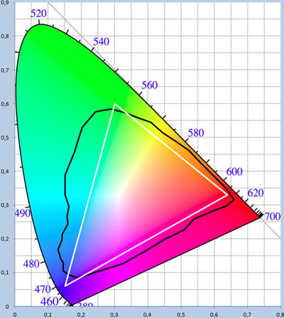
Figure 8: Rec. 709 / sRGB and Pointer’s gamut in CIE 1931 xy chromaticity diagram
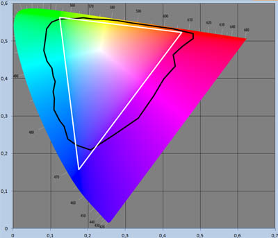
Figure 9: Rec. 709 / sRGB and Pointer’s gamut in CIE 1976 u’v’ chromaticity diagram
sRGB
sRGB is an RGB color space created by HP and Microsoft in 1996, for use on displays, printers and the Internet. The sRGB color space uses the same primaries and white point as Rec. 709. The biggest difference between these two is that sRGB is just an absolute color space, specifying only chromaticities of primaries and white point and a gamma correction curve. Whereas Rec. 709 specifies far more aspects of image display, including pixel count and frame rate.
There are also differences in the properties specified by both – Rec. 709 coding use SMPTE reference levels (also known as narrow range), where reference black has an 8-bit RGB value of [16; 16; 16] and reference white [235; 235; 235], sRGB uses the full 8-bit color depth for each channel. There’s also a difference in gamma, Rec. 709 uses a gamma of 2.4, whereas sRGB uses an average gamma of 2.2.
At the time of introduction most CRT monitors were able to reproduce the entire sRGB color space, having color gamuts with very similar primaries, aiding greatly with its acceptance. This continued with the introduction of TFT LCD displays. Nowadays most display panels still have a color gamut with primaries that a more or less the same as the ones sRGB uses. This has led to most software being designed with the assumption that in the absence of a color profile specifying otherwise the color gamut of the display can be assumed to be equal to the sRGB color space. This is also true for all popular operating systems, regardless of platform. The same applies for content without a color profile.
This would all be great (most displays and software all using the same color space), if it weren’t for the fact that sRGB is a quite small color space. On a wide gamut display all colors would be oversaturated without calibration. Once calibrated content exported in sRGB or without a color space assigned to it (and therefore assumed as sRGB) would be displayed correctly. This however does also mean that out of the entire gamut of the display only the part covered by the sRGB color space will be used. Seems a bit pointless to put any effort in display quality if you’re going to limit the color output to just over two thirds of the Pointer gamut and just a third of all colors. In the very least you would like to cover all diffuse surface colors (Pointer’s gamut). But it would make sense to cover even more, since the color gamut of objects extends outside the Pointer’s gamut with specular reflection and light passing through a substance can also easily have a chromaticity that’s outside the Pointer’s gamut. The sky for instance can have many colors in it not inside the Pointer’s gamut.
Adobe RGB
The Adobe RGB (1998) color space was developed by Adobe Systems, Inc. to improve upon the gamut of the sRGB color space in primarily cyan-green hues, for better conversion to the subtractive CMYK color model used by printers. It uses the same red and blue primaries as the sRGB color space, but the green primary is more saturated and also of a much deeper hue of green (sRGB uses a rather yellowish hue of green). The green primary is the same as that of the NTSC 1953 color space.

In the CIE 1931 xy chromaticity diagram this results in a significant improvement over the sRGB color space, covering 45.2% of all chromaticities and 86.2% of Pointer’s gamut. In the CIE 1976 u’v’ chromaticity diagram the difference is far less pronounced: covering 38.7% of all chromaticities and 80.3% of Pointer’s gamut. This is due to Adobe RGB using the same red and blue primaries as sRGB. This also brings us to one of the downsides of Adobe RGB: for wide gamut displays it’s still not wide enough, primarily in red and blue, and at the same time it’s not as widely supported as sRGB.

Figure 10: Adobe RGB and Pointer’s gamut in CIE 1931 xy chromaticity diagram

Figure 11: Adobe RGB and Pointer’s gamut in CIE 1976 u’v’ chromaticity diagram
Adobe Wide Gamut RGB
The Adobe Wide Gamut RGB color space was, like the Adobe RGB ’98 color space, developed by Adobe System, Inc. It has a very wide gamut by using monochromatic primaries with very wide spread hues. It covers 77.6% of the CIELAB color space, whereas the Adobe RGB ’98 color space only covers 52.1% and sRGB 35.9%.

In the CIE 1931 xy chromaticity diagram the Adobe Wide Gamut RGB color space covers 71.5% of all chromaticities and 99.1% of Pointer’s gamut. In the CIE 1976 u’v’ chromaticity diagram the coverage is 76.1% and 98.5% respectively.

Figure 12: Adobe Wide Gamut RGB and Pointer’s gamut in CIE 1931 xy chromaticity diagram

Figure 13: Adobe Wide Gamut RGB and Pointer’s gamut in CIE 1976 u’v’ chromaticity diagram
Drawbacks of using Adobe Wide Gamut RGB
Using the Adobe Wide Gamut RGB color space has a couple of drawbacks though. With the currently technology it would be extremely hard, if not altogether impossible, to create a display that can reproduce this color gamut. Even if it were possible to produce a display with these primaries, the red one would have to be extremely bright, because our eyes are hardly sensitive to light with a wavelength of 700 nm (as can be seen in Figure 2).
It also uses the CIE Standard Illuminant D50 as white point. Nearly all display panels use D65 as native white point. Changing this results in the loss of usable color depth. With 8-bit color depth white would no longer be [255; 255; 255], but more something along the line of [255; 250; 240] (not actually calculated). This brings us to the next problem: a color space this size would require a high color depth to avoid posterization effects (color banding). To date setting up an end to end workflow with 10-bit color depth per channel has proven to be quite a challenge already, and that might not even cut it. For a color space this size 12-bit or even 16-bit color depth per channel might be necessary.
The reason it’s hard to set up an end to end Deep color workflow is because there are a couple of bottlenecks in the chain (in bold):
Capture device > file format > application > operating system > graphics card driver > graphics card > interface/interconnect > display electronics > display panel
- Applications: while there are many applications that support working and exporting in high color depth (mainly image / video editing or content creation software), hardly any of them support 10-bit display output. With a quick search the only two I could find were Adobe Photoshop (CS6 or newer) and Zoner Photo Studio (v13 or newer).
- Graphics card driver: even though nearly all modern graphics cards have hardware support for Deep Color, it’s only usable on the Nvidia Quadro (not including Quadro NVS) and AMD FirePro series of graphics cards for professional use. For some reason a lot of features aren’t available on graphics cards of the Nvidia GeForce and AMD Radeon series, even though the hardware fully supports it. Among these are 10-bit color depth support and full OpenGL support.
- Display panel: true 10-bit display panels are quite scarce and the displays that hold them are usually very expensive. Most displays that are specified as having 10-bit color depth are in fact regular 8-bit color depth panels with an FRC-module implemented in the display electronics. FRC stands for Frame Rate Control, a form of temporal dithering. When an 8-bit+FRC panel is told to display a 10-bit color that isn’t an 8-bit color, it will alternate between the two closest 8-bit colors with each subsequent frame, thus approximating the desired color. The downside of this is that it only works well for static content. With darker colors it can also produce some visible flicker.
DCI-P3
The DCI-P3 color space is a part of the SMPTE RP 431-2 standard for “Digital Cinema Quality – Reference Projector and Environment”, which was first released by the SMPTE (Society of Motion Picture & Television Engineers) in 2007. The latest version of this standard is RP 431-2:2011. The SMPTE RP 431-2 standard defines the Reference Projector and its controlled environment, along with the acceptable tolerances around critical image parameters for Review Room and Theatre applications. The goal is to provide a means for achieving consistent and repeatable color image quality. (Source: SMPTE).
The “DCI” in the name of the DCI-P3 color space stands for Digital Cinema Initiatives, LLC. This is a joint venture, founded in 2002, of seven of the largest motion picture studios:
- 20th Century Fox
- Metro-Goldwyn-Mayer
- Paramount Pictures
- Sony Pictures Entertainment
- Universal Studios
- The Walt Disney Company
- Warner Bros.
Although Metro-Goldwyn-Mayer withdrew as a member of DCI in May 2005, prior to the release of the DCI specification. (Source: DCI)
The DCI-P3 color space uses the same blue primary as the Rec. 470-6, Rec. 709, sRGB and Adobe RGB color spaces, but it uses different green and red primaries. The red primary of DCI-P3 is monochromatic 615 nm, a slightly deeper hue of red than the nearly monochromatic 611 nm red primary of NTSC 1953. The green primary is a slightly more yellowish hue of green than that of the Adobe RGB and NTSC 1953 green primary, but more saturated.

In the CIE 1931 xy chromaticity diagram the DCI-P3 color space covers 45.5% of all chromaticities and 86.9% of Pointer’s gamut. In the CIE 1976 u’v’ chromaticity diagram the coverage is 41.7% and 85.5% respectively.

Figure 14: DCI-P3 and Pointer’s gamut in CIE 1931 xy chromaticity diagram

Figure 15: DCI-P3 and Pointer’s gamut in CIE 1976 u’v’ chromaticity diagram
The high saturation of the red and green primaries does make it hard to work in this color space on regular computer displays, because even the widest gamut panels cannot cover the entire DCI-P3 color space. The only display I could find that covers the entire DCI-P3 color space is the Dolby Professional Reference Monitor PRM-4200. The new Canon DP-V3010 reference display also comes very close though. This probably has to do with the fact that the DCI-P3 color space is designed for cinema projectors, not displays.
NTSC 1953
NTSC 1953 was the analog television standard for most of the Americas and a few countries in Asia. Today it’s no longer used for that purpose, because analog television has been superseded by digital television. A few specifications of the NTSC 1953 standard are still in use today though. DVD’s released in countries that used NTSC are still in 480i resolution. Nearly all video content in these countries still uses the NTSC frame rate of 60Hz.
NTSC uses a red primary that’s a more orange hue of red than the one used by sRGB and Adobe RGB, but very saturated, it’s very close to monochromatic 611 nm light. The green primary is the same as the one used by the Adobe RGB color space (or actually it’s the other way round). The blue primary is about as saturated as the one used by the sRGB and Adobe RGB colour spaces, but with a hue closer to azure than blue. In CIE 1931 xy it covers 47.3% of all chromaticities and 89.5% of Pointer’s gamut. In CIE 1976 u’v’ these numbers are 38.1% and 79.4% respectively.

While the NTSC 1953 color space is no longer used for its original purposes, it is still used as a reference to describe the size of the color gamut of a display. This is simply done by comparing the size. You calculate the area of the color gamut in the CIE 1931 xy chromaticity diagram using the chromaticity coordinates and divide the result by 0.1582 (the area of NTSC 1953 in CIE 1931 xy). The size of the gamut is therefore only relative and not equal to the coverage of the NTSC 1953 color space, unless all three primaries of the color gamut of the display lie inside or on the edges of the NTSC color space.
The same can be done in the CIE 1976 u’v’ chromaticity diagram by converting the CIE 1931 xy chromaticity coordinates of both the NTSC 1953 color space and the display gamut and calculate the area using those converted coordinates. This usually results in a higher number, because most displays use a deeper hue for both the red and blue primary than the NTSC 1953 color space. In the CIE 1976 u’v’ chromaticity diagram these make up larger portion of the colors than in the CIE 1931 xy chromaticity diagram.

Figure 16: NTSC 1953 and Pointer’s gamut in CIE 1931 xy chromaticity diagram

Figure 17: NTSC 1953 and Pointer’s gamut in CIE 1976 u’v’ chromaticity diagram
ProPhoto RGB
ProPhoto RGB is a rather unusual color space, because it uses imaginary green and blue primaries. Part of the color space is therefore imaginary as well. The red primary is the same as in the Adobe Wide Gamut RGB color space: monochromatic 700 nm.
The most notable use of the ProPhoto RGB color space is by the Adobe Lightroom and Adobe Camera RAW software, however not in pure form. The Lightroom RGB space uses a gamma of 1.0, whereas ProPhoto RGB uses a gamma of 1.8. The reason for this is that Lightroom is primarily a RAW-image editor and RAW-images are not gamma encoded, but use a linear gamma of 1.0. The Lightroom RGB space does use the same primaries as ProPhoto RGB though.

Figure 18: ProPhoto RGB and Pointer’s gamut in CIE 1931 xy chromaticity diagram

Figure 19: ProPhoto RGB and Pointer’s gamut in CIE 1976 u’v’ chromaticity diagram
Most, if not all sources, will claim that 13% of the colors in the ProPhoto RGB color space are imaginary. In the CIE 1931 xy chromaticity diagram only 4.41% of the chromaticities in ProPhoto RGB fall outside of the CIE 1931 xyY color space and are therefore imaginary. In the CIE 1976 u’v’ chromaticity diagram 11.87% of the chromaticities in ProPhoto RGB fall outside the CIE L*u*v* color space. I assume that for the 13% value the CIELAB color space was used as a reference, unfortunately none of the sources I could find specifies that.
In the CIE 1931 xy chromaticity diagram 79.2% of the chromaticities are covered by the ProPhoto RGB color space, in the CIE 1976 u’v’ chromaticity diagram this is 76.5%. In both chromaticity diagrams the Pointer’s gamut is completely covered.
Rec. 2020
Much like with Rec. 470, Rec. 601 and Rec. 709 the Rec. 2020 standard is more than just a color space. It is the standard for Ultra High Definition Television (UHD-TV), which knows two versions: 4K (3840×2160 and 4096×2160) and 8K (7680×4320 and 8192×4320). Apart from the obvious improvement in resolution over the Rec. 709 standard, the Rec. 2020 standard also improves upon its predecessor in many other ways. The maximum frame rate doubles from 60 Hz progressive to 120 Hz progressive (interlaced resolutions are no longer supported, which is good). The color depth also increases by at least 2 bits per channel, with the possibility of 4 bits. Because Rec. 709 and Rec. 2020 both use studio swing /narrow band, this does not result in the usual 16.8 million, 1.07 billion and 68.7 billion colors though.
| Bit depth per channel | Reference black level | Reference white level | Usable combinations per channel | Total number of colors |
| 8 | 16 | 235 | 220 | 10,648,000 |
| 10 | 64 | 940 | 877 | 674,526,133 |
| 12 | 256 | 3760 | 3505 | 43,059,012,625 |
Last but not least, the Rec. 2020 offers significant improvement over the Rec. 709 standard when it comes to the color gamut: nearly twice the size of its predecessor. It uses three monochromatic primaries with wavelengths of 630, 532 and 467 nm. This results in a very large gamut, but without most of the drawbacks of even larger color spaces like the Adobe Wide Gamut RGB color space.
Most of the thought process behind the origin of these primaries can be found in ITU Recommendation BT 2246-2:2012. The summarized version is that UHD-TV should have a larger color gamut in order to cover the real surface colors (based on Pointer’s gamut and SOCS database) as much as possible using real primaries.
Two sets of primaries were proposed. Korea proposed 625, 531 and 467 nm, because 625 and 531 nm are on the equi-hue lines of the red and green primaries respectively of LED-backlit LCD and AMOLED. Japan proposed 635, 532 and 467 nm, because 635 and 532 are easily realized with current laser technology.
For red the equi-hue lines for CIELAB ΔE= ±2 for 625, 635 and their average, 630 nm, were plotted in the CIE 1931 xy chromaticity diagram. The equi-hue area for 630 nm with CIELAB ΔE= ±2 largely overlapped with those for 625 and 635 nm. So 630 nm was chosen as red primary, because it could reflect the characteristics of both displays types (flat panel and laser displays).
The performance of both modified sets, using the same 630 and 467 nm red and blue primaries, but different green primaries of 531 and 532 nm, was then tested by calculating the coverage of the Pointer’s gamut and the DCI-P3, Rec. 709, NTSC 1953 and Adobe RGB color spaces. While there was no significant difference between the two, the 532 nm primary proposed by Japan was chosen as the green primary for Rec. 2020.

The resulting colors space covers 63.3% of all chromaticities and 99.9% of Pointer’s gamut in the CIE 1931 xy chromaticity diagram, in the CIE 1976 u’v’ chromaticity diagram these are 57.2% and 99.7%.
What makes this color space particularly interesting is that it covers the entire sRGB and Adobe RGB color space in both chromaticity diagrams and only just shy of covering the entire DCI-P3 and NTSC 1953 color spaces with a negligible portion of up to 0.02% falling outside its gamut. This makes it possible to display nearly all content available with accurate colors. With the Rec. 2020 standard improving on nearly every other standard for content display in most, if not all, aspects of image quality, I strongly encourage both the television industry and all display manufacturers to embrace this standard, because it could take content display to a whole new level.

Figure 20: Rec. 2020 and Pointer’s gamut in CIE 1931 xy chromaticity diagram

Figure 21: Rec. 2020 and Pointer’s gamut in CIE 1976 u’v’ chromaticity diagram
Optimal RGB color space for Pointer’s gamut coverage
The RGB color space specified by the Rec. 2020 standard is actually extremely close to the optimal RGB color space (using real primaries) for coverage of the Pointer’s gamut. The red and blue primaries are already spot on and the green primary differs only 5 nm from optimal. The optimal RGB color space would have the following primaries:

The resulting color space covers 66.7% of all the chromaticities in the CIE 1931 xy chromaticity diagram and 58.6% of the chromaticities in the CIE 1976 u’v’ chromaticity diagram. The coverage of the Pointer’s gamut is not a true 100% as can be seen in Figure a and Figure b, but the difference is too small to give an accurate value of the coverage.
In the CIE 1931 xy chromaticity diagram the Matlab program gives a coverage of 99.9584%, but it should be noted that the coverage of the Pointer’s gamut by the Pointer’s gamut is 99.9774% according to the same program. Obviously this should be a 100%. A more accurate representation of the actual value would be dividing the first value by the second value, which yields 99.9810%. Either way the difference is negligible, therefore the coverage can be assumed to be a 100%.
The same applies in the CIE 1976 u’v’ chromaticity diagram, where the calculated coverage by the optimal color space divided by the calculated coverage by Pointer’s gamut itself yields a value of 99.9614%.
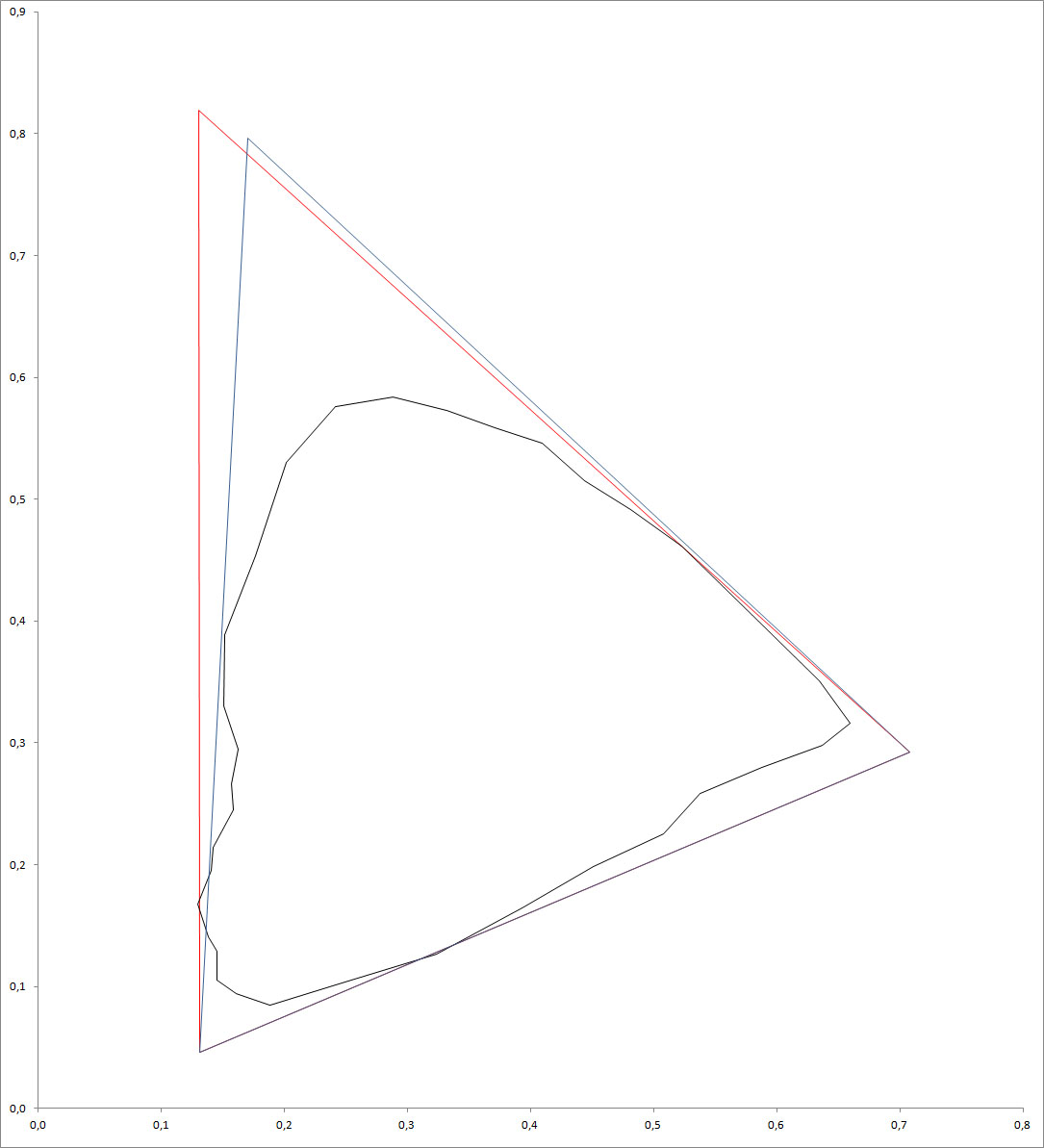
Figure a: Optimal color space for Pointer’s coverage (red), Rec. 2020 (blue) and Pointer’s gamut (black) in CIE 1931 xy chromaticity diagram
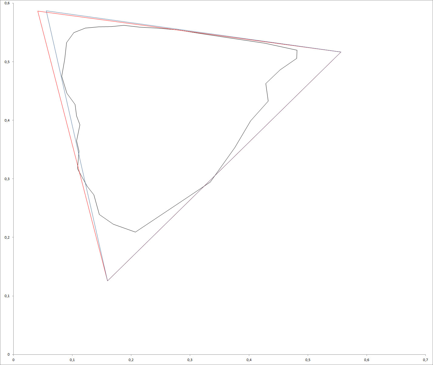
Figure b: Optimal color space for Pointer’s coverage (red), Rec. 2020 (blue) and Pointer’s gamut (black) in CIE 1976 u’v’ chromaticity diagram
As can be seen in Figure a and b, the optimal RGB color space for Pointer’s gamut coverage has minor decrease in saturation in yellow and orange compared to the Rec. 2020 color space. On the other hand you do get a deeper hue of green and better saturation in cyan and blue. You also get a better coverage of the ProPhoto RGB color space, but the coverage of the DCI-P3 and NTSC 1953 color spaces are slightly lower. Coverage of the Adobe RGB and sRGB/Rec. 709 color spaces are still a true 100%.
The reason that 527 nm wasn’t even considered, Korea proposed 531 nm and Japan 532 nm, was that the proposed primaries were based on what’s currently possible with LED backlit LCD and AMOLED and with Laser displays respectively. It would not make sense to use a green primary that can’t be easily reproduces by any of the display technologies and also has a lower coverage of the DCI-P3 and NTSC 1953 color spaces to just have a slightly higher coverage of the Pointer’s gamut.
Maximum achievable color gamut using RGB primaries
Unlike the previous color spaces discussed, this is not an actual color space. It is just a gamut I’ve calculated that achieves the highest coverage of the chromaticity diagrams. Because of the difference in shape and linear density along the spectral locus, this gamut doesn’t use the same primaries in the CIE 1931 xy chromaticity diagram as the ones it uses in the CIE 1976 u’v’ chromaticity diagram. It should be noted that a display with this gamut would have the same problems as discussed earlier for the Adobe Wide Gamut RGB color space. The even larger gamut would even aggravate these problems.
In the CIE 1931 xy chromaticity diagram the maximum achievable gamut covers 73.8% of all chromaticities and 97.7% of Pointer’s gamut, using three monochromatic primaries with wavelengths of 700, 518 and 433 nm (RGB). In the CIE 1976 u’v’ chromaticity diagram the maximum achievable color gamut covers is 83.4% of all chromaticities and 96.8% of Pointer’s gamut, using the same 700 nm primary for red, but different ones for green and blue, with wavelength of 514 and 412 nm respectively. This also means that the maximum achievable RGB color gamut in the CIE 1976 u’v’ chromaticity diagram is larger than the ProPhoto RGB color space, which only covers 76.5% of the colors. Even though it uses only real primaries, while two of ProPhoto RGB’s primaries are imaginary.


Figure 22: maximum achievable 3 primary gamut in CIE 1931 xy

Figure 23: maximum achievable 3 primary gamut in CIE 1976 u’v’
Maximum achievable color gamut using more than 3 primaries
Using more than three primaries makes it possible to cover nearly all visible colors. I’ve calculated this for up to 6 primaries.

As already shown by the example with 3 primaries; the primaries are different in the CIE 1976 u’v’ chromaticity diagram. The coverage of the chromaticities in the CIE 1976 L*u*v* color space is also higher than that of the CIE 1931 xyY color space for the same number of primaries. This is because the curve around green is smaller, making it easier to approximate it with a polygon with a low number of vertices.
The result of this is that you can already cover nearly as much of the CIE 1976 L*u*v* color space with 3 primaries, as you can cover of the CIE 1931 xyY color space with 4 primaries. With 4 you can already cover more of CIE 1976 L*u*v* than with 5 of CIE 1931 xyY, and the same applies for 5 in CIE 1976 versus 6 in CIE 1931. The curve around green also means that for color models with 5 or more primaries, you’ll end up with more than one green primary for coverage optimization of the CIE 1931 xyY color space. With 6 primaries you’ll also have two green primaries in the CIE 1976 u’v’ chromaticity diagram. As discussed earlier in the paragraph about the line of purples, adding a magenta primary would be redundant. Adding a yellow (580 nm) primary would be too, because in both the CIE 1931 xy and CIE 1976 u’v’ chromaticity diagrams the spectral locus is a straight line (with an accuracy of 4 significant figures) between 780 and 560 nm.
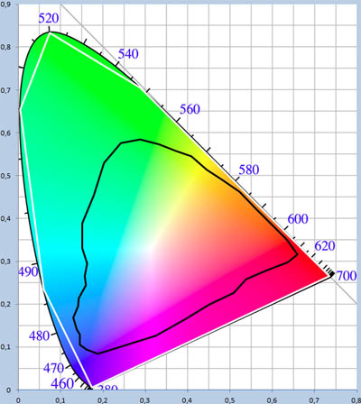
Figure 24: maximum achievable 6 primary gamut in CIE 1931 xy

Figure 25: maximum achievable 6 primary gamut in CIE 1976 u’v’
ACES RGB
ACES RGB is part of the ACES standard (Academy Color Encoding System) developed by the Academy of Motion Picture Arts and Sciences (probably best known for the Academy Awards) with major contributions from other companies, including:
- Adobe
- Arri
- Autodesk
- Dolby
- Fujifilm
- Kodak
- Pixar
- Sony
Development started in 2004 and was finished in 2013 (although it will probably receive at least a few more updates). The ACES is standardized by the SMPTE standards ST 2065-1:2012, ST 2065-2:2012, 2065-3:2012 and ST 2065-4:2013.
The ACES standard was introduced to form a single standard again. In the analog age 35 mm film was the standard, but with the digitization nearly every camera manufacturer has a different RAW-output format and there’s no single standard for CGI/VFX either.
The goal of the standard is to create a complete architecture for production, mastering and archiving (also for the source master) that supports every possible input and output format (not only currently available but including whatever might be possible in the future) without the loss of data. To achieve this, ACES standardizes the file format, color management system and image-interchange framework.
Floating-point encoding
The idea of the ACES is that it stores data scene-referred, rather than output-referred. So instead of storing white as [255; 255; 255] (for an 8-bit example) and let it depend on the display or projector what white is, you store the relative scene luminance (exposure). This also means that there is also no gamma encoding, because the real world it’s linear: if the energy of the light source is twice as high the exposure will be twice as high and therefore the stored value will also be twice as high.
The reason for gamma encoding is that human contrast perception if proportional to luminance; you can discriminate smaller differences in luminance at lower luminance levels. It would for instance be difficult to perceive any difference between 200 and 201 cd/m², while the difference between 1 and 2 cd/m² would be easily perceived by anyone. The absolute difference is the same, but the relative difference is 200 times greater.
Without gamma encoding you’d lose accuracy in the dark end of the spectrum when using fixed-point (integer) encoding. To solve this, ACES uses floating-point (scientific notation) encoding by using part of the bit depth for the fraction and part for the exponent. The result of this is that the number of levels between two stops (stop is increase in exposure by a factor of two) is equal over the entire dynamic range. With integer encoding (for linear gamma) this varies dramatically, for instance there are 0 levels in between 1 and 2, while there are 63 levels in between 64 and 128. Both are a 1 stop difference.
The floating-point encoding used by ACES also results in a massive dynamic range of over 30 stops (over a billion to one contrast ratio). Far more than any device can capture or display and also far more than our eyes can perceive:
| Medium | Contrast ratio | Stops |
| Capture | ||
| Mid range DSLR | 125 – 500:1 | 7-9 |
| High-end full frame DSLR | ~2000:1 | 11 |
| Phase One IQ250 | ~16,000:1 | 14 |
| RED Epic-M Red Dragon | >92,000:1 | >16.5 |
| Arri Alexa | >16,000:1 | >14 |
| Sony CineAlta F65 | ~16,000:1 | 14 |
| Motion picture negative film | >32,000:1 | >15 |
| Output | ||
| Reflective prints | <100:1 | <6.6 |
| Film projection (average) | ~10,000:1 | ~13.3 |
| Film projection (Kodak VP) | ~100,000:1 | ~16.6 |
| Digital projection | 2,000-10,000:1 | 11-13.3 |
| TFT LCD | 500-3,000:1 | 9-11.5 |
| CRT | >65,000:1 | >16 |
| Plasma | 4,000-65,000:1 | 12-16 |
| OLED | >100,000:1 | >16.6 |
| Human vision | ||
| Simultaneous contrast | ~100:1 | ~6.6 |
| Sequential contrast | >1,000,000:1 | >20 |
An important note about the sequential contrast ratio of our eyes: while the maximum contrast ratio of our eyes is over a million to one, it takes our eyes over half an hour to adapt for maximum accuracy at the dark end of the dynamic range. The practical sequential contrast ratio (for which our eyes can adapt in the order of tenths of a second) is in the order of 1,000-10,000:1 (10-13.3 stops).
It also has to be noted that while video and photo cameras currently capable of dynamic ranges of just over 16.5 stops at best, higher dynamic ranges can be achieved by using HDR capture methods. The RED Mysterium-X and Scarlet-X are capable of dynamic ranges up to 18 stops (~260,000:1) using HDRx, while the native sensor dynamic range is only 13.5 stops (11,500:1). Some specialized measurement devices have far greater native dynamic ranges, the Klein K10-A colorimeter for instance is capable of measuring brightness from 10,000 cd/m² all the way down to 0.00006 cd/m², resulting in a dynamic range of 27.3 stops (about 165,000,000:1 contrast ratio).
Another advantage of the 16-bit floating-point encoding used by ACES is that it does not introduce color quantization errors (color banding). Although there can still be color banding in the output, because of the display device itself.
Colorimetry
Not only the encoding used by ACES, but also the colorimetry is designed to encompass all data possible for both current and future capture and display devices (for the visible spectrum that is).
To do this, it uses three imaginary primaries:

You might have noticed that the red primary appears to be the same red primary used by ProPhoto RGB color space. This however is not the case. The value might be the same, but the number of significant figures isn’t. The red primary of ProPhoto RGB uses four significant figures, which makes it the same as all points on the spectral locus for every wavelength up from 698 nm. It can therefore be assumed to be a monochromatic real primary with any wavelength up from 698 nm (up from 780 nm the brightness would have to be near infinite though, because the sensitivity approximates zero).
The ACES RGB primary however is specified in five significant figures and is therefore no longer on the spectral locus, because no wavelength on the spectral locus has an x-coordinate ≥ 0.734695 and y-coordinate < 0.265305.
These primaries were chosen so that the resulting color space would encompass the entire visible spectrum. It therefore completely covers every real color space and also some with imaginary primaries (like ProPhoto RGB).
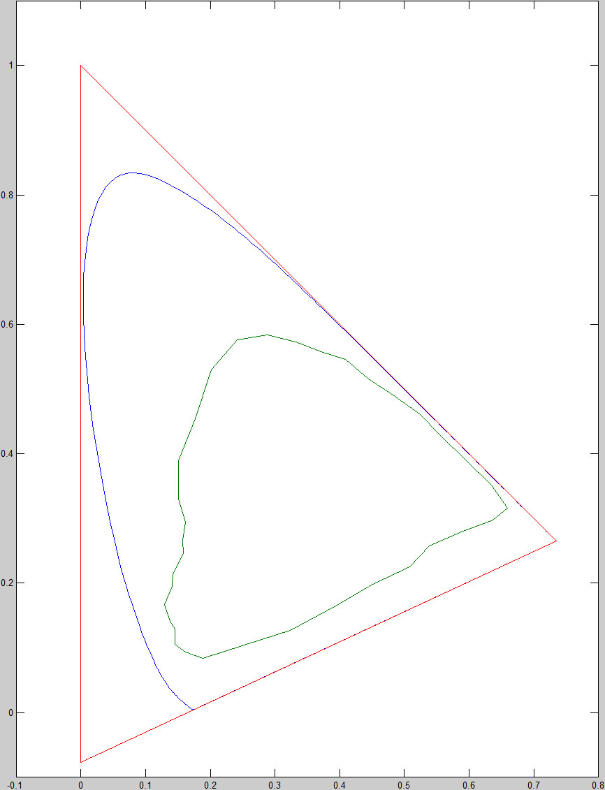
Figure e: ACES RGB and Pointer’s gamut in CIE 1931 xy chromaticity diagram

Figure f: ACES RGB and Pointer’s gamut in CIE 1976 u’v’ chromaticity diagram
The downside of these primaries is that in the CIE 1931 xy chromaticity diagram 15.5% of ACES RGB is imaginary and in the CIE 1976 u’v’ chromaticity diagram this is even 32.8%. Except for some coding inefficiency this is not a real problem though, because with the 16-bit floating-point encoding it doesn’t really matter that you lose a part to imaginary colors, because even then it’s still far more accurate than any capture or display device or our eyes.
Input Device Transform (IDT) and Output Device Transform (ODT)
The downside of ACES is that it requires device specific transformations to and from ACES and it’s even recommended to have different IDT’s and ODT’s for different environments. For cameras you’d have an IDT for sunlight and one for incandescent-tungsten studio lighting. With displays you would ideally have different ODT’s for normal light conditions and a darkened room. These IDT’s and ODT’s have to be supplied by the manufacturers. If there isn’t an IDT / ODT for your capture / display device there’s no point in using ACES.

Figure g: ACES Idealized system block diagram

Monitor Panels
To give an idea of where we stand today when it comes to the coverage of the Pointer’s gamut a few high-end wide gamut display panels will be discussed. An average desktop panel has deliberately not been included, because the average desktop panel will have a gamut that’s roughly equal to the sRGB color space. Even though the primaries are almost never identical to those of the sRGB color space, if one were to take the average primaries of a large number of panels from different panel manufacturers the resulting primaries would come very close to the primaries of the sRGB color space.
AU Optronics M270DAN01.1
The AU Optronics M270DAN01.1 is a relatively new panel, using AU Optronics’ Advanced Hyper-Viewing Angle (AHVA) panel technology, which is quite similar to IPS. Like most current high-end 27” panels it has a 2560×1440 pixel resolution. What makes this panel interesting though are the true 10-bit color depth per channel and the massive color gamut. The M270DAN01.1 uses the following primaries:

This results in a gamut that covers about half of all chromaticities, in the CIE 1931 xy chromaticity diagram it’s 51.4% and in the CIE 1976 u’v’ chromaticity diagram it’s 49.5%. The coverage of the Pointer’s gamut for both chromaticity diagrams are 94.2% and 94.5% respectively.

Figure 26: AU Optronics M270DAN01.1 gamut in CIE 1931 xy
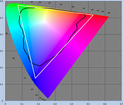
Figure 27: AU Optronics M270DAN01.1 gamut in CIE 1976 u’v’
LG Display LM240WU4
The LG Display LM240WU4 panel is a high-end wide gamut CCFL backlit H-IPS panel that was featured in many high-end displays from late 2008 to mid 2011, of which some are still sold today. Among these were some very high-end reference displays for color critical work:
- Eizo ColorEdge CG243W
- Eizo ColorEdge CG245W
- NEC SpectraView Reference 241
- Quato Intelli Proof 240 Motion
- Quato Intelli Proof 242 excellence
- Quato Intelli Proof 244 excellence
Another display that used the LM240WU4 panel was the very popular Dell UltraSharp U2410. The LM240WU4 panel has a resolution of 1920×1200 pixels and an 8-bit color depth for the SLA1 and SLA3 versions, 8-bit+FRC for the SLB1 and SLB3 versions. All versions use the same primaries:

The resulting gamut covers 48.4% of all chromaticities and 92.3% of Pointer’s gamut in the CIE 1931 xy chromaticity diagram, in the CIE 1976 u’v’ chromaticity diagram these are 45.5% and 91.8%.

Figure 28: LG Display LM240WU4 gamut in CIE 1931 xy

Figure 29: LG Display LM240WU4 gamut in CIE 1976 u’v’
LG Display LM240WU5-SLA1
Even though this panel is already nearly six years old, it is still one of the most high-end panels to date. Only three display models use the LM240WU5-SLA1 panel:
- HP DreamColor LP2480zx
- LG W2420R
- Quato Intelli Proof 240 excellence LED
The HP is still in production. While the LG and Quato are still sold by some resellers, it’s only remaining stock. Production of the LG was ceased sometime last year and Quatographic Technology GmbH has been decommissioned completely since August 15th last year.
HP DreamColor LP2480zx
The HP DreamColor LP2480zx was the first released out of those three, first announced in April 2008 and released on June 12th 2008. It was the result of a collaboration between HP and DreamWorks Animation SKG, made to fill the gap between studio grade reference monitors, with prices in excess of £10,000, and the average high-end computer display at the time. According to DreamWorks an important factor that led to this initiative was the disappearance of CRT-monitors (which still outperform the average LCD display in many aspects of image display):
“Color is absolutely critical to what we do here at DreamWorks. Prior to the DreamColor display our entire color infrastructure was based on CRT monitors. The problem was: CRT stopped being made. We were left without a solution for our film makers. Nobody was choosing to solve that problem. It is at that point we realized: not only did we need a solution, the entire imaging industry needed a good solution for color accurate displays.”
The LP2480zx was the first computer display to have a true 10-bit color depth per channel and it also had an extremely wide color gamut compared to other high-end displays at the time. Even today the true 10-bit color depth and the size of the color gamut are exceptional.
It comes with its own color management system: HP DreamColor Advanced Profiling Solution, now simply called HP DreamColor, developed by X-Rite. The latest version is nearly identical to the Dell UltraSharp Color Calibration Solution (discussed in the reviews of the U2413, U2713H, U3014 and UP3214Q), both are based on the X-Rite i1Profiler 1.4.2 software. It offers hardware calibration of the display and color gamut remapping through its 12-bit LUT and also allows you to change the white point of the display at backlight level (D50, D55, D65 and custom), instead of in the panel, thus losing none of the available color depth. The color gamut can be remapped to any of the color spaces listed below, as well as custom color spaces.
- Rec. 601
- Rec. 709
- DCI-P3 Emulation (native gamut doesn’t completely cover DCI-P3)
- sRGB
- Adobe RGB
What also made this display stand out was the ability to sync to frame rates all the way down to 47.952 Hz, making it possible to display nearly all common video frame rates (some at exactly double the actual frame rate).
LG W2420R
The LG W2420R was released in May 2009. Unlike the LP2480zx, the W2420R did not acquire a reference status among people in the imaging industry. This probably had to do with the bundling of the DataColor Spyder 3 colorimeter, which was not at all suitable for calibrating an RGB-LED backlit display. The True Color Finder software that came along with it also did not offer the same feature set as the HP equivalent. The new True Color Pro calibration solution from LG still fails to achieve accurate results, but at least it now uses a colorimeter that’s suitable for wide gamut displays: an LG branded colorimeter based on the MAZeT True Color sensor (MTCSiCT).
Quato Intelli Proof 240 excellence LED
The Quato Intelli Proof 240 excellence LED was released around the same time as the LG. While the HP is more focused towards video editing, the Quato is primarily focused on soft proofing, although it’s still perfectly suitable as a video editing display. This is perhaps best shown by the Fogra Soft Proofing certification and the Ugra certification, as well as the support for ECI-RGB (RGB working color space designed to include all printable colors, regardless of the printing technology used) and ISO Coated v2 (color space for offset printing).
The IP240ex LED has a 7×5 zones active uniformity compensation that equalizes brightness and color across the display. Like the HP and LG it also comes with a color management system, iColor Display, capable of hardware calibration and gamut remapping. Another interesting feature is the implementation of the Faroudja DCDi technology for deinterlacing and frame rate conversion, which shows that the IP240ex LED is indeed also intended as a video editing display.
Panel properties
The LM240WU5-SLA1 panel uses direct matrix RGB LED backlighting and has true 10-bit color depth. It has a resolution of 1920×1200 pixels. The LM240WU5-SLA1 uses the following primaries:

The resulting gamut covers 52.0% of all chromaticities and 94.5% of Pointer’s gamut in the CIE 1931 xy chromaticity diagram, in the CIE 1976 u’v’ chromaticity diagram these are 50.9% and 94.8%.

Figure 30: LG Display LM240WU5-SLA1 gamut in CIE 1931 xy

Figure 31: LG Display LM240WU5-SLA1 gamut in CIE 1976 u’v’
LG Display LM240WU9-SLA1 / LM270WQ3-SLA1 / LM300WQ6-SLA1
The LG Display LM240WU9-SLA1, LM270WQ3-SLA1 and LM300WQ6-SLA1 are part of the latest generation of AH-IPS panels from LG.Display that use the GB-r-LED backlighting technology. GB-r-LED uses green and blue LEDs coated in red phosphor to create white light, whereas standard W-LED backlighting uses only blue LEDs coated in yellow phosphor. This results in a far larger color gamut that even exceeds wide gamut CCFL and approximates the color gamut of RGB-LED backlighting.
Because all three panels use the exact same primaries, I’ve combined them in one paragraph. Some panel properties are not the same for all three panels. Among these are obviously size and resolution, but also color depth: the LM240WU9 and LM270WQ3 have 8-bit+FRC color depth, whereas the LM300WQ6 has true 10-bit color depth. Some of the displays these panels are used in are listed below.
LM240WU9
- Asus PA249Q
- BenQ PG2401PT
- Dell UltraSharp U2413
- NEC PA242W
LM270WQ3
- Asus PA279Q
- Dell UltraSharp U2713H
- LG 27EA83
- NEC PA272W
LM300WQ6
- Dell UltraSharp U3014
- Hazro HZ30WiG
- Lenovo ThinkVision LT3053p
- NEC PA302W
These panels use the following primaries:

The resulting gamut covers 49.1% of all chromaticities and 93.1% of Pointer’s gamut in the CIE 1931 xy chromaticity diagram, in the CIE 1976 u’v’ chromaticity diagram these are 45.9% and 92.3%.

Figure 32: LG Display LM240WU9 / LM270WQ3 / LM300WQ6 gamut in CIE 1931 xy

Figure 33: LG Display LM240WU9 / LM270WQ3 / LM300WQ6 gamut in CIE 1976 u’v’
LG Display LM270WQ2-SLA1
Like the LM240WU4, which is of the same generation, the LM270WQ2 panel was featured in many displays, including high-end displays from Eizo, NEC and Quato. Probably the most popular display that used this panel was the Dell UltraSharp U2711. The LM270WQ2-SLA1 panel has a resolution of 2560×1440 pixels and an 8-bit+FRC color depth. It uses the following primaries:

The resulting gamut covers 48.5% of all chromaticities and 92.5% of Pointer’s gamut in the CIE 1931 xy chromaticity diagram, in the CIE 1976 u’v’ chromaticity diagram these are 46.4% and 92.8%.

Figure 34: LG Display LM270WQ2-SLA1 gamut in CIE 1931 xy

Figure 35: LG Display LM270WQ2-SLA1 gamut in CIE 1976 u’v’
LG Display LM300WQ5
This panel had been around for quite some time before it was finally replaced by the LM300WQ6. At least seven versions of this panel were made. The oldest version (STA2) is from November 2007, the newest version (SLA2) is from October 2010. It was featured in a large number of displays from a variety of display manufacturers that include Dell, Eizo, Hazro, HP, LG and NEC amongst others. Nearly half of all 30” display models use a version of the LM300WQ5 panel. Dell, Hazro and NEC even had multiple displays of different generations that used different versions of the LM300WQ5 panel.
All versions uses the same direct light 18x wide gamut CCFL-tubes backlighting and also the same color filters for the sub-pixels. Therefore the primaries are the same for all versions. The color depth is not the same for all versions though. The four STA versions have 8-bit color depth, while the SDA1, SLA1 and SLA2 have true 10-bit color depth. The primaries of the LM300WQ5 panel are:

The resulting gamut covers 48.2% of all chromaticities and 92.3% of Pointer’s gamut in the CIE 1931 xy chromaticity diagram, in the CIE 1976 u’v’ chromaticity diagram these are 45.4% and 91.7%.

Figure 36: LG Display LM300WQ5 gamut in CIE 1931 xy

Figure 37: LG Display LM300WQ5 gamut in CIE 1976 u’v’
Samsung LTM240CS02
Unlike all the LG.Display panels discussed before, which were IPS panels, and the AU Optronics M270DAN01.1, which uses a technology similar to IPS, the Samsung LTM240CS02 panel is based on a Vertical Alignment technology, Super Patterned Vertical Alignment (S-PVA) to be precise. Like some versions of the LG.Display LM300WQ5 panel it’s already quite old, seven years this May. What makes it interesting though is that it was one of the first panels to use RGB-LED backlighting. This resulted in a color gamut that was extremely large at the time and unprecedented. The color depth was only a standard 8-bit per channel though.
The LTM240CS02 was only used in the Samsung XL24 and LaCie 724. Its bigger brother, the LTM300DS, was also only used in displays from Samsung and LaCie: XL30 and 730 respectively. It used the following primaries:

As you can the green and red primaries are of an even deeper hue than those of the LG.Display LM240WU5-SLA1 panel (with roughly equal saturation), although the difference in green is negligible. The LM240WU5-SLA1 uses a blue primary though that has both a deeper hue and is more saturated than that of the LTM240CS02, which especially in the CIE 1976 u’v’ chromaticity diagram results in a pronounced difference. Therefore the LM240WU5-SLA1 still has the larger gamut.
The color gamut of the LTM240CS02 panel covers 51.1% of all chromaticities and 94.0% of Pointer’s gamut in the CIE 1931 xy chromaticity diagram, in the CIE 1976 u’v’ chromaticity diagram these are 46.9% and 92.8%.

Figure 38: Samsung LTM240CS02 gamut in CIE 1931 xy

Figure 39: Samsung LTM240CS02 gamut in CIE 1976 u’v’
Mitsubishi LaserVue
One example of the laser displays discussed earlier in the part on the Rec. 2020 color space is the Mitsubishi LaserVue line of TV’s. These are rear projected DLP televisions using a pair of scanning mirrors (one for the horizontal direction and one for vertical) to create the image pixel by pixel. This makes the image formation process very similar to that of the electron gun in CRT monitors.
The LaserVue line was discontinued in 2012, but it seems that it has revived, because Mitsubishi showed a 4K LaserVue UHD-TV prototype last October at the CREATEC show in Japan.
Some of the LaserVue models only use a laser for red and regular LED’s for blue and green, like the 4K model, but some use lasers for all primaries. The ones that use lasers for all primaries use laser diodes with wavelengths of 640, 532 and 447 nm. This results in the following primaries:

The resulting covers about two thirds of the chromaticity diagrams, with a coverage of 65.0% of the chromaticities in CIE 1931 xy and 69.5% of the chromaticities in CIE 1976 u’v’. The coverage of the Pointer’s gamut is 97.3% and 96.0% respectively.

Figure c: Mitsubishi LaserVue gamut in CIE 1931 xy

Figure d: Mitsubishi LaserVue gamut in CIE 1976 u’v’
Laptop Panels
As with the desktop display panels a few high-end wide gamut panels for laptops will be discussed to give an indication of what’s possible in terms of gamut size and Pointer’s gamut coverage. For comparison a 45% NTSC and a 60% NTSC laptop panel have also been included. These are the most common gamut sizes on laptops.
AU Optronics B156HW01 V0/V1/V2/V3/V5/V6
The AU Optronics B156HW01 is a panel that is used in many laptops from a variety of manufacturers that include Asus, Dell, HP, Lenovo and MSI. Versions 4 and 7 use B+RG LED backlighting, which improves upon standard W-LED backlighting by not just using a yellow phosphor to coat the blue LEDs, but instead a red and a green phosphor, resulting in a white with better spectral distribution, which in turn results in a larger color gamut. The other six versions use standard W-LED backlighting, resulting in a color gamut of about 60% NTSC. This is the typical color gamut for displays in mainstream and high-end laptops.
All versions of the B156HW01 panel are based on the Twisted Nematic (TN Film) display technology, have a 1920×1080 pixels resolution and a color depth of 6-bits per channel. All versions, except for V4 and V7, use the following primaries:

The resulting color gamut covers only 28.6% of all chromaticities and 59.3% of Pointer’s gamut in the CIE 1931 xy chromaticity diagram, in the CIE 1976 u’v’ chromaticity diagram these are 28.8% and 60.3%. What stands out here though is that the blue primary is similar to the ones found in high-end desktop displays. Only the red and green primaries are very different. The green primary actually is just as much yellow as it is green. The red primary is more orange than red and is actually closer to the yellow side of orange than the red side.
When you look at the gamut plotted in the CIE 1931 xy or CIE 1976 u’v’ chromaticity diagram you’ll notice that the only colors that these laptop panels can display fairly accurate are shades of blue and yellow/orange. This should come as no surprise, as the backlight is made up of blue LEDs coated in yellow phosphor.

Figure 40: AU Optronics B156HW01 W-LED gamut in CIE 1931 xy

Figure 41: AU Optronics B156HW01 W-LED gamut in CIE 1976 u’v’
AU Optronics B156XW04 V5
While the 60% NTSC gamut for displays found in most mainstream and high-end laptops is already very small compared to the gamuts of all the desktop panels discussed earlier, it gets even worse for low-end laptops. These laptops typically have a display with a gamut that’s only 45% NTSC and also a very low resolution of just 1366×768 pixels. The B156XW04 V5 panel uses the following primaries:

The resulting color gamut covers only 21.6% of all chromaticities and 45.1% of Pointer’s gamut in the CIE 1931 xy chromaticity diagram. In the CIE 1976 u’v’ chromaticity diagram it gets even worse: covering only 17.3% of the chromaticities (roughly a 1 in 5.8 ratio) and 37.4% of Pointer’s gamut.
I personally wouldn’t use displays like these for anything other than black text on a white background, because pretty much every color would not be shown as intended. This is best shown by looking at the gamut plotted in either one of the chromaticity diagrams.

Figure 42: AU Optronics B156XW04 V5 gamut in CIE 1931 xy

Figure 43: AU Optronics B156XW04 V5 gamut in CIE 1976 u’v’
LG Display LP156WF3 / LP171WU8-SLB1
Luckily it isn’t all bad when it comes to laptop displays. More and more laptop manufacturers start using IPS panels in their laptops again (something that stopped sometime during 2007/2008 and started again late 2012). Unfortunately these often still have a 60% NTSC color gamut and 6-bit color depth (as with all versions of the LG Display LP156WF4 panel for instance). There are however a few exceptions, the LP156WF3 and LP171WU8-SLB1 panels definitely are among those exceptions.
The LM156WF3-SLB1 is the DreamColor 2 panel in the HP EliteBook 8540w and 8560w mobile workstations. The SLB2 version is the PremierColor panel in the Dell Precision M4600 mobile workstation. The SLB3 is an alternative version of the DreamColor 2 panel in the 8560w. The LP171WU8-SLB1 panel is the DreamColor 2 panel in the HP EliteBook 8740w mobile workstation. It is possible that the HP EliteBook 8570w and 8770w and Dell Precision M4700 use the same DreamColor/PremierColor-panels as the 8560w, 8760w and M4600 respectively, but this has not been confirmed.
All these panels use RGB-LED backlighting and have true 10-bit color depth, resulting in 4096 times the color gradations of the typical 6-bit TN laptop display. They also have a much higher contrast than typical laptop panels. The LP156WF3-SLB2 (Dell PremierColor) has a contrast of 700:1, the other three all have 800:1. The typical laptop has a contrast of only 400:1 to 600:1. All four of these panels use the same primaries:

Considering the average laptop has a color gamut somewhere between 45% and 60% NTSC, these panels can reproduce twice the number of colors the average laptop display can reproduce, with a color gamut of 109.49% NTSC. It covers 51.8% of the chromaticities and 95.4% of Pointer’s gamut in the CIE 1931 xy chromaticity diagram. In the CIE 1976 u’v’ chromaticity diagram these are 49.5% and 95.4% respectively.

Figure 44: LG Display LP156WF3 / LP171WU8-SLB1 gamut in CIE 1931 xy

Figure 45: LG Display LP156WF3 / LP171WU8-SLB1 gamut in CIE 1976 u’v’
LG Display LP171WU5-TLB1
The LP171WU5-TLB1 is the original DreamColor panel in HP EliteBook 8730w mobile workstation, released in March 2009. Unlike with the later 8540w and 8560w, there wasn’t an optional DreamColor display for the 8530w. Dell didn’t have a PremierColor display option for their Precision series mobile workstations either at the time.
Like all other DreamColor panels this panel uses RGB-LED backlighting. It is however the only DreamColor panel that doesn’t have true 10-bit color depth: the LP171WU5-TLB1 has to do with 8-bit color depth.
What’s interesting though is that of all panels discussed in this article, including the desktop panels, it has the largest color gamut in the CIE 1931 xy chromaticity diagram. It also has the highest coverage of Pointer’s gamut, NTSC 1953, ProPhoto RGB and Rec. 2020 in the CIE 1931 xy chromaticity diagram. The primaries used by the LP171WU5-TLB1 are:

The resulting gamut covers 52.0% of all chromaticities and 95.7% of Pointer’s gamut in the CIE 1931 xy chromaticity diagram, in the CIE 1976 u’v’ chromaticity diagram these are 48.7% and 95.2%.

Figure 46: LG Display LP171WU5-TLB1 gamut in CIE 1931 xy

Figure 47: LG Display LP171WU5-TLB1 gamut in CIE 1976 u’v’
LG Display LP173WF3
The LG Display LP173WF3-SLB2/SLB3 panel is the DreamColor 2 panel in HP EliteBook 8760w mobile workstation and the LP173WF3-SLB1 is the Dell PremierColor panel in the Dell Precision M6600. It’s possible also the DreamColor 2 / PremierColor panel for the 8770w and M6700, but this hasn’t been confirmed.
All versions of the LP173WF3 panel are very similar to the LP156WF3-SLB3 panel, although they have slightly different primaries.
The primaries used by the all versions of the LP173WF3 panel are:

The resulting gamut covers 51.8% of all chromaticities and 94.7% of Pointer’s gamut in the CIE 1931 xy chromaticity diagram, in the CIE 1976 u’v’ chromaticity diagram these are 49.6% and 94.8%.

Figure 48: LG Display LP173WF3 gamut in CIE 1931 xy

Figure 49: LG Display LP173WF3 gamut in CIE 1976 u’v’
Color space coverage
This last chapter consists of two tables: one for the CIE 1931 xy and one for the CIE 1976 u’v’ chromaticity diagram. In these tables the coverage of all discussed color spaces (except for Adobe Wide Gamut RGB) by all discussed color spaces and panels are given for easy comparison.
CIE 1931 xy chromaticity diagram

CIE 1976 chromaticity diagram

Conclusion
While there’s still a lot of room for improvement using the RGB color model for both color spaces and display panels by using monochromatic primaries, the future lies with 4, 5 and 6 primary color models. This enables us to reproduce a significantly larger palette. Sharp already has a few HD-TVs that use an RYGB color model (the Quattron models) for a couple of years now and demonstrated a prototype with RYGCB primaries that covered over 99% of the Pointer’s gamut during SID Display Week 2009 (Source: Sharp).
I would say that in my opinion Rec. 2020 is currently the best color space. It covers the largest amount of Pointer’s gamut of all common RGB color spaces using real primaries and it also fully covers many other common color spaces. The 12-bit color depth specified by the standard might even be more interesting.
Now it’s up to the display manufacturers to show what they can achieve. Mitsubishi has already shown the potential of laser backlit displays with their LaserVue TV’s. Furthermore, OLED seems to have finally arrived, although the first consumer OLED computer monitor is yet to be released. Something that could be really great is combining those two and make a LED display with laser diodes instead of regular (AM)-OLED. I’m not sure if that’s possible though. Another interesting technology that can boost color gamut size is the quantum dot technology (be sure to check Jeff’s blog for a few interesting articles on this).
 | If you have enjoyed this review and found it useful, please consider making a small donation to the site. |