Introduction
We talked about the influx of Korean monitors into
the market when
we reviewed the
QNIX QX2710 LED display back in April last year. This manufacturer, along
with other common vendors like Achieva and Yamakasi for instance focus on
providing low-cost displays, built around decent quality panels. We tested a 27"
model from QNIX last time, and now we have a 32" sized model with us now, the
"QX320QHD Super Ultra DP Lite". There are a few variations of this screen
available, with the functionality of the stand and the video inputs being the
main differences it seems. The panel used and the spec and performance is the
same. The model we have with us now is the more basic of the stands, with only a
side to side swivel adjustment offered. It has DVI, HDMI and DisplayPort inputs.
Look out for the "QX320QHD Super Ultra Pivot" model as well which has a more
functional stand with tilt, height, swivel and rotate offered. There are
versions with the adjustable stand but without the DisplayPort input as well.
The QX320QHD (as we will refer to it as throughout
the review for ease) uses a 2560 x 1440 resolution AU
Optronics AMVA panel, the same as used in the
BenQ BL3200PT in fact. This model supports virtual 4k resolutions as well (3840 x 2160 resolution) through the AD
board inside the monitor. There is also a low blue light mode and flicker free
backlight promoted, much like BenQ's own recent developments. The features list
even mentions that the screen can be overclocked although the actual performance
we have seen can vary so we are keen to see how this one performs. We will test all
these features throughout the course of this review to check if they deliver.
If you appreciate the review
and enjoy reading and like our work, we would welcome a
donation
to the site to help us continue to make quality and detailed reviews for you.
Specifications and Features
The following table gives detailed information
about the specs of the screen:
|
Monitor
Specifications |
|
Size |
32"WS (81.3 cm) |
Panel Coating |
Light AG coating |
|
Aspect Ratio |
16:9 |
Interfaces |
1 HDMI 1.4
1 DisplayPort (version 1.2)
|
|
Resolution |
2560 x 1440 |
|
Pixel Pitch |
0.276 mm |
Design
colour |
Glossy black bezel and base |
|
Response Time |
5ms G2G |
Ergonomics |
None |
|
Static Contrast Ratio |
3000:1 |
|
Dynamic Contrast Ratio |
2 million:1 |
VESA Compatible |
Yes
200 x 100m |
|
Brightness |
300 cd/m2 |
Accessories |
Power cable and adapter, audio and DL-DVI
cables |
|
Viewing Angles |
178/178 |
|
Panel Technology |
AU Optronics AMVA |
Weight |
8.5Kg |
|
Backlight Technology |
W-LED |
Physical Dimensions |
(WxHxD) with stand max height
744 x 447 x 180 mm |
|
Colour Depth |
16.7m |
|
Refresh Rate |
60Hz (overclockable) |
Special
Features |
2x
5W stereo speakers, low blue light mode, Virtual 4k support, overclockable
refresh rate |
|
Colour Gamut |
Standard gamut ~100% sRGB |
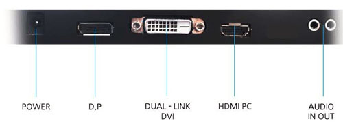
The QX320QHD model we have with us offers a reasonable range of modern connectivity options. There are
HDMI, DisplayPort and Dual-link DVI input interfaces provided for video
connections. There is no D-sub offered here. All the interfaces can support the
native 2560 x 1440 resolution at normal 60Hz refresh rate. Only a DL-DVI cable
is provided in the box, no HDMI or DisplayPort. Some versions of the QX320QHD
come without the DisplayPort interface, and some have a second HDMI port as well
so check the specs.
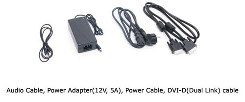
The screen has an external power supply which is
provided in the box alongside the power cable. There are a few extra features
from this screen as well including integrated 2x 5W stereo speakers, support for 'Virtual
4k' resolutions and a low blue light mode. There are no USB ports offered on
this model or features like ambient light sensors or motion sensors.
Below is a summary of the features and connections
of the screen:
|
Feature |
Yes / No |
Feature |
Yes / No |
|
Tilt adjust |
 |
DVI |
 |
|
Height adjust |
|
HDMI |
|
|
Swivel adjust |
|
D-sub |
|
|
Rotate adjust |
|
DisplayPort |
|
|
VESA compliant |
|
Component |
|
|
USB 2.0 Ports |
|
Composite |
|
|
USB 3.0 Ports |
|
Audio connection |
|
|
Card Reader |
|
HDCP Support |
|
|
Ambient Light Sensor |
|
MHL Support |
|
|
Human Motion Sensor |
|
Integrated Speakers |
|
|
Touch Screen |
|
PiP / PbP |
|
|
Factory Calibration |
|
Blur Reduction Mode |
|
|
Hardware calibration |
|
G-Sync |
|
|
Uniformity correction |
|
FreeSync |
|
Design and Ergonomics
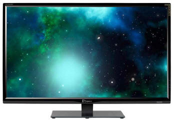
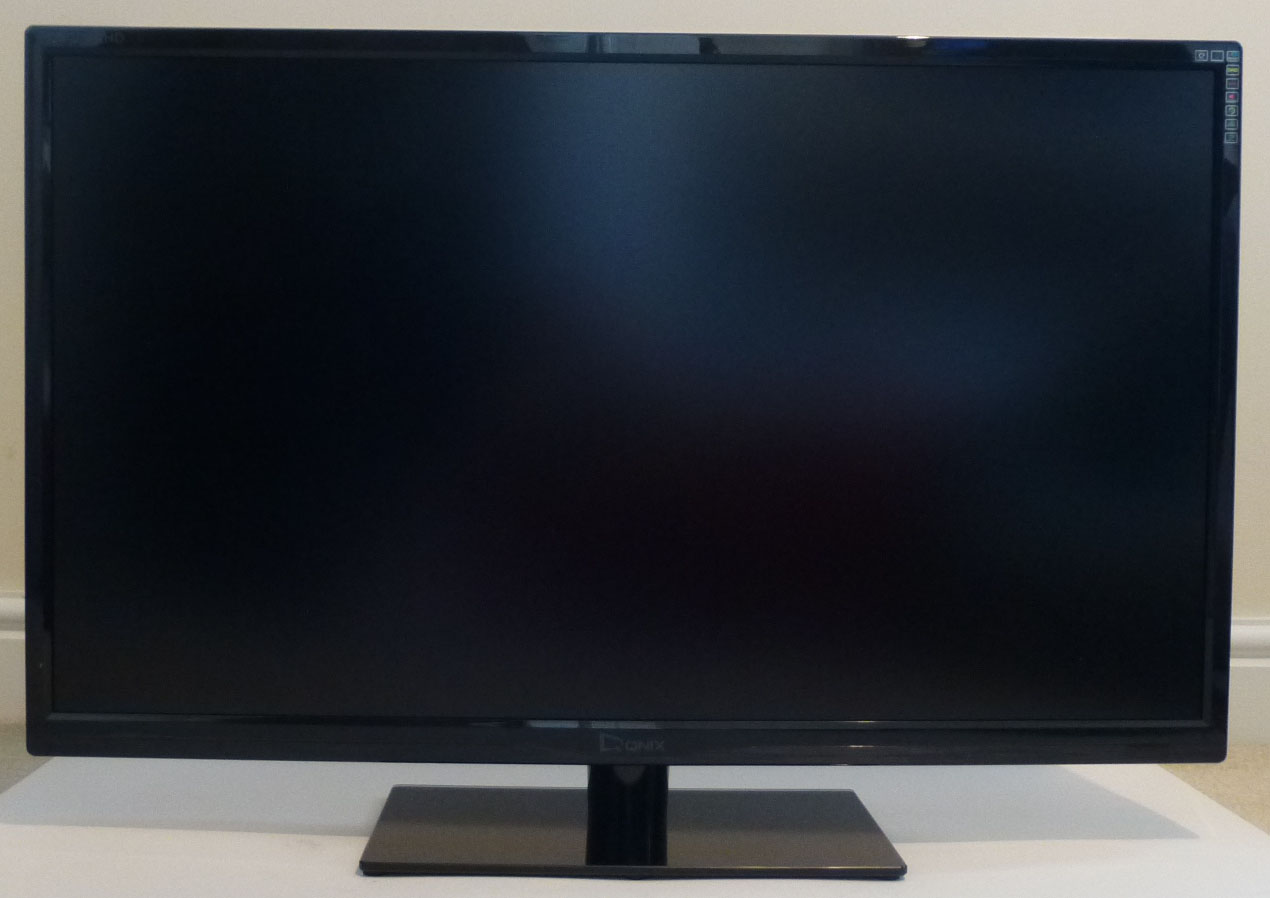
Above: front view of the screen. Click for larger version
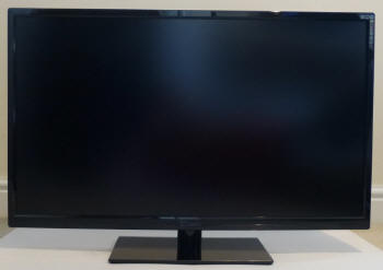
Above: front view of the screen. Click for larger version
The QX320QHD comes in an all black design.
Glossy plastics are used for the bezel which has a "QX320QHD" logo in the
top left hand corner, and a "QNIX" logo in the middle of the bottom bezel.
The bezel measures a modest 16mm along the sides and top, and 22mm along
the bottom edge. There is a fairly large power LED in the bottom right
hand corner which glows blue during normal operation and red when the
screen is on standby.
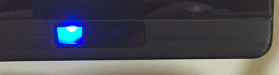
Above: view
of power LED
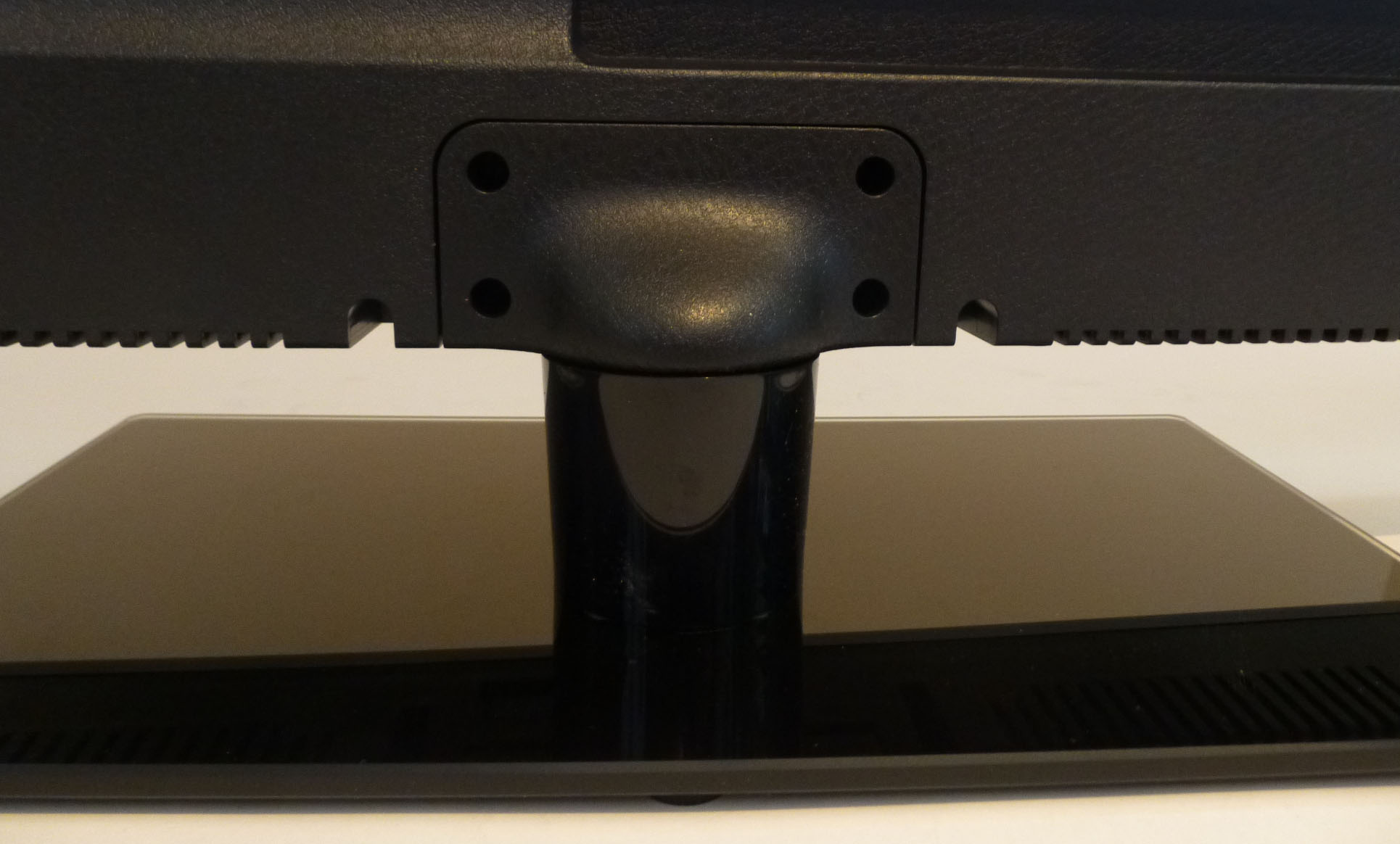
On this model we have with us (Super Ultra
DP Lite) the stand is screwed in to the back of the screen and connects in
to a large black glass base. This measures 320 x 180mm in size and
provides a strong base for the screen. Because the screen is so large, and
the arm quite thin, the screen does wobble a bit from side to side
however.
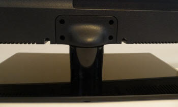

Above:
views of the base and stand (back and front). Click for larger versions
The back of the screen is matte black
plastic as shown below. There are VESA 200 x 100 screws on the back, and
the interface connections are located on the bottom edge of that central
section. The stand screws in to the bottom of the display at the back as
well.


Above: back
and side views of the screen, click for larger versions
The versions we have with us has a very
limited stand indeed. The only function it provides is a side to side
swivel, which is at least smooth and easy to use. There is no tilt
adjustment which is our main gripe, as the screen is too vertical and
needs to be tilted back a bit. We actually ended up wedging something
under the bottom of the stand at the front to tilt it back a bit for our
use. There is no height adjustment either which makes this stand very
limited. There are versions of the QX320QHD with a fully adjustable stand
(including pivot as well) so we would certainly recommend those where
possible unless you plan to wall/arm mount the screen. It is at least VESA
compliant.
A summary of the screens ergonomic adjustments
is shown below:
|
Function |
Range |
Smoothness |
Ease of Use |
|
Tilt |
No |
n/a |
n/a |
|
Height |
No |
n/a |
n/a |
|
Swivel |
Yes |
Smooth |
Easy |
|
Rotate |
No |
n/a |
n/a |
|
Overall |
Very limited range of
ergonomic adjustments on this particular version |
The materials were of a reasonable standard and the
build quality felt ok, although fairly no frills as you might expect. There was no audible noise from the screen,
even when conducting specific tests which can often identify buzzing issues.
The whole screen remained fairly cool even during prolonged use as well which
was pleasing.
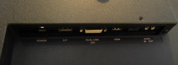
Above: rear
views of the screen showing connections. Click for larger version
The back of the screen provides connections for
the power supply which is provided with the screen. There are then
video connections for DisplayPort, Dual-link DVI and HDMI. Additional audio
in/out ports are also provided.
OSD Menu
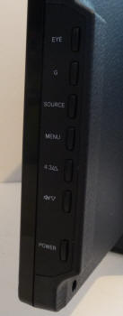
Above: OSD control buttons on the bottom right hand edge
The screen is controlled through a series of
5 buttons located on the bottom right hand edge of the screen. There are a few
quick access options available. The 'EYE' button turns the low blue light mode
on and off. The 'G' button accesses the preset game mode quickly. The source
button allows you to switch between the various inputs. This is actually quite a
slow and cumbersome process and it takes a while to cycle to the one you want
(if you have more than one device connected). You have to cycle through them in
order each time as well to get to the one you want.
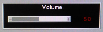
The down/volume arrow gives you quick access to the
volume control as shown above, if you're using the built in speakers or
headphone jack. The 4:3/up arrow switches between the two aspect ratio modes, wide
and 4:3.
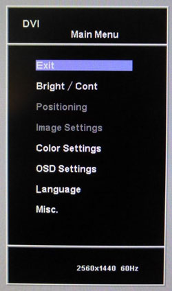
The "menu" button brings up the main OSD as shown
above. This is split into 7 sections, although two are greyed out here as they
relate to the analogue input only and we are using DVI.
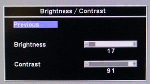
The "bright / Cont" section gives you control over
the brightness and contrast settings as you would expect.
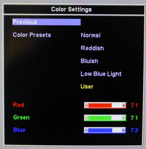
The "color settings" menu gives you access to the
colour preset
modes and the user configurable mode, useful for
calibration.
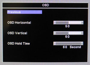
The "OSD" section allows you to adjust the behaviour of the menu itself.
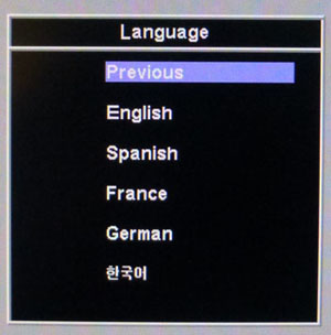
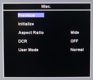
The "language" section is self explanatory. The "misc"
section contains the aspect ratio control and DCR function. The 'user mode'
option switches between the normal and game preset modes. The 'initialize'
setting does a factory restore of the screen.
All in all there were not many options or settings
in the menu to play with. We would have liked to have seen better preset mode
availability and perhaps certain settings defined for different uses beyond just
gaming. There is
also no control over the overdrive impulse so we will have to hope the
manufacturer has set this up appropriately. We did find navigation a little
tricky in some cases and it wasn't as intuitive as it could have been. We found
we sometimes switched the screen off accidentally via the power button which is
located a little below the "down" arrow. Because
the stand is fairly unstable the screen wobbles a lot when you use the buttons
on the bottom edge, so it didn't feel very sturdy. One last minor gripe is if
you reset the screen using the initialize option, the default language returns
to Korean, so you have to find the language section and turn it back to English.
Power Consumption
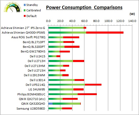
In terms of power consumption the manufacturer
lists usage of 50.0W and 0.5W in standby. We carried out our normal tests to
establish its power consumption ourselves.
|
 |
|
State and Brightness
Setting |
Manufacturer Spec (W) |
Measured Power Usage
(W) |
|
Default (80%) |
50.0 |
54.4 |
|
Calibrated (25%) |
- |
53.5 |
|
Maximum Brightness (100%) |
- |
54.5 |
|
Minimum Brightness (0%) |
- |
53.1 |
|
Standby |
0.5 |
7.1 |
|
We tested this ourselves and found that out of the
box the screen used 54.4W of power. No matter what brightness setting you select
in the OSD menu, the power consumption barely changes at all. There is a reason
for this which we will discuss
later
on in the review but because of the way this brightness control works, you
are stuck using the full power consumption at all times. This should probably be
a consideration as it's much higher than most displays once calibrated to a
comfortable luminance. Even when the screen is on standby it uses 7.1W of power,
nowhere near the spec of 0.5W.
Panel and Backlighting
|
Panel Manufacturer |
AU Optronics |
Colour Palette |
16.7 million |
|
Panel Technology |
AMVA |
Colour Depth |
8-bit |
|
Panel Module |
M320DVN01.0 |
Colour space |
Standard gamut |
|
Backlighting Type |
W-LED |
Colour space coverage (%) |
100% sRGB, ~72% NTSC |
Panel Part and Colour Depth
The QNIX QX320QHD features an
AU Optronics M320DVN01.0 AMVA panel which is capable of producing 16.7 million colours.
The panel offers an 8-bit colour depth and the part is confirmed when
dismantling the screen as shown below. This is the same panel as used in the
BenQ BL3200PT as well. Most places, including the QNIX spec seem to refer to
this screen as having an "AH-VA panel" which is in fact incorrect. AHVA is AU
Optronics' answer to IPS technology from LG.Display. The panel used here is an
AMVA (VA type) panel as indicated by the high contrast ratio of 3000:1 - which is
a dead giveaway that it is VA and not IPS-type.
Screen
Coating
The
screen coating on the QX320QHD is a light anti-glare (AG) offering as
opposed to any kind of glossy coating, similar to other AMVA panels we've tested
in the past although perhaps not quite as "semi-glossy" as we're used to. It
retains its anti-glare properties to avoid unwanted reflections, but does not
produce an overly grainy or dirty image that some thicker AG coatings can.
There are some slight cross-hatching patterns visible if you know how to spot
them but they are very subtle and shouldn't bother the average user at all.
Certainly not as pronounced as seen on the Dell U2713HM which was sometimes
criticised for the cross-hatching appearance of the coating.
Backlight Type and Colour Gamut
The screen uses a White-LED (W-LED) backlight unit
which has become very popular in today's market. This helps reduce power
consumption compared with older CCFL backlight units and brings about some
environmental benefits as well. The W-LED unit offers a standard colour gamut
which is approximately equal to the sRGB colour space (100% sRGB coverage quoted).
Anyone wanting to work with wider colour spaces would need to consider wide
gamut CCFL screens or the newer range of GB-r-LED type displays available
now. If
you want to read more about colour spaces and gamut then please have a read of
our
detailed article.
Backlight
Dimming and Flicker
We tested the screen to establish the methods used
to control backlight dimming. Our in depth article talks in more details about a
common method used for this which is called
Pulse Width Modulation (PWM). This in itself gives cause for concern to some
users who have experienced eye strain, headaches and other symptoms as a result
of the flickering backlight caused by this technology. We use a photosensor +
oscilloscope system to measure backlight dimming control
with a high level of accuracy and ease. These tests allow us to establish
1) Whether PWM is being used to control the
backlight
2) The frequency and other characteristics at which this operates, if it is used
3) Whether a flicker may be introduced or potentially noticeable at certain
settings
If PWM is used for backlight dimming, the higher
the frequency, the less likely you are to see artefacts and flicker. The duty
cycle (the time for which the backlight is on) is also important and the shorter
the duty cycle, the more potential there is that you may see flicker. The other
factor which can influence flicker is the amplitude of the PWM, measuring the
difference in brightness output between the 'on' and 'off' states. Please
remember that not every user would notice a flicker from a backlight using PWM,
but it is something to be wary of. It is also a hard thing to quantify as it is
very subjective when talking about whether a user may or may not experience the
side effects.
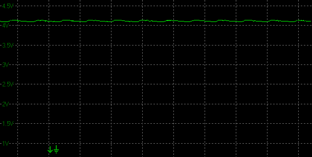
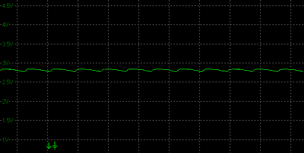
100% 50%
0%
Above scale = 1
horizontal grid = 5ms
At all brightness settings a constant voltage is
applied to the backlight, and PWM is not used for backlight dimming at all.
There is a low amplitude and low frequency (60Hz) oscillation evident in the
graphs above, but it's not something which should cause any real issue in
practice. The screen is flicker free as a result. However, the bad news is that
when you alter the brightness control you are actually controlling the digital
white level, and not adjusting the backlight voltage (using a Direct Current
method). As a result, contrast ratio is destroyed and it is hard to achieve a
satisfactory setup. See the following sections for more information. The screen
does live up to its flicker free advertisement, but the brightness control
method used is not very good.
|
Pulse Width
Modulation Used |
No |
|
Cycling
Frequency |
n/a |
|
Possible
Flicker at |
|
|
100% Brightness |
No |
|
50% Brightness |
No |
|
0% Brightness |
No |
For an up to date list of all flicker-free (PWM free) monitors please see our
Flicker Free Monitor Database.
Contrast
Stability and Brightness
We wanted to see how much variance there was in
the screens contrast as we adjusted the monitor setting for brightness.
In theory, brightness and contrast are two independent parameters, and good
contrast is a requirement regardless of the brightness adjustment.
Unfortunately, such is not always the case in practice. We recorded the
screens luminance and black depth at various OSD brightness settings, and
calculated the contrast ratio from there. Graphics card settings were left at
default with no ICC profile or calibration active. Tests were made using an
X-rite i1 Display Pro colorimeter. It should be noted that we used the
BasICColor calibration software here to record these, and so luminance at
default settings may vary a little from the LaCie Blue Eye Pro report.
|
OSD
Brightness |
Luminance
(cd/m2) |
Black
Point (cd/m2) |
Contrast
Ratio
( x:1) |
|
100 |
264.40 |
2.06 |
128 |
|
90 |
258.39 |
0.93 |
278 |
|
80 |
233.10 |
0.18 |
1295 |
|
70 |
207.66 |
0.11 |
1888 |
|
60 |
186.77 |
0.11 |
1698 |
|
50 |
164.62 |
0.11 |
1497 |
|
40 |
147.36 |
0.12 |
1228 |
|
30 |
128.24 |
0.12 |
1069 |
|
20 |
110.38 |
0.12 |
920 |
|
10 |
96.80 |
0.12 |
807 |
|
0 |
81.81 |
0.12 |
682 |
|
Total Luminance Adjustment Range
(cd/m2) |
182.59 |
Brightness OSD setting controls backlight? |
|
|
Total Black Point
Adjustment Range (cd/m2) |
1.94 |
|
Average Static Contrast Ratio |
- |
PWM Free? |
|
|
Recommended OSD setting
for 120 cd/m2 |
25 |
The brightness control gave us a pretty good range
of adjustment when it comes to actual luminance output. At the top end the
maximum luminance reached 264.4
cd/m2 which was
high, and only slightly lower than the specified maximum brightness of 300 cd/m2
from the manufacturer. There was a decent 182.59 cd/m2 adjustment
range in total, and so at the minimum setting you could reach down to a fairly low
luminance of 81.81 cd/m2. This should be adequate for those wanting
to work in darkened room conditions with low ambient light. A setting of 25 in the OSD menu should return you a
luminance of around 120 cd/m2 at default settings.
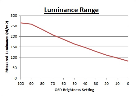
We have plotted the
luminance trend on the graph above.
The brightness setting in the OSD menu does
reduce the luminance of the screen in a fairly consistent manner, although the
adjustments at the top end from 100 - 90 don't alter the luminance much.
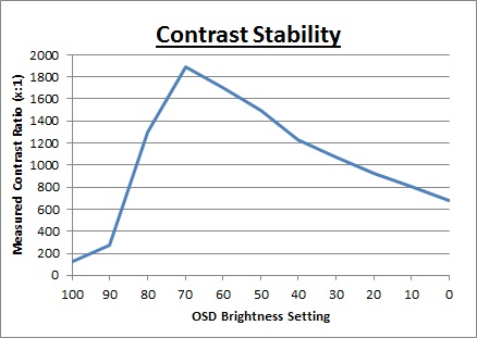
It is when we examine the contrast stability information that the truth emerges
about the brightness control of this screen. While it is good news that the
screen is dimmed
without the need for
Pulse Width Modulation, and is flicker free, a more problematic issue arises
here. The backlight intensity is not actually being adjusted at all here, and it
is always running at maximum voltage, and therefore a constant (high) power
consumption. To avoid the need for PWM to dim the backlight, QNIX have instead
opted to use a digital white level control. That means that the brightness
control is controlling the digital white level, having a massive knock-on effect
to the contrast ratio and the appearance of the image. You can see that the contrast ratio varies hugely across, and you can see this in practice as the
contrast and image look very varied across the brightness adjustment range. In
the best case, at around 70% brightness we achieve a contrast ratio of 1888:1
which is very good obviously, although nowhere near the advertised 3000:1 spec.
At this brightness setting you have a specific digital white level setting,
paired with a specific digital lack level setting from the 'contrast' control
option. The resulting contrast and image at least look right, but as you
move away from this balance of the two, the actual contrast ratio is affected
significantly. Unfortunately at settings around 70% brightness where the
contrast ratio is at least good, the luminance is too high for comfortable
viewing at around 208
cd/m2. If
you want to achieve a comfortable luminance of around 120
cd/m2 a setting
of about 25% brightness is needed in the OSD menu, which leaves you with a
contrast ratio of ~990:1. Not only are you crushing contrast ratio, but dark
content detail is totally lost as well and the image does not look as good.
This is a very
rare thing to see in the modern desktop monitor market, and frankly is very
disappointing. The brightness control should be controlling the backlight
intensity, allowing you to achieve a good range of luminance while maintaining a
stable contrast ratio as well. As a result the only way to get a more
comfortable brightness from the display is to change the monitors digital white
level, or change your graphics card brightness output. Either way, you are
crushing the contrast ratio significantly and affecting your image quality
negatively.
Testing
Methodology
An
important thing to consider for most users is how a screen will perform out of
the box and with some basic manual adjustments. Since most users won't have
access to hardware colorimeter tools, it is important to understand how the
screen is going to perform in terms of colour accuracy for the average user.
We restored our graphics card to default settings and disabled any previously active
ICC profiles and gamma corrections. The screen was tested at default factory settings using the DVI interface, and analysed using
an
X-rite i1
Pro Spectrophotometer (not to be confused with the i1 Display Pro
colorimeter) combined with
LaCie's Blue Eye Pro software suite. An X-rite i1 Display Pro colorimeter was
also used to verify the black point and contrast ratio since the i1 Pro
spectrophotometer is less
reliable at the darker end.
Targets for these tests are as follows:
-
CIE Diagram - validates the colour space
covered by the monitors backlighting in a 2D view, with the black triangle representing the
displays gamut, and other reference colour spaces shown for comparison
-
Gamma - we aim for 2.2 which is the default
for computer monitors
-
Colour temperature / white point - we aim
for 6500k which is the temperature of daylight
-
Luminance - we aim for 120
cd/m2, which is
the recommended luminance for LCD monitors in normal lighting conditions
-
Black depth - we aim
for as low as possible to maximise shadow detail and to offer us the best
contrast ratio
-
Contrast ratio - we aim
for as high as possible. Any dynamic contrast ratio controls are turned off here
if present
-
dE average / maximum -
as low as possible.
If DeltaE >3, the color displayed is significantly different from the
theoretical one, meaning that the difference will be perceptible to the
viewer.
If DeltaE <2, LaCie considers the calibration a success; there remains a
slight difference, but it is barely undetectable.
If DeltaE < 1, the color fidelity is excellent.
Default Performance and
Setup
Default settings of the screen were as follows:
|
Monitor OSD Option |
Default Settings |
|
Brightness |
80 |
|
Contrast |
89 |
|
Preset mode |
Normal |
|
RGB |
82, 87, 93 (locked) |
QNIX QX320QHD - Default Settings


|
|
Default Settings |
|
luminance (cd/m2) |
256 |
|
Black Point (cd/m2) |
0.18 |
|
Contrast Ratio |
1460:1 |
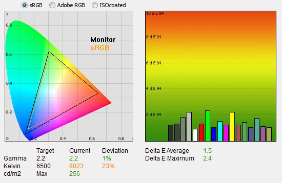
Initially out of the box the screen was set in the
default 'normal' preset mode. The screen was bright as it was set at
a default 80% brightness setting. Colours felt a bit too cool, but you could tell it was a standard gamut screen. We went ahead and measured the default state with
the i1 Pro.
The
CIE diagram on the left of the image confirms that the monitors colour gamut
(black triangle) is roughly equal to the sRGB colour space. There is some minor
over-coverage in some blue and green shades, but not by anything significant.
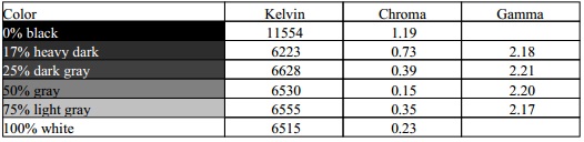
Default gamma was recorded at 2.2 average, leaving it with a small 1% deviance
from the target of 2.2 which was very good. White point was measured at 8023k
being too cool and 23% out from the target of 6500k which was a shame. Perhaps
this was a deliberate overly cool normal mode, so that it's visibly easy to tell
when you switch to the heavily promoted low blue light mode which is warmer?
Luminance was recorded at a bright 256
cd/m2 which is
too high for prolonged general use. The screen was set at a default 80%
brightness in the OSD menu but that is easy to change of course to reach a more
comfortable setting. The problem with doing that is that it
massively impacts
the contrast ratio and appearance of the screen since you are not adjusting the
backlight intensity, but adjusting the digital white level. We have talked about
that in the previous section and will look at how to calibrate the screen in the
following section.
At this default setting
the black depth was 0.18 cd/m2 giving us a good static contrast ratio of
1460:1. This was strong compared with other panel technologies like TN Film and
IPS, but for a VA panel it was pretty low. It couldn't live up to the specified
3000:1 figure and because of the way the brightness control works, it really
varies massively depending on your brightness setting.
Colour accuracy was at least very good out of the box
with a default dE average of 1.5 and a maximum of only 2.4. Testing the screen with various gradients showed smooth transitions
with no sign of any banding thankfully. There was some gradation evident as you
will see from most monitors in darker tones.
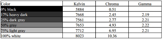
Colour Temperatures
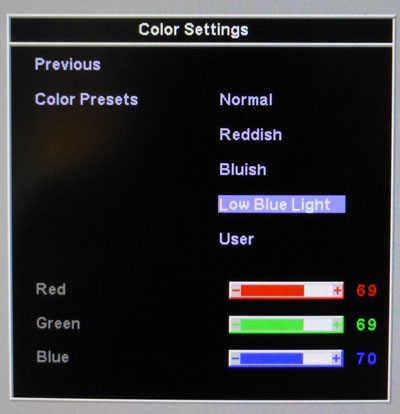
The QX320QHD features a range of 'color presets'
within the OSD menu as shown above. We measured the screen
with the X-rite i1 Pro spectrophotometer in each of the preset modes to establish
their colour temperature / white point. All other settings were left at factory defaults and no
ICC profile was active. The results are recorded below:
|
Selected
Preset Mode |
RGB Settings
in OSD |
Measured
Colour temperature (k) |
|
Normal |
82, 87, 93 |
8023 |
|
Reddish |
96, 87, 89 |
6585 |
|
Bluish |
78, 84, 96 |
9148 |
|
Low Blue Light |
87, 85, 79 |
5814 |
|
User |
87, 87, 42 |
4257 |
You will note that we've also listed the RGB
levels for each of these preset modes in the table above. These are locked for
each preset, with the exception of the "user" mode where you can change them
as you like. We had found on the 27" QX2710 that the preset modes didn't offer
any real adjustment at all to the RGB levels, and so the resulting white point
remained very static. On the QX320QHD the preset modes do at least change the
appearance. The normal mode is a bit too cool as we'd established in the
previous section of the review. The 'reddish' mode was actually closer to our
desired 6500k white point, measured at 6585k here. Bluish was much cooler even
than the normal mode. Low blue light mode did indeed reduce the blue gain a
lot, resulting in a warmer appearance and a 5814k white point. The user mode
was incredibly yellow by default and was warmer still. We're not sure why the
user mode is set up by default like this, but at least you can change the RGB
settings in that mode for calibration.
The Low Blue Light mode designed to reduce the
blue spectral output of the W-LED backlight which can be harsh on the eyes to
some users. See the relevant section from our
BenQ XL2720Z review for more information about that feature. Other manufacturers have more
recently followed suit as well since BenQ first introduced it. The QNIX QX2710 when we tested it in April
2014 had a Low Blue
Light option in the color presets menu but it didn't seem to do anything at
all in practice. We were keen to see if this now worked as a feature on the
QX320QHD.
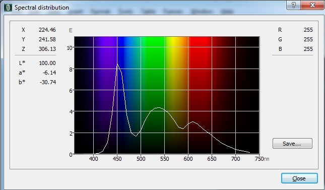
We measured the spectral distribution of the
backlight first of all in the 'normal' colour preset mode, using the X-rite i1
Pro. You can see the high peak for blue light from W-LED backlights here,
which is what a Low Blue Light mode is designed to try and reduce.
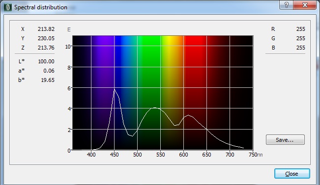
Switching to the Low Blue Light mode setting in
the OSD resulted in a pleasing reduction in blue light output as shown above.
This worked more effectively than it had on the QX2710, although you are now
running with a warmer overall screen appearance as a result.
Calibration
We used the
X-rite i1 Pro spectrophotometer combined with the LaCie Blue Eye Pro
software package to achieve these results and reports. An X-rite i1 Display Pro
colorimeter was used to validate the black depth and contrast
ratios due to lower end limitations of the i1 Pro device.
|
Monitor OSD Option |
Calibrated Settings |
|
Brightness |
32 |
|
Contrast |
89 |
|
Preset Mode |
User |
|
RGB |
85, 83, 84 |
QNIX QX320QHD- Calibrated Settings
|
|
Calibrated Settings |
|
luminance (cd/m2) |
120 |
|
Black Point (cd/m2) |
0.10 |
|
Contrast Ratio |
1213:1 |
Calibration of the QX320QHD can be tricky as
we are lacking any real backlight control. With the brightness setting
controlling the digital white level, as you reduce this to a comfortable
luminance, you end up crushing the contrast ratio and making the image look bad.
We did our best to overcome this and achieve a more comfortable setup as best we
could. First of all we changed to the 'user' preset mode which would give us access
to the RGB channels, as well as the brightness and contrast settings which are
available in all the modes. We left the LaCie software to calibrate
to "max" brightness which would just retain the luminance of whatever brightness
we'd set the screen to, and would not in any way try and alter the luminance at
the graphics card level, which can reduce contrast ratio even further. These adjustments
before profiling the screen would help preserve tonal values and limit
banding issues. After this we let the software carry out the LUT adjustments and create an
ICC profile.
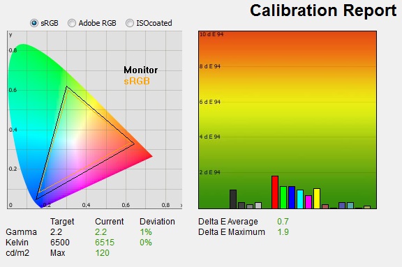
Average gamma was measured at 2.2 average,
with only a minor 1% deviance as we'd seen out of the box in the 'normal' preset
mode. The
white point was now corrected to the target, now measured at 6515k, correcting
the significant 23% deviance out of the box. Luminance had been improved thanks to the
adjustment to the brightness setting and was now being measured at 120
cd/m2. Since
this controlled the digital white level it did crush the contrast ratio, leaving us with a black depth of 0.10 cd/m2
but a
still reasonable static contrast ratio
of
1213:1. Again this was nowhere near the capability of a VA panel like this, but
with the digital white level needing to be turned down to achieve a comfortable
luminance, this was a necessary sacrifice. Colour accuracy of the resulting
profile was very good, with dE average of 0.7 and maximum of 1.9. LaCie would
consider colour fidelity to be very good overall.
Testing the screen with various colour gradients
showed mostly smooth transitions. There was gradation evident in mid to dark tones
and some minor banding introduced due to the adjustments to the
graphics card LUT from the profilation of the screen. The dark tones were badly
affected however because of the way the brightness control operates, losing a
large portion of the darker tones into a black mess. This was unfortunately
unavoidable if you want to run the screen at a luminance around this level.
You can use our settings and
try our calibrated ICC profile if you wish, which are available in
our ICC profile database. Keep in mind that results will vary from one
screen to another and from one computer / graphics card to another.
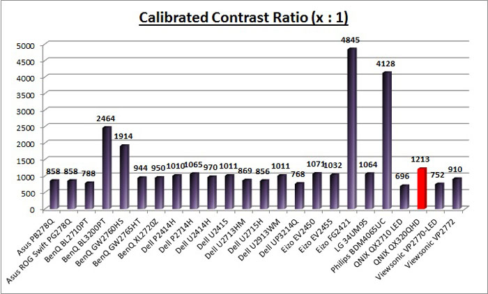
Performance Comparisons
The comparisons made in this section try to give
you a better view of how each screen performs, particularly out of the box which
is what is going to matter to most consumers. When comparing the default factory
settings for each monitor it is important to take into account several
measurement areas - gamma, white point and colour accuracy. There's no point
having a low dE colour accuracy figure if the gamma curve is way off for
instance. A good factory calibration requires all 3 to be well set up. We have
deliberately not included luminance in this comparison since this is normally
far too high by default on every screen. However, that is very easily controlled
through the brightness setting (on most screens) and should not impact the other
areas being measured anyway. It is easy enough to obtain a suitable luminance
for your working conditions and individual preferences, but a reliable factory
setup in gamma, white point and colour accuracy is important and not as easy to
change accurately without a calibration tool.
From these comparisons we can also compare the
calibrated colour accuracy, black depth and contrast ratio. After a calibration
the gamma, white point and luminance should all be at their desired targets.
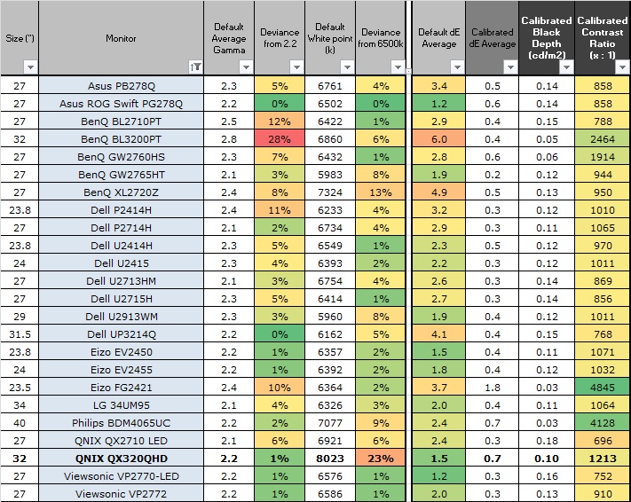
Default setup of the screen out of the box was
mostly pretty good. Gamma was within a very minor 1% deviance from the target
which was pleasing.
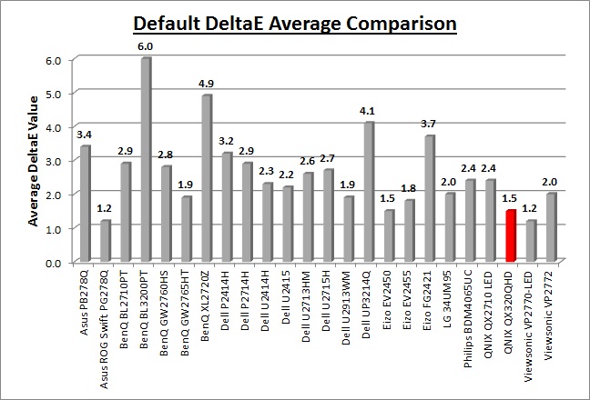
Colour accuracy was very good at dE 1.5 average, and contrast ratio was good at
1460:1. This was a high contrast ratio but not as high as you can get from
modern VA panels like this, down to the poor brightness adjustment
behaviour. The other problem with the default setup was the overly cool white
point, measured at 8023k and being 23% out from our target. The luminance was
also too high which is standard for most screens. We would normally not have
this as an issue, as usually a simple brightness adjustment in the OSD reduces
the backlight, lowers the luminance and does not impact any other aspect of the
setup. That can't be said for this display though as it adjusts the digital
white level, skewing contrast badly and affecting the image quality.
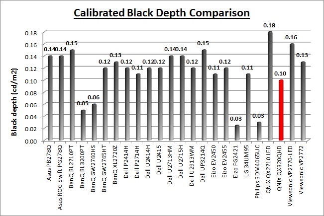
The display was pretty good when it came to black depth
and contrast ratio compared with IPS and TN Film type displays. With a calibrated contrast ratio
of 1213:1 you might consider this to be a high figure. In reality it was very
low for a VA panel which is capable of reaching up to around 2500 - 3000:1 as
evident by the BenQ BL3200PT (2464:1) which uses the exact same panel. The
reason for the crushed contrast ratio was again related to the digital white
level adjustment instead of a real backlight control. Not to mention that once
calibrated to a comfortable luminance level the dark tonal range is severely
crushed as well.
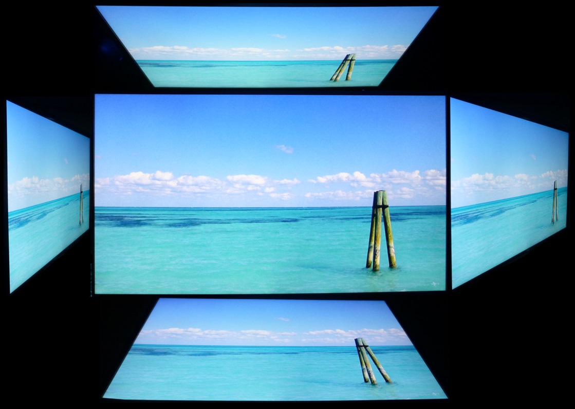
Viewing Angles
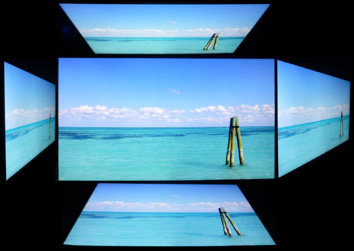
Above: Viewing
angles shown from front and side, and from above and below. Click for
larger image
Viewing angles of the QX320QHD, like the BenQ
BL3200PT we'd tested before, were surprisingly good. We had seen some steps
forward for VA viewing angles when we reviewed the
BenQ GW2760HS with its "Color Shift-Free Technology". This had given a
marked improvement over older AMVA panels such as the
BenQ GW2750HM which is compared in the review of the GW2760HS linked. The
viewing angles of these new 32" AMVA panels are perhaps even a little better
still than the GW2760HS. There was less contrast shift horizontally and the
wider viewing positions were less pale than on the GW2760HS. They were certainly
much better than older AMVA panels which had a tendency to go very pale and also
introduce an obvious colour shift. On the older GW2750HM for instance the image
went very yellow from a horizontal angle. Vertically there was a slightly more
pronounced contrast shift and the image went a little pale, but again not as
noticeable as on the GW2760HS and without all the yellow colour shift of the
GW2750HM. These improvements were very pleasing, and the BL3200PT was certainly
a very good step forward when it comes to viewing angles. They weren't quite as
wide as IPS-type panels, but they were certainly getting much closer.
Despite these improvements users should still be
aware that the panel still exhibits the off-centre contrast shift which is
inherent to the VA pixel structure. When viewing a very dark grey font on a
black background, the font almost disappears when viewed head on, but gets
lighter as you move slightly to the side. This is an extreme case of course as
this is a very dark grey tone we are testing with. Lighter greys and other
colours will appear a little darker from head on than they will from a side
angle, but you may well find you lose some detail as a result. This can be
particularly problematic in dark images and where grey tone is important. It is
this issue that has led to many graphics professionals and colour enthusiasts
choosing IPS panels instead, and the manufacturers have been quick to
incorporate this alternative panel technology in their screens. We would like to
make a point that for many people this won't be an issue at all, and many may
not even notice it. Remember, many people are perfectly happy with their TN Film
panels and other VA based screens. Just something to be wary of if you are
affected by this issue or are doing colour critical work.

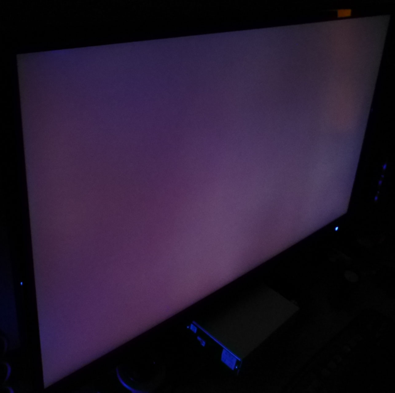
Above: View of an
all black screen from the side. Click for larger version
On a black image there was a pale purple hue to
the screen as you can see above. It wasn't as obvious as the white glow
(commonly referred to as IPS-glow) you see from a lot of IPS-type panels, but it
was more than any off-angle glow we had seen from the BenQ BL3200PT using the
same panel.
Panel Uniformity
We wanted to test
here how uniform the brightness and colour temperature was across the screen, as well as identify any
leakage from the backlight in dark lighting conditions. Measurements of the luminance
and colour temperature were taken at 35 points across the panel on a pure
white background. The measurements for luminance were taken using BasICColor's calibration
software package, combined with an X-rite i1 Display Pro
colorimeter with a central point on the screen calibrated to 120 cd/m2. Measurements for colour temperature (white point) were taken using
BasICColor software and the i1 Pro spectrophotometer which can more accurately
measure the white point of different backlighting technologies. The below uniformity diagram shows the difference, as a percentage,
between the measurement recorded at each point on the screen, as compared with the
central reference point.
It is worth
noting that panel uniformity can vary from one screen to another, and can depend
on manufacturing lines, screen transport and other local factors. This is only a
guide of the uniformity of the sample screen we have for review.
Uniformity of Luminance
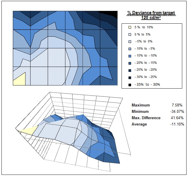
The luminance uniformity of the screen was
a bit of a concern. Our sample showed a
noticeable difference in luminance diagonally across the screen from bottom
left to top right. In the bottom left hand corner it was a little brighter
than the centrally calibrated 120
cd/m2
point, ranging up to 130 cd/m2 in the most extreme example. The
top right hand region of the screen was much darker though, dropping down to
91 cd/m2. This could prove problematic if you are working with
colour critical content or large areas of a single colour where the
variation will become apparent. Only 45% of the screen was within a 10%
deviance of the target which was pretty poor. Maybe performance will vary by
sample.
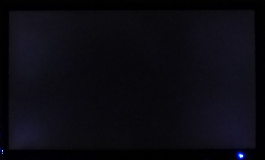
Backlight Leakage
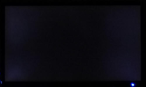
Above: All black screen in a darkened room. Click for larger version
As usual we also tested the screen with an all
black image and in a darkened room. A camera was used to capture the result. The
camera showed there was some clouding from the four corners of the display. This
was fairly subtle in practice to be honest and was nothing too severe.
General and Office Applications
The QX320QHD feature a large 2560 x 1440 WQHD
resolution which we've seen for several years from 27" sized monitors. This is
part of the new generation of larger 32" sized screens with the same resolution.
As a result of the larger 32" screen size you are left with a larger pixel pitch
than on a 27" monitor of course, and so text and fonts are bigger. On the
QX320QHD the pixel pitch of 0.276 mm is quite a bit bigger than 0.231 mm offered
by a 27" monitor of the same res although certainly not too big we didn't
feel. In fact it is smaller than on a 27" 1920 x 1080 resolution screen
(0.311mm) and is very comparable to a 24" 1920 x 1200 res model (0.270 mm) in
pixel pitch. Many people will find this an ideal pixel pitch we think, being
more comfortable for a lot of text work without being too small, and without
giving up the huge resolution which is great for multi-tasking and split-screen
work.
|
Screen size |
24" |
27" |
27" |
32" |
|
Resolution |
1920 x 1200 |
1920 x 1080 |
2560 x 1440 |
2560 x 1440 |
|
Pixel Pitch (mm) |
0.270 |
0.311 |
0.231 |
0.276 |
The massive resolution is really good for office
and general use, giving you a really big screen area to work with. It is a
noticeable upgrade from a 24" 1920 x 1200 resolution for multi-tasking and
overall desktop area. For those wanting a high resolution for CAD/CAM, design,
photo work etc, this is a really good option. The image was very sharp and crisp
and text was very clear.
With its
WQHD display, you enjoy 77% more desktop space than a full HD screen to spread
out your windows and palettes.
The screen can also support "virtual 4k" resolutions if you have a suitable
graphics card and set up a custom resolution to send to the panel (30Hz maximum
refresh rate at 3840 x 2160). This seems to be a current trend with some
manufacturers so that they can advertise their screen as supporting 4k
resolution, but without actually providing a native 4k panel. It's a bit
misleading in our opinion and buyers should watch out for it. We tried it on the
QX2710 before, and also on the QX320QHD now out of interest but fail to see any
real use for it. The high resolution just gets scaled by the panel back down to
the 2560 x 1440 pixels which make up the panel. As a result you lose sharpness
and clarity and text looks more blurry. Add to this also that you are limited to
using a 30Hz refresh rate and it's not a great feature.
The light AG coating from the AMVA
panel is a positive feature when it comes to these kind of uses and we had been
pleased with the coating on this model. This light panel coating ensures that
white backgrounds of office documents looked good, and did not suffer from the
overly grainy and dirty feel of some competing panels featuring heavy,
aggressive AG coating. It also remained free from the reflections you might
experience from a full glossy solution so seems to be a good half-way between
the two.
The
wide and improved viewing angles provided by the modern AMVA panel in both
horizontal and vertical planes, helps minimize on-screen colour shift when
viewed from different angles. You do have to contend with the off-centre
contrast shift inherent to VA panels which can lead to some detail being lost in
darker content when viewed head on. It's not a major problem but it's one of the
reasons why IPS is considered a better choice for colour critical work. There
are low levels of glow on dark content from an angle, certainly nothing like
you see on most IPS panels although it was more apparent than on the similar
BenQ BL3200PT for some reason. The sheer size of the screen may create some minor
issues with glow visibility towards the corners depending on your viewing
position and line of sight.
The default setup
of the screen was decent enough, offering a good gamma and low dE. The white
point was a bit too cool and the screen was far too bright. The major problem
with this screen is the lack of a true backlight adjustment, and so (as we've
talked about lots already), achieving a comfortable luminance comes at a big
cost. The Low Blue Light mode may be useful to some users who are sensitive to
the blue spectral output from the W-LED backlight unit. It at least did reduce
the blue spectral output but again you've still got problems with the luminance
and contrast ratio. The brightness
range of the screen was good, with the ability to offer a luminance between
approximately 264 and 82 cd/m2. This should mean the screen is
perfectly useable in a wide variety of ambient light conditions, including
darkened rooms. A setting of ~25 in the OSD brightness control should return you
a luminance close to 120 cd/m2. The
backlight regulation is the main issue. There's no PWM used which at least
means the screen is flicker free, but the fact that the backlight is not
adjusted is a major drawback.
The stand provided on this particular model we are
testing is very limited as well, with only a basic side to side swivel offered.
There's not even a tilt adjustment here and so the screen is too vertical for
our liking. In fact we had to wedge some cardboard underneath the front of the
stand to tilt the screen back a bit for our uses! Look for the other versions of
the QX320QHD if you can as the lack of stand adjustments on this model is
annoying. Wall or arm-mounting the screen is an option of course
as the screen is at least VESA compliant (200 x 100mm). The additional
integrated speakers might be useful for the odd Youtube clip or mp3. There's
unfortunately no USB ports or any further extras like ambient light sensors or
card readers which are useful in office environments.
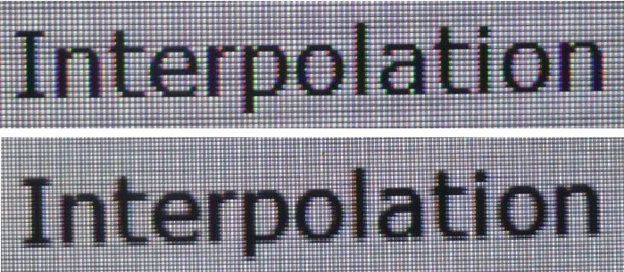
Above: photo of
text at 2560 x 1440 (top) and 1920 x 1080 (bottom)
The screen is designed to run at its native
resolution of 2560 x 1440 and at a 60Hz recommended refresh rate. However,
if you want you are able to run the screen outside of this resolution. We tested
the screen at a lower 1920 x 1080 resolution to see how the screen handles the
interpolation of the resolution, while maintaining the same aspect ratio of
16:9. At native resolution the text was sharp and a comfortable size as we've already
discussed. When running at a 1080p resolution the text is still sharp, with low
levels of blurring. You do lose some screen real-estate as well of course but
the image seems to be interpolated well from 1080p sources.
Responsiveness and Gaming
|
Quoted G2G Response Time |
5ms G2G |
|
Quoted ISO Response Time |
n/a |
|
Panel Manufacturer and
Technology |
AU Optronics |
|
Panel Part |
M320DVN01.0 |
|
Overdrive Used |
? |
|
Overdrive Control Available to
User |
No |
|
Overdrive Settings |
n/a |
The QX320QHD is rated by QNIX as having a 5ms G2G
response time which suggests that the panel should be using
overdrive /
response time compensation (RTC) technology to boost pixel transitions
across grey to grey changes. There is no user control over the overdrive impulse
within the OSD menu so we will have to rely on the manufacturers setup here. The
part
being used is the
AU Optronics M320DVN01.0 AMVA panel. Have a read about response time in
our
specs section if you need additional information about this measurement.
We will first test the screen using our thorough
response time testing method. This uses an oscilloscope and photosensor to
measure the pixel response times across a series of different transitions, in
the full range from 0 (black) to 255 (white). This will give us a realistic view
of how the monitor performs in real life, as opposed to being reliant only on a
manufacturers spec. We can work out the response times for changing between many
different shades, calculate the maximum, minimum and average grey
to grey (G2G) response times, and provide an evaluation of any overshoot present
on the monitor.
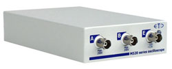
We use an
ETC M526
oscilloscope for these measurements along with a custom photosensor device.
Have a read of
our response time measurement article for a full explanation of the testing methodology and reported
data.
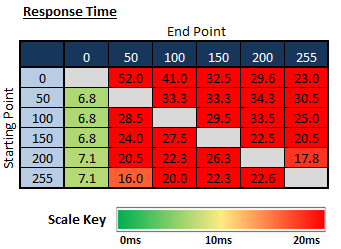
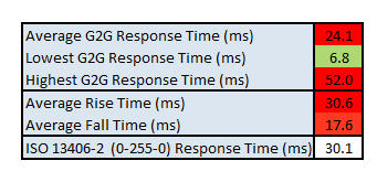
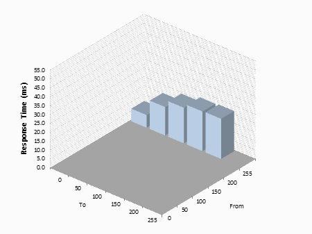
It appears that the screen does not use overdrive
at all! The average G2G response time was measured at 24.1ms which was very slow
for any modern panel. VA panels have never been known for their responsiveness,
and to use one without any overdrive circuit is asking for trouble. The only
"normal" speed transitions were those changing to black (x > 0) where they
reached down to 6.8 - 7.1ms. The rest of the transitions from grey to grey
shades were very slow indeed. The rise times particularly were slow, with some
reaching as high as 52ms in the worst cases. It looks like QNIX haven't used an
overdrive circuit on this model at all. We know from our tests of the BenQ
BL3200PT which uses the same panel, that it is capable of faster pixel response
times when overdrive is properly applied. A few slow transitions plagued that
screen as well but it was much faster than the QX320QHD. Clearly the 5ms G2G
response time spec is misleading here.
On a positive note, because no overdrive was being
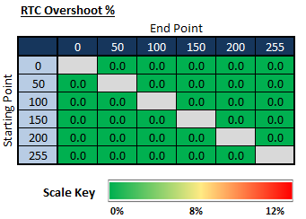
used there was no overshoot at all.
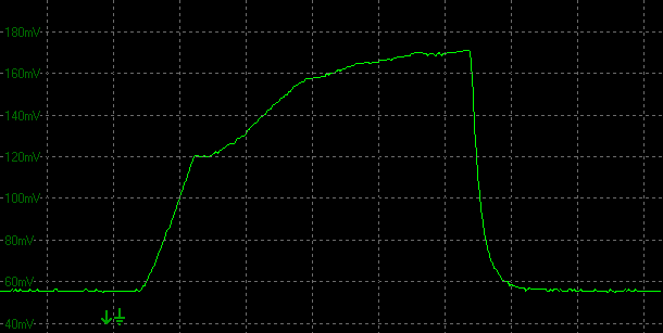
Transition: 0-50-0(scale = 20ms)
The above graph gives an example of the slowest
pixel response time we measured, on the rise time here from 0 - 50. This was
measured at a whopping 52ms to reach 90% of the desired final luminance.
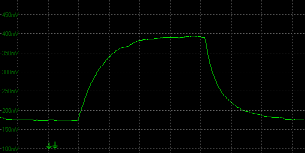
Transition: 50-100-50
(scale = 20ms)
The above is a more classic example of what we
saw. Slow rise times (33.3ms here) and slow fall times (28.5ms). No overshoot at
all, because it seems overdrive is not even been applied.
Display Comparisons
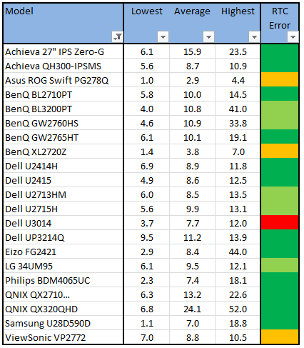
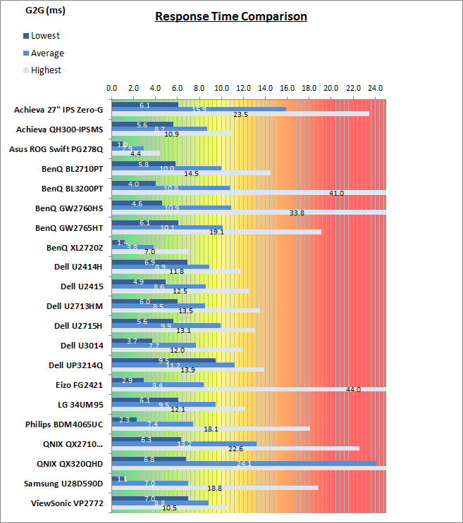
The above comparison table and graph shows you the
lowest, average and highest G2G response time measurement for each screen we
have tested with our oscilloscope system. There is also a colour coded mark next
to each screen in the table to indicate the RTC overshoot error, as the response
time figure alone doesn't tell the whole story.
The response time performance of the QNIX QX320QHD
was very poor unfortunately. With an average G2G response time figure of 24.1ms
it was slower than any other panel we've tested. It's a VA panel type, which are
inherently slow anyway and really need a decent amount of overdrive applied to
be able to reach satisfactory speeds for gaming. Unfortunately with overdrive
being left off this screen, the pixel transitions were slow. We have seen much
faster from other modern VA panels like the BenQ BL3200PT (same panel - 10.8ms
G2G average) and BenQ GW2760HS (10.9ms) for instance. IPS panels can reach a
little faster still, getting to around 8.6ms G2G in the best cases without
introducing a lot of overshoot problems from an overly aggressive RTC impulse.
TN Film models are of course faster still, reaching down to 2.9ms for instance in the example of the new
Asus
ROG Swift PG278Q (with moderate overshoot). As a result, we wouldn't
recommend this screen for gaming to be honest, unless it's perhaps low motion
games which won't suffer as a result of the slow response times too much.
The screen was also tested using the chase test in
PixPerAn for the following display comparisons. As a reminder, a series of
pictures are taken on the highest shutter speed and compared, with the best case
example shown on the left, and worst case example on the right. This should only
be used as a rough guide to comparative responsiveness but is handy for a
comparison between different screens and technologies as well as a means to
compare those screens we tested before the introduction of our oscilloscope
method.
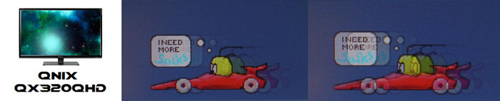
32"
5ms
G2G (?) AU Optronics AMVA
In practice the QNIX QX320QHD showed high levels
of motion blur and some ghosting due to its slow response times. There was no
user control for the overdrive impulse and so there was no way to speed the
panel up either unfortunately.
32"
5ms
G2G (?) AU Optronics AMVA
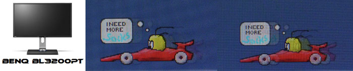
32"
4ms
G2G AU Optronics AMVA (AMA Setting = High)
27"WS 4ms G2G AU Optronics AMVA (AMA = High)
If we compare the QX320QHD first of all against
two other recent VA panels we've tested, the difference in responsiveness is
quite obvious. There is far more blurring and some ghosting to the image from
the QNIX than the other two models, and we know from our oscilloscope
measurements that they have a healthy application of overdrive to boost pixel
response times nicely.
32"
5ms
G2G (?) AU Optronics AMVA
27"
4ms
G2G AU Optronics AHVA
Comparing the QX320QHD against their 27" QX2710
model is also possible. The QX2710 features an AHVA (IPS-type) panel and
although it's quite slow for that technology compared with other models on the
market, it's still quite considerably faster than the AMVA panel (VA type) in
the 32" model here.
32"
5ms
G2G (?) AU Optronics AMVA
27"
8ms
G2G LG.Display AH-IPS (Response Time = Normal)
27" 8ms G2G
LG.Display AH-IPS
27"
4ms
G2G AU Optronics AHVA (AMA = High)

27" 12ms G2G
Samsung PLS (Response Time = Advanced)
We can also compare the QX320QHD to some
popular 27" 2560 x 1440 IPS-type screens we have tested in recent times.
All these other models are again much faster than the QNIX in practice, showing
sharper moving images with less blurring.
32"
5ms
G2G (?) AU Optronics AMVA
27"
1ms
G2G AU Optronics TN Film @ 144Hz (OD = Normal)
27" 1ms G2G
AU Optronics TN Film + 144Hz (AMA = High)
23.5" 4ms G2G
Sharp MVA + 120Hz
We've also included a comparison above against
3 very fast 120Hz+ compatible screens we have tested. The other screens shown
here are all aimed primarily at gamers and have various features and extras
which make them more suitable overall for gaming.
Firstly there is a comparison against the
Asus ROG Swift PG278Q with its 144Hz refresh
rate and fast response time TN Film panel. This showed very fast pixel response times and smooth movement thanks to
its increased refresh rate. You are able to reduce the motion blur even more
through the use of the ULMB strobed backlight as well if you need to. In other
related areas this screen also supports NVIDIA's G-sync technology. There was
some slight overshoot noticeable on the Asus but nothing major.
Then there is a comparison against the
BenQ XL2720Z with another very fast TN Film panel and 144Hz refresh rate.
This showed very low levels of motion blur, but some dark overshoot was
introduced as a side-effect as you can see. This screen even includes a native
Blur Reduction mode to help eliminate further perceived motion blur.
Lastly there is the MVA based Eizo FG2421 screen
with a fast response time (especially for the panel technology being used) and
120Hz refresh rate support. There is also an additional 'Turbo 240' motion blur
reduction mode which really helps reduce the perceived motion blur in practice.
While these pixel response tests from PixPerAn
give one view of the performance of the panel, there is something else going on as well here which can't be picked out by the camera. All of these other
gaming models are
running at 120Hz (or higher) refresh rates, which allows for improved 120fps+ frame rates and
in some cases the support of
3D stereoscopic content as well. This can really help improve smoothness and
the overall gaming experience so these screens still have the edge when it comes
to fast gaming. Any additional extras to reduce perceived motion blur can also
have a real benefit in practical terms, and again not easy to pick out with this
camera method.
Refresh Rate Overclocking
One are which some Korean monitors are known for
are their ability to overclock the refresh rate. In affect this would allow you
to boost the native 60Hz maximum refresh rate supported by the panel to 100Hz or
more. The ability to overclock a monitor depends on several factors including
the panel, internal electronics and your graphics card. You will need third
party apps to set up a custom resolution and refresh rate to test it, and
results will vary from one screen to another often. Some Korean monitors can be
overclocked up to around 100Hz which then brings about benefits in terms of
frame rate and motion smoothness for gaming. It also means you can have a 2560 x
1440 resolution IPS (or PLS/AHVA) panel with a refresh rate of >60Hz which is
desirable to some. It won't be long before we see some native 120Hz+ IPS-type
displays on the market anyway.
There are a couple of considerations which should
be made when even thinking about overclocking. Firstly you need to consider
whether the response time of the panel is even sufficient to cope with the
increased frame rate. For instance if you are running a screen at 120Hz, there
is a new frame sent to the screen every 8.33ms. If the response time is not less
than this it will not be able to keep up with the demand. This is one of the
reasons why TN Film panels are the main technology for 120Hz+ displays as their
response times allow for this frame rate support. Most IPS-type panels are much
slower and so while you might be able to send 120 fps to the screen (if you can
reach 120Hz), the response time of the pixels may struggle to keep up. This
results in excessive blurring and a poor gaming experience. You need to have pixel
response times which are at least able to keep up with the frame rate ideally.
There are still benefits in terms of gaming frame
rate and smoothness of movement but refresh rate isn't everything. You also need
to be aware that although you might be able to run a screen at a higher refresh
rate, and it will display an image, it may well drop frames which makes the
whole thing pointless anyway. That will lead to stuttering and frame drops which
no one wants. What you are looking for is a display with a fast response time,
and the ability to support higher refresh rates without frames being dropped.
This screen is advertised as being able to support
overclocked refresh rates although a specific figure isn't listed. We tested the
QX320QHD and it was easy enough to create custom resolutions and refresh rates
which the monitor accepted. An image was displayed fine at 2560 x 1440
resolution and at 75 and 100 refresh rates. We tested these over both DL-DVI and
DisplayPort. At 75Hz the image was displayed fine and we confirmed no frames
were dropped. 75Hz is a viable overclocking refresh rate on this screen. At
100Hz although the image was displayed, frames were unfortunately dropped,
meaning running at 100Hz was pointless. Some artefacts were also visible in some
situations. We didn't bother trying other custom refresh rates between 75Hz and
100Hz as the response times were too slow anyway to keep up with the frame rate
demands on this screen, even if you send 60 fps to the screen.
Additional Gaming Features
Aspect Ratio Control -
The QX320QHD has a very limited range of
aspect ratio control options through the OSD 'Misc' menu. There are only options for
"wide" and "4:3" only. At least with the screen being a native 16:9
aspect ratio it should handle a lot of content and external devices without much
issue, as a lot of content is in the same aspect ratio nowadays anyway. Would
have been nice to see more options available though like an auto-aspect
retention, 5:4 and 1:1 pixel mapping perhaps.
Preset Modes -
There is a specific gaming preset modes available
in the OSD on this model. We're not really sure what it's intended to do, but it
seems to make the image a little warmer and alter the sharpness a little,
compared with our calibrated normal mode.
Lag
We have written an in depth article about
input lag and the various measurement techniques which are used to evaluate
this aspect of a display. It's important to first of all understand the
different methods available and also what this lag means to you as an end-user.
Input Lag vs. Display Lag vs. Signal
Processing
To avoid confusion with different terminology we
will refer to this section of our reviews as just "lag" from now on, as there
are a few different aspects to consider, and different interpretations of the
term "input lag". We will consider the following points here as much as
possible. The overall "display lag" is the first, that being the delay between
the image being shown on the TFT display and that being shown on a CRT. This is
what many people will know as input lag and originally was the measure made to
explain why the image is a little behind when using a CRT. The older stopwatch
based methods were the common way to measure this in the past, but through
advanced studies have been shown to be quite inaccurate. As a result, more
advanced tools like SMTT provide a method to measure that delay between a TFT
and CRT while removing the inaccuracies of older stopwatch methods.
In reality that lag / delay is caused by a
combination of two things - the signal processing delay caused by the TFT
electronics / scaler, and the response time of the pixels themselves. Most
"input lag" measurements over the years have always been based on the overall
display lag (signal processing + response time) and indeed the SMTT tool is
based on this visual difference between a CRT and TFT and so measures the
overall display lag. In practice the signal processing is the element which
gives the feel of lag to the user, and the response time of course can
impact blurring, and overall image quality in moving scenes. As people become
more aware of lag as a possible issue, we are of course keen to try and
understand the split between the two as much as possible to give a complete
picture.
The signal processing element within that is quite
hard to identify without extremely high end equipment and very complicated
methods. In fact the studies by Thomas Thiemann which really kicked this whole
thing off were based on equipment worth >100,1000 Euro, requiring extremely high
bandwidths and very complicated methods to trigger the correct behaviour and
accurately measure the signal processing on its own. Other techniques which are
being used since are not conducted by Thomas (he is a freelance writer) or based
on this equipment or technique, and may also be subject to other errors or
inaccuracies based on our conversations with him since. It's very hard as a
result to produce a technique which will measure just the signal processing on
its own unfortunately. Many measurement techniques are also not explained and so
it is important to try and get a picture from various sources if possible to
make an informed judgement about a display overall.
For our tests we will continue to use the SMTT
tool to measure the overall "display lag". From there we can use our
oscilloscope system to measure the response time across a wide range of grey to
grey (G2G) transitions as recorded in our
response time
tests. Since SMTT will not include the full response time within its
measurements, after speaking with Thomas further about the situation we will
subtract half of the average G2G response time from the total display lag. This should allow us to give a good estimation of
how much of the overall lag is attributable to the signal processing element on
its own.
Lag Classification
To help in this section we will also introduce a broader classification system
for these results to help categorise each screen as one of the following levels:
-
Class 1)
Less than 16ms / 1 frame lag - should be fine for gamers, even at high levels
-
Class
2)
A lag of 16 -
32ms / One to two frames - moderate lag but should be fine for many gamers.
Caution advised for serious gaming and FPS
-
Class
3)
A lag of more
than 32ms / more than 2 frames - Some noticeable lag in daily usage, not
suitable for high end gaming
For the full reviews of the models compared here and the dates they were written
(and when screens were approximately released to the market), please see our
full
reviews index.
|
(Measurements in ms) |
|
|
Total Display Lag (SMTT
2) |
7.8 |
|
Pixel Response Time
Element |
7.8 |
|
Estimated Signal
Processing Lag |
~0.0 |
|
Lag Classification |
1 |
|

Class
1 |
We have provided a comparison above against other
models we have tested to give an indication between screens. The screens
tested are split into two measurements which are
based on our overall display lag tests (using SMTT) and half the average G2G
response time, as measured by the oscilloscope. The response time is split from
the overall display lag and shown on the graph as the green bar. From there, the
signal processing (red bar) can be provided as a good estimation.
The screen showed a total average display lag of
7.8 ms as measured with SMTT 2. Taking into account half the average G2G
response time at should be 12.05ms we can estimate that
there is basically no signal
processing lag on this screen at all. This should not present any problems
for gaming, even playing fast FPS games, although the response times are of
course a concern.
Movies and Video
The following summarises the screens performance
in video applications:
-
32"
screen size makes it a good option for an all-in-one multimedia screen, but
being quite a bit smaller than most modern LCD TV's of course.
-
16:9
aspect ratio is more well suited to videos than a 16:10 format screen, leaving
smaller borders on DVD's and wide screen content at the top and bottom.
-
2560 x
1440 resolution can support full 1080 HD resolution content.
-
Digital interface support HDCP for any encrypted and protected content
-
DVI, DisplayPort and HDMI connections
available, offering great connectivity choices for modern DVD players,
Blu-ray, consoles etc.
-
Cables provided in the box
for DVI only.
-
Light
AG coating provides clear images with no major graininess, and without the
unwanted reflections of a glossy solution.
-
Wide
brightness range adjustment possible from the display, including high maximum
luminance of ~264
cd/m2 and a good minimum luminance of
~82 cd/m2. This should afford you very good control for different
lighting conditions.
-
Contrast ratio is the problem though as it
varies massively across the brightness adjustment range. The brightness
control changes the digital white level and not the backlight intensity, and
so you massively crush contrast ratio when you alter away from a high setting
of around 70%. As a result, running the screen at a more comfortable lower
luminance results in a significantly reduced contrast ratio and a loss of a
huge amount of detail in the darker tonal range. This is not a good option for
movie viewing as a result.
-
There
is no specific 'movie' preset mode available on this screen.
-
Poor
pixel responsiveness which may struggle with fast moving scenes in movies and
lead to noticeable blurring and ghosting.
-
Wide and improved viewing angles from modern
AMVA panel technology meaning several people could view the screen at once
comfortable and from a whole host of different angles. White glow from an
angle on black content is minimal.
-
No
major backlight leakage which is good, even in darkened room conditions. Some
clouding from the corners evident.
-
Very limited range of ergonomic adjustments on
this particular version we are testing making it hard to obtain a comfortable
position for multiple users or if you want to sit further away from the screen
for movie viewing.
-
2x 5W
integrated stereo speakers on this model and a headphone jack if sending sound
to the screen over HDMI.
-
Limited range of
hardware aspect ratio options available with only 'wide' and '4:3' offered.
Being a native 16:9 aspect ratio screen this might not be a big problem as lot
of content is in that format anyway.
-
Picture in picture (PiP) and Picture By Picture (PbP) are not available on
this model.
Conclusion
I think before we summarise the screens
performance we should point out that Korean import models like this have one
primary focus - offering decent panels at a very competitive and low cost. You
can pick up the QX320QHD for ~£290 GBP, which is a lot less than mainstream
competitors like the BenQ BL3200PT which uses the same panel (£480 GBP). Of
course you do have to sacrifice a fair amount for the cost saving.
The default setup of the screen was pretty good,
and we were pleased with the gamma and colour accuracy. The color preset modes
at least worked on this model, unlike what we'd seen on the 27" QX2710 in the
past. This included the Low Blue Light mode which worked as advertised. Viewing
angles were strong for a VA-type panel, following on from what we'd seen from
the BenQ BL3200PT before and a marked improvement over older VA panels we've
tested. The signal processing lag of the screen was also pretty much
non-existent which was excellent news (although see our following notes...)
Unfortunately while some areas of the screen were
reasonably good, there were a few main issues which we found it hard to look
past. The lack of a proper backlight adjustment from the brightness control was
a real problem and goodness knows why any manufacturer would use this method
nowadays. True, it allows them to provide a flicker free backlight (as
advertised), but what is the point when adjusting the luminance of the display
(which you really have to) results in crushed contrast ratios, messed up images
and loss of darker tonal values? Not to mention the high power consumption as a
result of having a backlight running at maximum power all the time. This really
was a glaring issue we felt, and it had a negative impact on a lot of areas of
the screen. It's not the first screen we've seen like this, and to be honest it
seems a fair number of Korean models use this method. Just know what you're
buying if you do want to go after a low cost screen.
Brightness control aside, we were also
disappointed by the very poor pixel response times. It seems no overdrive
circuit has been used at all here, and response times are very slow as a result.
It's a shame, as the non-existent signal processing lag and overclockable
refresh rate (at least up to 75Hz) were positive points, and could have made
this a decent gaming option. Both were pretty pointless when the pixel response
times make gaming a non-starter. The stand on this particular version was also
very limited and so we would encourage any potential buyer to go for one of the
"pivot" models or mount the screen separately if you do decide to purchase the
QX320QHD.
If you appreciate the review
and enjoy reading and like our work, we would welcome a
donation
to the site to help us continue to make quality and detailed reviews for you.
|
Pros |
Cons |
|
Very low price |
Backlight control not
available, leading to crushed contrast and loss of dark tonal values |
|
Reasonable default setup |
Poor pixel response times - no
overdrive circuit |
|
Very low signal processing lag |
Very limited stand on this
version |